Christine Phillips: Amanda, you were educated at the Architectural Association (AA) in London where the focus is very much on ideas rather than practical training. In your previous work at Future Systems, though, such as the Selfridges department store in Birmingham, you were able to transform quite radical ideas into built projects. How important is the built outcome of an idea to you?

Amanda Levete.
Image: Peter Guenzel
Amanda Levete: Oh, for me it’s everything. I don’t want to undermine the theoretical position, but for me being an architect is about realization and it always has been. Having said that, at the AA I spent a lot of time trying to come up with proposals and projects that were completely conceptual and were not about the built idea. That’s where I cut my teeth in conceptual analysis and I still think that’s a very important part of the way that we think as an office, that you don’t leap to the formal conclusion of something. You’re right in saying that the legacy of Future Systems is that we [Amanda Levete Architects] have a technical fluency that is very developed and that we find very interesting. It’s a fluency that’s not just about three-dimensional thinking, it’s a fluency with computer software – that’s not a fluency I have, but most people in my office do – and a passion for working with the people who make your buildings and a real respect for those people. To be able to involve them at early stages and learn from their experience – their intuition with materials – is very important for me.

The proposal for Central Embassy in Bangkok, a retail podium and hotel tower clad in extruded aluminium tiles.
CP: While it’s not yet complete, your project the Central Embassy in Bangkok is a great example of a building that combines technology, culture, history and context with your interest in organic forms. It draws on the heritage and culture of the area, but it’s also providing a new language for Bangkok.
AL: When we started work on this project, we had never built in Asia at this scale; in fact, we’d never built at this scale anywhere in the world. It was important to me that we rooted the design in the city, in the culture, while at the same time expressing excitement about modernity and the future. We were given a brief and a site that had many constraints – we couldn’t go very high because of building code restrictions and the brief was for a hotel tower and a retail shopping mall, the typical American and European typology of the plinth and the tower. It’s a very difficult typology to resolve, particularly when the height restraints do not allow for elegance in relation to the plinth.
This is where the idea of using a looped geometry, which we were exploring at a much smaller scale in furniture design, to resolve a more instinctive merging between the tower and the plinth came in. So this twisted form became the way that we merged not just the typologies, which are kind of in opposition to each other, but the programs of the hotel and the shopping mall, because there is a lot of crossover there. Having created this form, we then had to find a way of cladding it that spoke of the [local] conditions. It was really clear to me early on that the socio-economic conditions in Bangkok are the polar opposite of what we have in Europe and North America – their technology is very expensive and labour is very cheap. So, how can we turn that to our advantage, how can we use that to produce a solution that you wouldn’t be able to realize in other parts of the world?

10 Hills Place, London (2009). Scoops in the facade draw light into the building, located in a narrow street near Oxford Circus.
Image: Edmund Sumner
We looked at what we had done on Selfridges and then on a much smaller building that we did in Hills Place [London], which was about developing a cladding system for buildings that don’t demand many windows, because a shopping mall doesn’t, it’s a black box. We had explored this a little bit on Selfridges with the idea of the disks, which came really from fashion but also from history and an understanding of how repetition is used to create grain and a pattern of complexity, depending on which angle you view it from. So then we sent somebody from our office to Thailand for a six-week research program looking at the history of ceramics there, which is very rich, but also looking at the incredible tradition they have of pattern making, whether it’s weaving or ceramics, to try to find a motif that would speak of the locale.
We looked at ceramics for some time, but there were problems with the volume and quality control we would need for a building of this type and the weight of ceramics. So we then turned our attention to a material that we’re more familiar with: aluminium. Bangkok is an extremely beguiling and seductive city but it’s also incredibly frustrating – the chaos of it, the traffic. How could we somehow capture both of these qualities? Looking at Thai temples and their rich tradition of overlapping terracotta and ceramic shingles, we came up with this idea of creating a shingle that had two surfaces, a bent piece of aluminium. By doing that we create one surface that reflects the city back to itself, the chaos of the city and the complexity of the city, while the other surface reflects the sky. We developed a piece of software that would control and order them so we could use it to accentuate the lines of the building; you get this really rich moiré effect, a building that shimmers and is never still. It does reflect both the serenity of Bangkok and the chaos.

The EDP Foundation Arts and Technology Centre, Lisbon will feature a low-slung topographic form, with public space along the waterfront and on the roof reactivating the riverfront precinct.
Image: Courtesy AL_A
CP: You took a similar approach with the EDP Foundation Arts and Technology Centre in Lisbon, Portugal, which I believe is due for completion next year, drawing on the culture of Lisbon and the tile pavements of the city.
AL: Yes. There is a rich tradition in Lisbon and in Portugal of using ceramics on buildings and there’s the incredible calçada , which are the complex marble cobblestones that pave much of the city. Sadly, much of that is being replaced with conventional paving because it’s more practical, it’s cheaper and it’s easier to walk on. But here we did use ceramics and have done a lot of research again into the form of the tile. It’s a very three-dimensional tile so that again it plays with light and shadow, because the site of this building is immediately on the river – it’s such a spectacular site and it’s facing south, so it’s all to do with light and water. We’re using the river as a reflective surface – the sun bounces off the river and when it hits the building, the building comes alive. It’s a very long facade, so as you walk past it along the riverfront you’ll get this changing water effect.
CP: Your way of thinking about context and the way you draw from a city is quite different from how we used to talk about context, say twenty years ago. I’m thinking specifically about this Lisbon project, because it’s sitting adjacent to a former power station, which is quite a remarkable building in itself.
AL: It’s an important metaphysical relationship as well as being two buildings side by side. The power station used to power the city and EDP, who is our client, produces energy, so the two buildings need to speak to each other. The form of the building came about for a number of reasons. One, its location on the riverfront is completely central, but over time in Lisbon the riverfront has been completely cut off from the old part of the city, which is on the hill behind it. The reason for this is the train tracks that are there to serve the docks, but the docks don’t have such an important role anymore in the city. So how could we find a way of trying to connect the building back to the city? It seemed to us it was important that it was very low slung, so that from the other side of the river or from the old city the new building would not inhibit views in any way, and that by being very low slung it has a respectful relationship to the Electricity Museum [the former power station], which speaks of the past. Then we wanted there to be some formal relationship to the brickwork of the museum, which is mostly a pinkish brown, but using very different materials. So we’re using a slightly iridescent whitish ceramic, which looks golden in the reflection from the water and the sun and takes on a slightly pinkish tinge that speaks of the museum next to it.
But there was another reason for the form of the building. It’s a very interesting social model because this is a public building with private money. Lisbon and the whole of Portugal have been going through incredibly difficult economic times, and so we wanted to somehow express this overlap of public and private. It is expressed in a literal way, so that the roof is very much for the people as well as the building. You can walk over the roof of the building, you can use it as a meeting place, or in the summer months to show films. On the roof you have a very clear, direct conceptual relationship with the old city and the riverfront, so it’s a way of regenerating that connection. Then we overlap the roof as a cantilever across the river frontage, so it creates much-needed shade in the summer and it also acts as a reflector – when the sun hits the water it bounces off it onto the underside of the cantilevered roof and then deep into the gallery space inside. So, at certain times of the year you will read the reflection of water on the gallery floor.

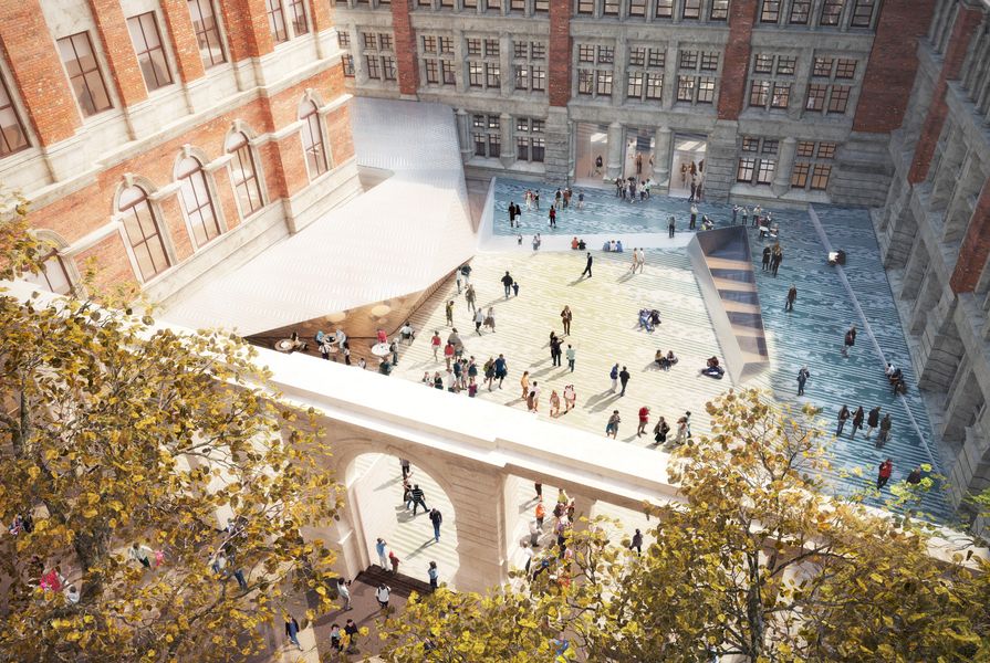
The scheme for the Victoria and Albert Museum addition in London is a permeable outdoor room inviting casual appropriation by the public, and a below-ground gallery space.
Image: Courtesy AL_A
CP: Another important project you’ve been working on is a design for a new gallery courtyard and entrance for the Victoria and Albert Museum (V&A) in London. This has the potential to radically alter how the museum engages with the street and how people might navigate into and through the museum.
AL: Creating a new entrance to one of the world’s greatest museums of art and design is a huge opportunity in itself. The street had been semi-pedestrianized – I wish it was completely pedestrianized, but it’s not – to reimagine the dialogue between the museum and the street and to, in some way, take the street into the museum and take the museum out into the street. We’re dealing with a building that is of huge historic importance and is Grade I listed, which is the highest heritage status that you can have. The presumption with Grade I listed buildings is that you don’t mess with them, but it seemed to us we had to propose an alteration to the Aston Webb screen, which is the front wall of the site. Originally it was completely solid at the bottom because it was designed to hide the boiler rooms of the museum, but the boiler rooms have long since gone and therefore it felt to us it was time to adapt the screen to restate its purpose. This time, its purpose is not to hide, it’s to reveal. By opening up the screen we reveal these incredible historic elevations of the V&A, which you didn’t have a sense of as a pedestrian. It also allows multiple entrances into the museum so you can drift in off the street. The moment of threshold is very different – it’s not about entering a front door, it’s a much more blurred experience. So the courtyard that we create, which is in a sense an external lobby to the museum, becomes this kind of orientating space. We put a cafe in a sunny area, so you can drift in off the street and you don’t have to go to the museum – it’s a place to hang out, it’s a place to meet, and it will hopefully encourage people to go inside.
CP: It might attract a new generation of people to the museum.
AL: I hope so. We have really conceived the courtyard as an outdoor room, a space to be curated. You can have any number of events there, but most importantly it’s a place for appropriation by the public. We’ve invested a huge amount of design time and research into working on this intuitive idea, but a very abstract one, of how do you make visible the invisible, because the major part of this project is invisible – it’s the gallery below ground.
The courtyard will be the first porcelain courtyard in the world that has a surface that reads as a colour field rather than a series of tiles. The geometry of the tiles is derived in some sense from the geometry of the structure that supports the courtyard – that is, the roof and the ceiling of the gallery.
Amanda Levete was selected to design the 2015 MPavilion in Melbourne.
Source
People
Published online: 9 Apr 2015
Words:
Christine Phillips
Images:
Courtesy AL_A,
Edmund Sumner
Issue
Architecture Australia, January 2015