The Venice Biennale national exhibition formula is simple. You select an artist, you put them in your pavilion, you may engage in some PR promotion but, knowing that all the other pavilions and gallerists (usually it is they who are paying for the production of the works) are doing the same thing, you hope that there is some reason you stand out from the crowd and that someone acknowledges and recognizes the quality of the work. Art is big business and Venice is at the apex of the pyramid of prestigious art (and marketing) events. Venice is where brands are maintained and protected, built up and established. It is where the Academy meets the market and where a massive proportion of the visitors is the crowd that “matter$$” who visit during the three-day preview (because everything at the Biennale is for sale and it is on a first-come, first-served basis), a sort of reserved slow-burn, three-day shopping frenzy. The fact remains that six months down the line there is only a dribble of people coming in to see the work.
So to be successful at the Venice Biennale, you gotta have presence.

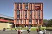
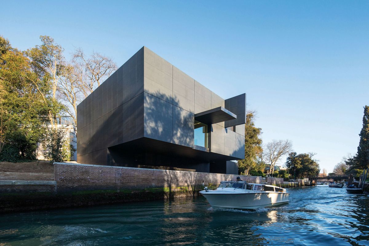
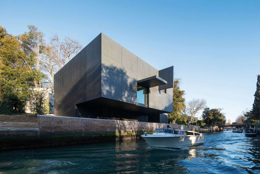
The entry canopy, detailed with “AUSTRALIA,” is one of four openable flaps on Denton Corker Marshall’s “black box.”
Image: John Gollings
We remember the old pavilion, built to show Arthur Boyd’s paintings. The “tin shed” in the Venetian sun was so hot that the oil paint started to soften, so hastily airconditioning units were found. From its inception it was vilified by architects and artists alike for a myriad of reasons, not the least being its unsuitability as a “far from mute” container to display and mount art and architecture shows.
And I remember the “soft” Hany Armanious show (2011) completely lost in the forceful tiered and curved space. People walked in, wheeled around and walked straight back out. Curiously, the regard for that old metal shed has recently been the subject of a slow and steady positive revisionism. The title “temporary” is the emperor’s new armour (of excuse) in protecting its fabricated legacy. It really is a far cry from the lipstick and pig comments it normally attracted from both architects and artists.
It is indeed extremely difficult to consider the new pavilion without comparing it to the Cox-designed “temporary” pavilion. Serendipity played a large role in ensuring that the new pavilion saw the light of day. The old pavilion was designated as temporary, thus avoiding the blanket heritage rating for the Giardini, which would have set it in aspic and made it impossible to alter, very much to the chagrin of the other pavilions (especially Canada).

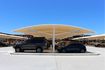
The brooding black box cantilevers over the canal, its recessed ground floor housing service areas and an office.
Image: John Gollings
The Denton Corker Marshall pavilion is generated from this unease, from this dissatisfaction that was further generated in Ronnie di Stasio’s (Melbourne restaurateur and architecture champion) Venice pavilion ideas design competition in 2008. Denton Corker Marshall’s concept is little changed from that competition entry: a white box inside a black box with openable and closeable flaps that break up the hard rectilinear form. A transformable blank canvas for artists and architects to do with what they please.
It is in the reconfiguration of the approach to the new pavilion that Denton Corker Marshall is particularly successful. Traversing an on-grade path from a new direction, you arrive in a Denton Corker Marshall-created clearing that is defined by the Uruguayan and the new Australian pavilions. It’s a deft move by a mature architectural hand, creating a clear civic setting defined and shared by these pavilions.
Looking across the canal from this new piazza, an uncanny landscaped piece of trompe l’oeil reveals itself, as if you are looking across an Australian valley. This view is initiated by the line of olive trees along the canal bank, their silver-blue hues reflected in the green canal.
From this space the contrast between the two pavilions is stark. Uruguay’s worn and tawdry steps up to its white temple front are matched by its twee gravel ramp retained by a border of treated half-round rough timbers reminiscent of those you find at a garden centre. To the right of this is the all-new, black, hard-edged, steel-floored and sided ramp leading up to the Australian Pavilion.
With its carefully detailed stainless steel handrails, whose supports also clamp the metal ramp sides together, the ramp takes you in angular turns past the black, granite-clad edifice brooding behind sparse (there is more planting to come) tall trees both hiding and mitigating the hard skyline profile. From this approach the new building is a shadow.
Via the ramp you are raised up in a triumphal procession to the concrete-floored, glass-balustraded entry porch, opening up a hitherto hidden and now dominating view across the canal to the pavilions of Greece, Romania, Egypt, Poland and Brasil – a view previously blocked by the Cox Box.
In my tour of the building I was treated to the spectacle of a section of the wall, the entry flap, opening and revealing the “AUSTRALIA”-trimmed, cantilevered canopy slowly opening in a smooth, motorized movement. I later watched the other panels open, wondering was it James Bond, Matt Helm or the Jetsons? Cute, very cute.
The open canopy covers a bridge from the entry porch to the electric sliding doors into the airconditioned space of the vestibule, flanked by its accoutrement of reception desk and, opposite the lift, stairs down to the kitchen, amenities storage and service areas (which also extend under the arrival deck). It is at the top of the stairs on the black wall of the vestibule that the donors’ names are imprinted.

Glass balustrades and sliding-glass doors allow an expanded view of the canal while concrete flooring visually connects the entry platform to the gallery.
Image: John Gollings
The concrete floor of the entry porch pervades inside the black entry vestibule, just a few steps away from the main gallery space. There is a window (a flap can close down over this, too) to the canal centred on the wall to your left and a fire-escape door two-thirds of the way along the wall to your right. The space is fifteen metres by sixteen metres and very high at five metres. It is very quiet; the acoustic ceiling deadens the sound transmission extraordinarily. The day I visited, Fiona Hall and crew were beavering away, installing her cabinet of curiosities, in a blacked out (painted out) cube of a gallery space. She was even painting over the window as if to blot out any reference to Venice. So much for the white cube inside the black cube.
The internal gallery space is indeed the mute “white” box so desired by the commissioner, the space that the artist could “own.” Well, Fiona was owning it. The gallery space is literally mute, in reference and context too, concrete-floored, not quite a cube. It could be anywhere and is probably nowhere. Is this the quintessential contemporary art space that speaks an anonymous language? It is hyper-conforming to the vision of what the commissioner and major stakeholder had described. It is as if the architects are warning him to be careful what you wish for.
Now, let us get on with creating some architecture! The exterior is shadow-boxing you from the approach side – jab, jab, softening you up, then uppercut on the terrace, then a left hook and – bam! – KO when you see it from the canal side. It has presence in spades. It redefines and dominates its setting.
The pavilion is clad in a rain screen of matt black Zimbabwe granite, arranged in large grids (3.4 by 3.7 metres) articulated by a ten-millimetre gap, containing within each a grid of nine tiles in three-by-three formation with five-millimetre gaps.
The two other openable flaps (other than the entry and canal-side window), one on the approach side, the other on the canal, are both high up on their facades. When they were opened I expected to see glass and views into the gallery space, but instead they reveal a blank, black surface that will be replaced next year by video screens, so although they modulate the outer form they have no transformable function for the interior. Each of the building’s four openable flaps close to become one of the nine-tile grids. They are detailed so that in the closed position they are indistinguishable from any of the other panels. Here, shut up looks shut up.
The grid denies any reading of the building’s structure and serves as a graphic articulation and scaling of the form of a rectangular cube that cantilevers out. The choice of this resilient and permanent material, used here as a skin, only alludes to its essential mass and solidity. The mattness denies its own materiality, creating a blankness. It is still difficult to imagine this background surface as transformative or as the location of the palimpsest so important in the Denton Corker Marshall concept.
It boldly proclaims itself, a brooding presence appearing as a sheer wall literally holding the canal edge, chesting forward with its lower bits tucked in, goading its neighbours or anyone who will listen to follow suit and to toe the same line. Australia has landed, a sheep in wolf’s clothing.
The undercroft of the cantilever gives the pavilion a splendidly exploitable outdoor sheltered space at the canal side. The positive effects of Denton Corker Marshall’s siting decisions have reinvigorated the site on all sides and influenced the Giardini to prioritize the creation of a new path along this part of the canal.
This pavilion is an embassy for the showcasing of Australia’s artistic (and architectural) production. In reality, like any embassy, only a small number of Australians will see this pavilion over the next decades. That means outta sight, outta mind … it could be seen as elite, remote and removed. It is possible that cultural ambition is a positive trait; however, constantly seeking validation on the international stage is a sign of immaturity, betraying insecurity leaning towards paranoia.
The motivation of corporate sponsorship is clear; it is a commercial exchange of sorts. However, when it comes to private benefactors of the non-anonymous kind, the motivations are more complex. Whatever their motivations, the thousands or in some cases millions of dollars buy entree and influence. The relationships can become skewed and the danger is that the tail starts wagging the dog.
Look at the example of David Walsh, of MONA fame, who is a major sponsor of the French Pavilion (really of the artist) this year. Conditional to his sponsorship was that at the Vernissage the French have to serve his Tasmanian beer.
Given that the new pavilion is only partially funded ($1 million out of $7.5 million) by the government, the conundrum remains – who is the client? We may claim it as our cultural embassy but we didn’t pay for it. Do we own it or does it belong to the funders?
We were told by the commissioner upon announcement of the new pavilion that the architecture of the pavilion was not important; it was the space for the artist that took primacy. He has made similar comments about the MCA extension in Sydney.
Denton Corker Marshall has been clever. The architects have understood the commissioner’s suspicion of architecture, his concern about the architecture dominating the art. What they have produced is a subtle subversion of the brief. For the new pavilion, whatever happens inside, the building outside does indeed dominate.
I am sure this will be spun differently and they will now most certainly laud and celebrate Denton Corker Marshall’s boldness. Denton Corker Marshall has long eschewed the “look at me” architecture of its home town and here in Venice its Australian pavilion says: “I am here. Look if you like. I am staking my place and I am not budging.”
An arts fundraiser told me that the new Australian pavilion would put Australia on the map in the art world. With this new building and seven Australian artists in the Arsenale curated show and reportedly an Aboriginal art show elsewhere, is Biennale 2015 set to be Australia’s year? No doubt the spin and hype have started and the new pavilion will create a lot of buzz in Venice – however, it is not, as they will tell you, the first twenty-first-century building in Venice. That would be doing a disservice to Messrs Calatrava, Chipperfield, Zucchi and others. It will also attract more visitors than ever, which is held up as a gauge of success.
Knowing the ins and outs of the mille-feuille (a thousand layered sheets) of Venetian bureaucracy, the political will of the Australian government, the managerial and organizational skills of the Australia Council for the Arts (especially Elaine Chia) and the determination of Denton Corker Marshall are nothing short of remarkable.
It was all done within the fixed timeframe. Budget? Well, it’s not our money.
Robert Grace sat down with Barrie Marshall and John Denton of Denton Corker Marshall to discuss the new Australian Pavilion at the Venice Biennale 2015. They discussed Denton Corker Marshall’s submission for the di Stasio competition in 2008 and the material selection process for the new pavilion. They also pondered in what sense the new pavilion’s design is Australian – or is it simply architecture? Read the interview here.
Credits
- Project
- Australian Pavilion Venice
- Architect
- Denton Corker Marshall
Melbourne, Vic, Australia
- Consultants
-
Contractor
SICOP Costruzioni e Restuari, Sirco, Fiel
Engineer Arup
Engineering consultant for operable panels Advanced Design Innovations (Australia)
Local architectural associate FARE Studio (Italy)
Project manager InTeA (Italy)
Services and Structural engineer STEAM (Italy), Arup (Australia)
- Site Details
-
Site type
Urban
- Project Details
-
Status
Built
Completion date 2015
Source
Project
Published online: 14 Oct 2015
Words:
Robert Grace
Images:
John Gollings
Issue
Architecture Australia, July 2015