We are nothing more than the sum of our memories. They are the basis of our emotions; we use them to mark out who we are and the journey we’ve taken in life; they inform how we behave in the present, the decisions we’ll make in the future. But as real as our memories can feel, subjectivity gets in the way and perceptions are distorted. As any psychotherapist will tell you, much can be gained from asking questions of memory and perception, from seeking an understanding of our particular subjectivity.
Melbourne architect Andrew Simpson used this to his advantage in designing an extension to a double-storey Victorian terrace in North Carlton, which he calls the Bower House. For, despite bricks and mortar being so solid that they’re commonly used as a metaphor for “solid,” it turns out that they’re not so inflexible in our memories. In an early architect–client conversation, inspired in part by House, Rachel Whiteread’s Turner Prize-winning concrete cast of a terrace house (look it up if you aren’t familiar with it – it’s quite incredible), talk turned to the intrinsic relationship between the spaces we live in and our memories of them. So Andrew set his clients a task: to individually sketch, from memory, the floor plans of all the homes they had shared, residences as far afield as the US, the UK, France and Melbourne, where lives had been lived and memories accumulated.

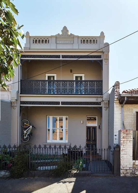
The front facade of the heritage-significant house was retained, giving away little of the geometric extension.
Image: Peter Bennetts
Uninformed as the clients were by any architectural training, their plans weren’t drawn to scale and the resulting (dis)proportions attributed to different spaces revealed their perceptions of their homes as skewed by subjectivity. For instance, a London pad was drawn with a huge stairway (the clients subsequently confirmed that this was one of their favourite spaces in the apartment, light-filled with high ceilings) and a Melbourne house was presented with a suspiciously wide hallway. Andrew took these drawings and converted them to “plannametric memories” – simplified floor plans that use colour to highlight and compare different modes of occupation, such as “converge and retreat,” “live,” “circulate,” “breath,” “sleep” and “wash” – and these were read as a kind of unconscious code for the clients’ preferences for their new family home.

The refurbished front rooms lead to the new kitchen via a spacious stairway, whose design was based on the clients’ memories of much-loved circulation spaces in their previous homes.
Image: Peter Bennetts
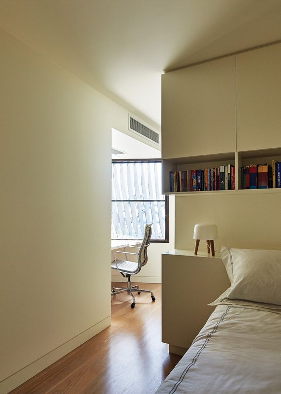
On the ground floor, the refurbished front rooms of the original house flow breezily into the new extension via a secondary living space that’s completely open at one end. The floor steps up at the threshold to the new kitchen, and the influence of those “plannametric” memories becomes clear – the spacious stairway from London, the suspiciously wide hallway from Melbourne, have been reimagined in this light-filled multipurpose circulation space. This theme continues in the new extension: above the kitchen and dining areas, a pod containing a spare bedroom, study and ensuite has been inserted into the new volume, leaving a double-height void that runs almost the full length of the space, leading out to the rear doors.

The upstairs pod is clad in a rippling, geometrical fibreglass shell, like an internal facade.
Image: Peter Bennetts
The pod itself, clad in a rippling, geometrical fibreglass shell, is the expression of two other themes from the early briefing discussions: the idea of the “internal facade” (Daniel Libeskind’s Jewish Museum Berlin was one reference) and the concept of “sumptuous minimalism,” derived in part from one of the clients’ “sense of Englishness.” The pod floats above the kitchen like a strange, futuristic cloud, its simple, repeated pattern and glossy reflections faintly reminiscent of a mesh purse – something precious, anyway, placed within the shell of the building. Indeed, different imaginations will ascribe it with different meanings and describe it with different metaphors, and therein lies much of its attention-grabbing appeal.
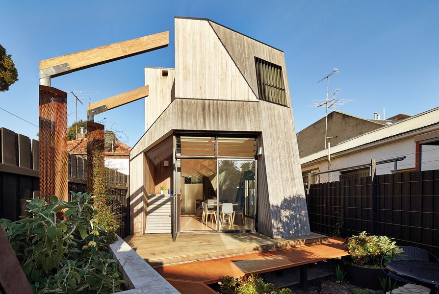
The timber-clad exterior of the extension presents a unique geometry too, first shaped by planning restrictions on overshadowing and then chipped away at to maximize natural light in different rooms on the first floor and to control direct sunlight from the west. Unusually for this largely heritage-listed part of town, it’s clearly visible to the public – in a happy coincidence, it can be seen from a side street and a rear laneway. At its feet, a timber deck steps down fantastic rust-coloured Corten steel stairs into a small, crazy-paved courtyard surrounded by angular, formed-concrete planters. With the new extension raised above ground level, the courtyard feels sunken into the earth, a hidden place – once the trees and plants grow, it will be quite magical. Behind it, a sliding gate leads straight out onto a laneway, where the public side of the back fence has been painted with a cute mural.
Looking back at the house from here – at the square masonry of the terrace and the unashamedly contemporary oblique angles of the new extension, at a backyard cricket wicket set up on the deck and the white fibreglass pyramids just visible through the window – one obvious question teases, its answer out of reach for a decade or two. When the clients’ young boys are fully grown, how they might draw it from their memories …
Products and materials
- Roofing
- Lysaght Spandek roof decking in Colorbond ‘Surfmist’
- External walls
- Spotted gum timber battens; recycled brick
- Internal walls
- Boral plasterboard Windows: Viridian clear toughened Glass; Wincom window awning; Breezway Altair louvres
- Doors
- Kiln-dried hardwood door frames
- Flooring
- Tasmanian oak in custom stain; spotted gum timber decking; granite floor tiles from Apex Stone in sawn finish; Perini ceramic floor tiles
- Lighting
- Cuneo and Kanji wall lamp, Algoritmo modular lighting system, Parabola and Rastaf downlights, Naiade recessed lights and Castore pendants, all from Artemide; Pierre + Charlotte Hydro wall light
- Kitchen
- Miele washing machine, dryer and dishwasher; Ilve oven and cooktop; Qasair Executive rangehood; Fisher & Paykel fridge; Dorf Crystal tap from Reece; Abey Nu Queen undermount laundry sink
- Bathroom
- Starck 3 Compact wall-hung pan; Parisi Ellisse toilet roll holder; Ideal Standard Moments towel rail from Reece; Zucchetti Spin shower head; Axus shower shelf; Accent Geo Viva bath spout; Rogerseller washbasin; Apex Stone square shower base in granite; Astra Walker mixer; Perini wall tiles; Artedomus wall tiles (powder room)
- Heating and cooling
- Hurlcon hydronic trench heating system; Daikin split-system airconditioner; Skyline Energy hot water split system
- Other
- Tessellated kitchen ceiling by Kings Fibreglass
Credits
- Project
- Bower House
- Architect
- Andrew Simpson Architects
Melbourne, Vic, Australia
- Project Team
- Andrew Simpson, Michael Barraclough, Emma Parkinson, Mel Buettikofer
- Consultants
-
Builder
Overend Constructions
Engineer BHS Consultants
Landscape architect Katherine Rekaris Landscape Architecture
- Site Details
-
Site type
Urban
Site area 190 m2
Building area 176 m2
Budget $625,000
- Project Details
-
Status
Built
Completion date 2013
Design, documentation 24 months
Construction 12 months
Category Residential
Type Alts and adds
Source
Project
Published online: 24 Jun 2015
Words:
Mark Scruby
Images:
Peter Bennetts
Issue
Houses, April 2015