Way back in 2007, news broke that the Kam Fook Group, respected purveyor of yum cha through numerous gargantuan Sydney outlets, was planning an audacious French–Chinese culinary chimera for Melbourne’s QV complex. Highly regarded restaurant designer Buro Architects was linked to the project, and Melbourne’s trés refined (and bloody parochial) foodies – newly softened up on the decadent fare of imported Sydneysiders such as Neil Perry and Guillaume Brahimi – held high expectations.
Weeks passed, then months. Tidbits of information trickled out through foodie blogs and newspaper columns, but the boarded-up shopfronts on Artemis Lane gave nothing away. Months ran into years, prime ministers came and went, and expectation gave way to a suspicion that this Duck Duck Goose may indeed have been cooked. And then the doors opened!
According to Buro’s Stephen Javens, the restaurant is far better for the extended gestation. “Often restaurants are designed and delivered with a high level of commercial imperative,” he says. “It was really nice to consider things over a longer period. We spent a lot of time discussing the diner’s experience.”

On the light side of the restaurant is an abstract Chinese tea garden.
Image: Earl Carter
Walking in from the street, you do get the sense that nothing has been spared in creating this place. Owner Edward Ng’s initial inspiration for twin French–Chinese restaurants came during a tour of Rheims and Champagne, and the entrance to the French fine dining side of Duck Duck Goose, with its low ceiling and Jonah-and-the-Whale-style metal ribs, was designed to evoke those regions’ famous caves. The concept plays out in experiential rather than literal aesthetic terms – the passageway acts as a point of reset, giving visitors time to adjust to the new environment and avoiding that common experience of entering a dining room and being shocked by its cacophony, colour and movement.
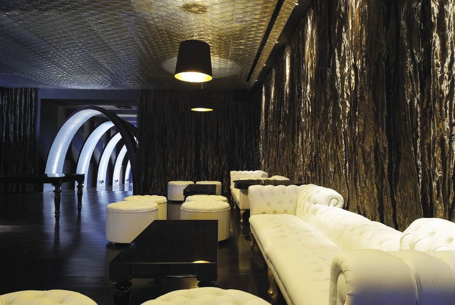
The entrance draws neat parallels with the QV complex itself (featured in Artichoke 09), which is characterized by small openings and narrow laneways that intersect at odd angles and open suddenly into larger volumes. Here the passageway opens into an unapologetically luxurious champagne bar. An ornate pressed metal ceiling catches the eye immediately, and soft metallic curtains wash the space in a golden glow while the bar itself – generously proportioned and stocked with an outstanding selection of fizz – is a refreshing antidote for anyone tired of rubbing shoulders in yet another hole-in-the-wall CBD gin joint.
Buro has capitalized cleverly on the constant changes in floor level here, a legacy of the car park below, to subtly demarcate different zones. From the champagne bar, a short flight of steps takes diners up to the fine dining restaurant. The steps are flanked by dark timber screens that help to define the boundary without blocking views and sounds.
This subtlety does not, however, dilute the impact of entering the dining room proper. The space is imbued with an undeniable sense of tranquillity and refinement. It’s a fine dining restaurant like they used to make them, and how refreshing!

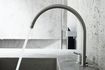
On the light side, the colour palette is restrained, with white and a pale American Oak.
Image: Earl Carter
Black chairs are matched to black marble tabletops, black curtains along the walls and carpet so dark you can only just make out a pattern, all arranged around a massive marble-clad pool. Its surface transforms light from an array of pendant lights above into gently chaotic patterns. The constant movement brings the space to life, and its quiet burble creates natural white noise that reduces the audibility of neighbouring conversations and quashes any temptation to play muzak.
The fine dining restaurant and champagne bar are collectively known to staff as the Dark Side. Its casual Cantonese twin, the Light Side, is an airy procession of eating areas that cascade like a terraced garden and flow down to QV’s main plaza. There are tables, banquettes, alcoves and bars for sampling dim sum and drinking tea, and the views between levels and out through windows provide a greater sense of space than experienced in the Dark Side. However, disparate as the two sides seem, they are linked by a shared selection of furniture, fittings and materials – black marble tables and chairs, for example, are replaced by white and blonde versions, respectively; dark-stained timber floorboards are repeated sans stain; and the marble water feature is re-imagined as a square, white stone dim sum servery at the ground floor entrance.

On the light side, the colour palette is restrained, with white and a pale American Oak.
Image: Earl Carter
In a transitional passageway that links the two restaurants, a series of private dining rooms feature elements from both – inky carpet from the Dark Side, for example, and American oak joinery from the Light Side. Diners here can order from either menu, and enjoy a direct line of sight into the huge twin stainless steel kitchens.
Perhaps, then, this is the best place to ponder the multiple personalities of Duck Duck Goose. On paper, it reads as Yin and Yang, dark and light, night and day, but this implication of dichotomy is misleading. It is a French–Chinese–Sydney–Melbourne thing, after all! Accordingly, Buro’s fitout isn’t all black or white, but evolves slowly as you pass through it, successfully accommodating a seemingly impossible diversity of experiences – from a five-minute tête-à-tête with a basket of steamed dumplings at one end, to a fifty-dollar glass of champagne at the other – in a seamless and singularly elegant whole.
Products and materials
- Walls
- Wall tiles to tasting bar from Urban Edge Ceramics; Bulletin Board from Duraloid; Laser-cut MDF screen from Routa-Tech.
- Ceiling
- Acoustic ceiling panels from Atkar Panel; Pressed metal ceiling from Wunderlite.
- Flooring
- Polished concrete from Progrind Australia; Timber oak floorboards from Brittons Timber and Tait Flooring; Resilient safety flooring from Altro Flooring.
- Lighting
- Jeremy Cole Aloe bud pendant from ECC Lighting; Metalarte white porcelain dining pendant from Inlite; Tully spot from Masson for Light; Flos spotlights and halogens from Euroluce; Shady Lady pendant from Dean Phillips; Halogen lights from Lumascape; Slimlight from Concord Sylvania; Kreon spotlights from Dedece; Tal brushed aluminium wall light from Light2; FlexiLED from Advanced Lighting; Ice lamps from Neoz; Aluminium and bamboo forest lights from Metal Mesh.
- Finishes
- Mirrors and bar shelves from Viridian; Curtains to cocktail bar from South Pacific Fabrics; Laminate from Laminex; Stainless steel sheeting from Rimex; Paints from Dulux; Resene and Bishop Decorative Finishes; Calacatta marble to bar; travertine and other stones from Apex Stone; Timber battens and solid timber from Tait; Timber veneers from New Age Veneers.
- Upholstery
- Banquette upholstery from Kvadrat Maharam.
- Kitchen
- Kitchen safety tile from Metz.
- Bathroom
- Tile to bathrooms from Signorino and Massa Imports.
Credits
- Project
- Duck Duck Goose
- Design practice
- Buro Architects
Melbourne, Melbourne, Vic, Australia
- Project Team
- Stephen Javens, Kayoko Kubo, Katherine Bond, Paul Kegen
- Consultants
-
Builder
Renascent
Building surveyor PLP Building Surveyors & Consultants
Lighting Electrolight
Services engineer Sokolski Consulting Group
Structural engineer Bonacci Group
Water Feature H2O Designs
- Site Details
-
Location
31–37 Artemis Lane QV ,
Melbourne,
Vic,
Australia
Site type Urban
- Project Details
-
Status
Built
Website http://www.au-ddg.com/
Category Commercial, Hospitality, Interiors
Type Restaurants
- Client
-
Client name
Duck Duck Goose
Website au-ddg.com
Source
Project
Published online: 1 Dec 2010
Words:
Mark Scruby
Images:
Earl Carter
Issue
Artichoke, December 2010