Exit is a video installation by Diller Scofidio and Renfro (DS+R), Mark Hansen, Laura Kurgan and Ben Rubin, in collaboration with Robert Gerard Pietrusko and Stewart Smith, currently showing at the Sydney Festival. The Voynich manuscript is hand-painted on vellum and carbon-dated to the early fifteenth century. What’s the connection?
Voynich, heavily illustrated with watercolour drawings that range from botanical diagrams to nude bathing scenes, is regarded as the world’s most mysterious document. Although intensively studied and considered by most cryptographers to hold genuine linguistic content, it remains anonymous, unsourced and untranslatable – because its language is entirely unknown.
Such documents are the defining mark of a Dark Age. In the eighth century, outside the monasteries, they were commonplace. In the future – if Exit’s predictions hold – they’ll be commonplace again. Indeed, the world may become a regular Babel since even now, says Exit with deadpan delivery, fully half of the planet’s 7,000-odd languages are threatened with extinction.
Language is just one area of damage from a world of catastrophic population displacement. “What is left of this world, of our native land, of the history of what so far is the only habitable planet?” This was the question from French philosopher Paul Virilio that formed Exit’s brief. Its answer is unity, connectivity and global consciousness.
Political art is de rigueur these days, yet still the work is impossible to categorize. Variously billed as an immersive installation, an exercise in data visualization and “a 360-degree animated global map which visualizes hard-hitting facts about the state of our planet,” Exit is neither art nor architecture nor geography. Not documentary, not science, not propaganda. What, then?
The DS+R team would say the label is irrelevant. After all, blurring boundaries is what they do, what they’ve always done. It’s even especially pertinent here since seamlessness – the “borderless condition” of the planet now that makes nation-states a dangerous irrelevance – thematizes the whole. But in the end we all want to know: is it any good?
Physically, Exit comprises a room-high cylindrical screen, maybe seven or eight metres in diameter. You enter from the back (making the “immersion” closer to 300 degrees than 360), where there’s a bench seat for five or six but everyone else, for the forty-five-minute-long show, is on the floor. (So no, it’s not exactly a pattern language of anthropometric comfort.)
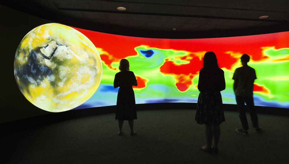
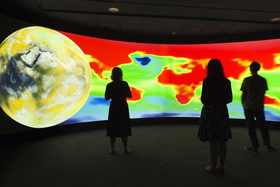
As to content, Exit relies heavily on maps to spatialize mass human displacements so far this century. Personally I love maps – for their art and their science, both – but this is not an exercise in map as enchantment.
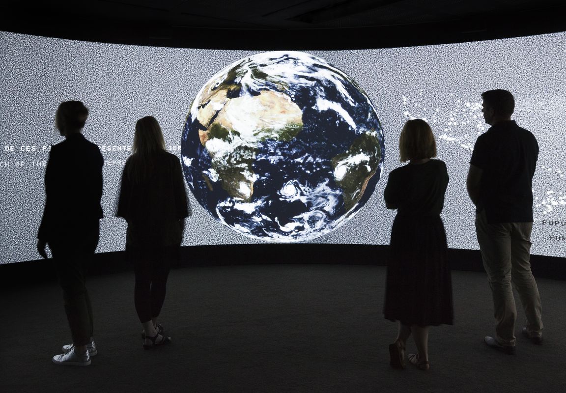
The show comprises a half-dozen sequential tranches of information crunched from impressive datasets and organized into topics like urbanization, migration, remittances, greenhouse gas emissions, sea-level rise and loss of indigenous cultures. Each tranche is rolled out clockwise around the room by a large holographic earth-ball, which erases in front and prints behind, accompanied by a kind of rumbling roar that is part retro charm, part foreboding, like an ancient wooden escalator in a mental asylum.
(“We did a great deal of thinking about the sound,” muses Ricardo Scofidio. “The sound is very emotional …”)
The sound may be “emotional” but the visuals are deliberately deadpan: no images, no narrative, no faces of catastrophe. Indeed, Elizabeth Diller explains, they worked consciously to “let the data do the talking” while hoping nevertheless for “strong emotional effect.” This suggests an aim somewhere between art’s desire to move people via the aesthetic and propaganda’s yearning to change minds and behaviours. So, does it work?
For me, not really. It’s not clear, it’s not poetic and it turns no new stones, nor old ones in a new or revealing way. It is interesting, like a news segment designed for people with no capacity for abstraction. It’s also aurally cute. When the topic is global remittances, for example, the screen arranges itself with circling national flags and the soundtrack fills with the busy “kerching!” of a thousand cash registers. When it’s comparing flood events across the hemispheres, blue blobs arrange themselves above and below the line, swelling to illustrate how vastly greater is the impact on those populations that are both least responsible and most vulnerable. When it’s deforestation, fire breaks out and crackles across the globe. But we kind of knew all that.
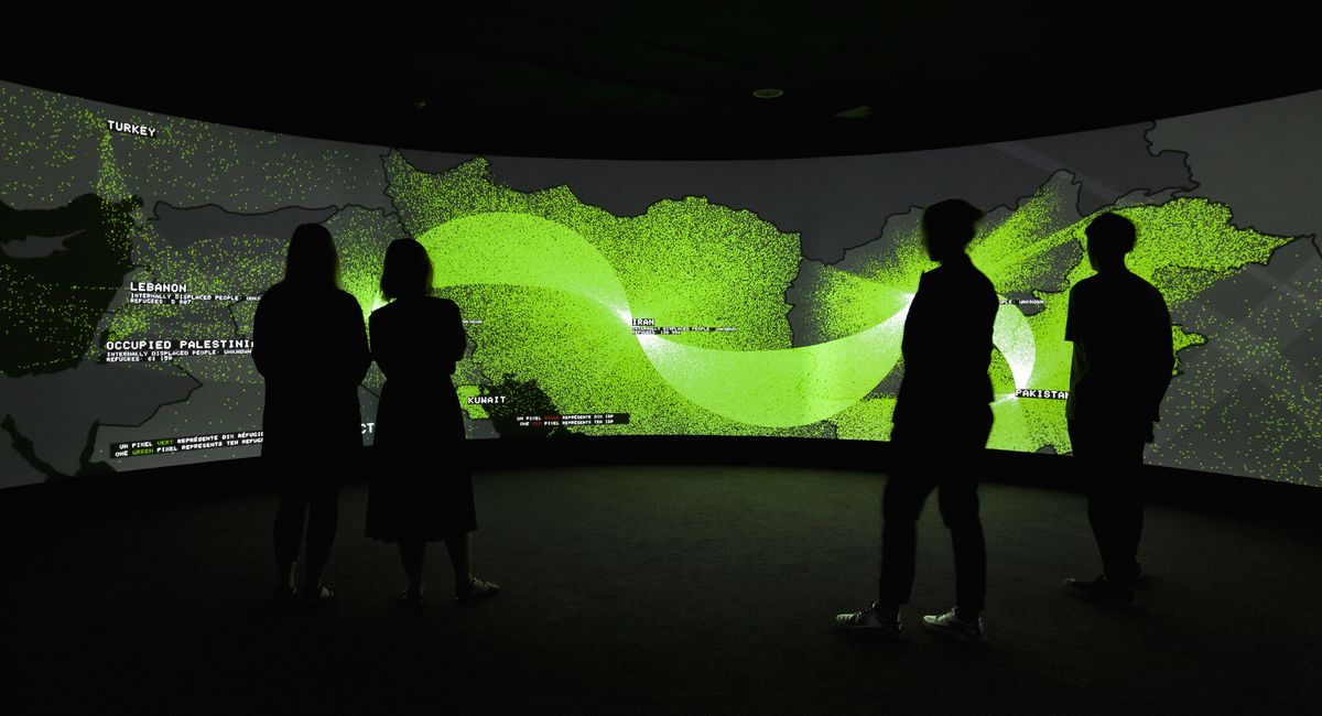
For me, the most compelling moment is the year-by-year representation of global migration. The flows, from areas of war or catastrophe, erupt as intermittent lime-green geysers – pixel torrents, at ten persons per pixel – erupting over a black world. From Afghanistan, Iraq or Sarajevo they flood to India, Turkey, Europe and the USA, where they pool, slow and eventually stop. Most noticeable, sitting there just off Oxford Street, Sydney, is that the flow to Australia never – at any time this century – exceeds the merest trickle. Most years it’s non-existent. Zip.
So yes, although Exit offers neither the miraculous conjurings of a Star Wars console game nor the emotional content of Pablo Picasso’s Guernica or a Francisco de Goya painting, it is engaging. But if you’re wondering whether to recommend it to a friend or colleague, it’s impossible not to also wonder what it is actually for. Here, Scofidio speaks of their desire to “expose cause and effect,” to reveal interconnectivities normally hidden or overlooked. This Exit achieves, although whether Sydney Festival audiences could possibly be considered unaware of such connections I frankly doubt.
The graphics are snappy but the message, in the end, is annoyingly diffuse. Naturally we assume that climate change, sea-level rise and mass migration and so on are Bad Things. But the segment on global remittances casts doubt on this, pointing out that migrant labour effectively siphons three times the total quantum of global foreign aid from rich economies to poor ones by the ancient practice of sending money home, pumping €389 billion (approximately AUD$647 billion) into underdeveloped economies in 2014 alone. So is there maybe an upside to mass displacement?
Call me jaded, but I reckon we’ve been fed figures and patterns about this stuff for as long as any of us can remember. What we lack is not facts, but an answer to the far more difficult question of human behavioural change. This, absent a miracle, is what will bring on Jane Jacobs’s new Dark Age.
The Australian premiere of Exit is presented by The University of New South Wales in association with the Sydney Festival, with support from major sponsor the City of Sydney. The exhibition runs from 7 January until 25 March 2017.