Archier’s recent client had been looking for somewhere she could comfortably retire to when a next-door neighbour bequeathed her a 600m2 property in the Hobart suburb of Howrah. “Carmel had been really close to the former owner,” says the architecture and design practice’s Melbourne-based senior designer Chris Gilbert. “Not only did he leave her the land, but he gave her this amazing collection of antique books as well.” The brief, although straightforward, was double-pronged in that it called for a new one-bedroom house which seamlessly integrated into the garden and also had enough room to accommodate a small library.
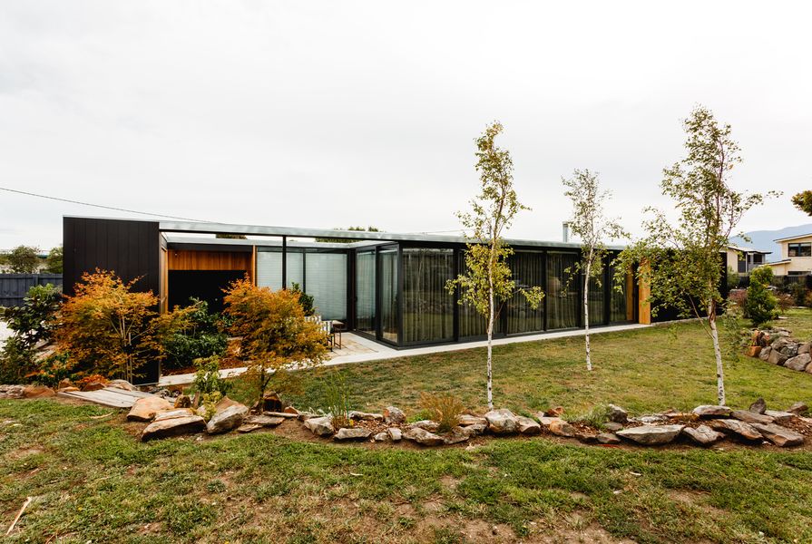
Gilbert, who along with Josh Fitzgerald and Chris Haddad, co-directs Archier, proposed a plan that twists into the landscape and explores the concept of living in it rather than on it. Treading the earth lightly resulted in a small footprint measuring only 100m2 and a rectangular scheme incorporating four courtyards, each directly connected with the surrounding landscaped garden.
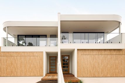
Incidentally, the house’s distinct horizontal form is a reference to Howrah’s local architectural vernacular – a richly appealing mix of 1970s’ suburbanism, underpinned by a latent modernist sensibility.

Black ceilings and cabinetry lend contrast and definition to the raw-material palette of timbers and untreated metals in the kitchen.
Image: Adam Gibson
An initial challenge posed by the triangular site’s conditions is its lack of aspect. “Generally speaking, if you’re building in Tasmania it’s on a site that has views of the ocean or mountains,” Gilbert explains. “So the question we kept on asking ourselves was: how do you produce a quality architectural outcome without the benefit of either?” His solution can be found in the single-storey home’s black-finished exterior, which functions as a clearly defined frame, drawing the eye inward, and the black powder-coated aluminium window frames and glazing that bring the outside in.

Part of the client’s brief was that the house should make space for a collection of antique books, the same which influenced the overall design of the building. The library looks out onto one of the four courtyards.
Image: Adam Gibson
This doesn’t so much blur the boundary between inside and outside, as strengthen it. The resulting views take in vignettes of the garden and each room’s corresponding courtyard, making the interior seem considerably bigger than it actually is. Carmel met her partner Richard during the construction period and although the house was originally designed for her as a sole occupant, they now comfortably live there together. “They really bonded over this home – and Richard is a landscape gardener, which works out well!” smiles Gilbert.
While a modest budget determined the pared-back material palette, its robust aesthetic was informed by Carmel’s newly inherited antique book collection. As Gilbert explains, “we wanted to embody the quality of those books in the design; their texture and all those things that make them so tasty and appealing when you think of how they feel.” Investigating available high performance construction methodologies that would work if left in a raw state led him to utilise Structurally Insulated Panel System (SIPS) to articulate the interior’s walls and ceiling.
Gilbert painted the ceiling’s exposed panels black and lined the walls with ‘shoulder packs’ (short lengths of timber boards) of Tasmanian oak. “Standard-sized boards would have created quite a strong vertical line,” he reflects. “So the shoulder packs work to make the overall scheme much more textural, almost like patchwork.” They soften the interior and add warmth to the living areas, bedroom and library, as well as referencing the irregularity of the garden with their slightly mottled appearance.

The ceiling panels have been painted black and the walls were lined with Tasmanian oak boards.
Image: Adam Gibson
The Tasmanian oak’s rich caramel tones are in contrast with the built-in storage units and shelving systems that are finished in black, like the ceiling and exterior cladding. These dark features interrupt the patchwork arrangement and prevent each space from appearing overly cluttered, which could easily have been the case if Gilbert hadn’t shown restraint in the material’s application. This balance between light and dark is particularly well executed in the kitchen, where the island benches are clad with short boards, adding yet another textural layer.

Leaving the stainless steel benchtops untreated so they more closely resemble zinc continues the raw aesthetic, as does the unburnished concrete floor.
Image: Adam Gibson
Leaving the stainless steel benchtops untreated so they more closely resemble zinc continues the raw aesthetic, as does the unburnished concrete floor. Both materials ensure the colour palette also remains neutral and this is advantageous in generating a greater sense of openness. Carmel and Richard have furnished the home with a few key pieces, favouring a minimalist country style that evokes a welcoming ambience. The fireplace in the lounge room further adds to this cosy atmosphere, while being a practical necessity during chilly winters.
The only flourishes of colour come from the personal effects displayed on the shelves in the kitchen and bedroom and from the leather, paper and cardboard bound antique books in the library. Collectively, the books’ spines form a tapestry-like fabric that is echoed in the use of shoulder packs to line the interior walls. “It’s a board size that’s not used very often; so, making it work as a complete solution was a really nice result,” Gilbert says. Stripping back the material palette and simplifying the plan were bold moves that ultimately reinforce the design’s environmental response, successfully injecting it with a sense of place.
For an interview with the architects, click here.
Source
Project
Published online: 7 Feb 2017
Words:
Leanne Amodeo
Images:
Adam Gibson
Issue
Urbis, June 2016