When Geoff and Maxine Suvalko attended an open home for a 1970s’ house in Herne Bay, in Auckland, New Zealand, they were surprised by the comments they overheard. Everyone else in attendance thought the dwelling should be pulled down but this couple didn’t – so they bought it and started thinking about how to enhance its wooden interiors and quirky spaces.
That was in 2007 and, since then, the Suvalkos have worked with architects Tim Dorrington and Sam Atcheson of Dorrington Atcheson Architects to transform the family home. Renovations were undertaken in two phases (in 2009 and 2011) and completed by Henry Dunham Building; the result is a five-bedroomed, 400m² house for a family for five: Geoff, Maxine, their daughter Hannah and sons Zach and Jacob.
“The initial concept bubbled to the surface pretty quickly,” says Tim Dorrington. “Some of the original spaces felt quite compromised and there were eighteen different roof planes but we wanted to keep the good bits and add to them without jarringly juxtaposing a new addition; we wanted to re-present the house.”
“Our brief was to open the house out functionally while retaining its personality. We wanted to contemporise the house, not reinvent it,” explains Geoff Suvalko.
Now, from the street, two forms dominate the exterior: one gabled and the other a box of thin vertical battens stained in a dark colour to hide the house beyond. Between the forms, a glimpse of the edge of the existing 1970s’ concrete-tiled roof can be seen. Throughout the architecture, deception is rife. The double-height, vertical, windowless façade of the boxed form hides both a garage and a bedroom above it. To the right, and set back, is a single garage door in lighter timber. In reality, both of these forms lead to the same double garage but the aesthetic trick avoids the traditional wide and low garage treatment so ubiquitous in the suburbs.

The front façade of the Auckland home.
Image: Emma-Jane Hetherington
Inside, just half a storey up from the garaging, the tricks continue. A small foyer features a wall of painted panels, suggesting cupboards. In reality, one panel reveals the guest bathroom and another the laundry. On the other side is the main living area, which consists of a kitchen and dining and sitting rooms.
Geoff and Maxine love the mid-century Case Study houses of California, particularly their open relationships with the outdoors and the focus inside on carefully designed, built-in furniture and storage. Accordingly, they designed much of the free-standing joinery themselves. At the back of the sitting room, a wall unit of light timber with sliding dark-stained plywood panels contains the television.
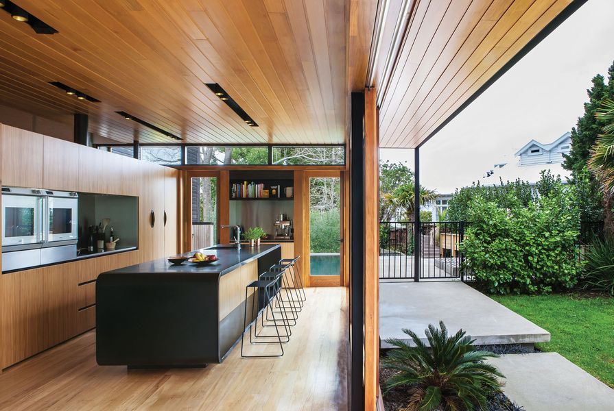
The kitchen is large, simple and bare. A monolithic black island made of granite takes up much of the space; it’s curved at both ends and appears to float above the timber floor, defying not only structure but gravity too. A recess on one side accommodates a breakfast bar; on the other, the dishwasher and several cupboards are resident. Behind it, a wall of timber-veneered cupboards with a dark recess is devoted to cooking and, beyond the far end of the island, a bench embedded in the outside wall is designed for books and beverages.
The island was an element conceived by Dorrington right at the beginning of the design process. “I wanted something singular: one piece of furniture that floated above the floor,” he says. “It is slightly staggered and extends past the rest of the cabinetry so you get a glimpse of it as you enter the sitting room, suggesting something intriguing beyond.”

The breakfast bar with stools from Simon James.
Image: Emma-Jane Hetherington
Tucked behind the kitchen is a formal dining room at the end of which is the original plastered fireplace. From there, a half flight of stairs leads to a day room. It has its own fireplace, which shares the original plastered chimney with the dining room below. This room “is the winter personality; it gets cold and the fireplaces go on in there,” says Geoff. “The downstairs living area is our summer personality, where we can open all the doors and live virtually outside.”
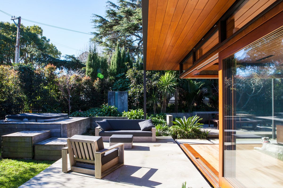
That downstairs living area is clearly designed to make the most of the ample outdoors, which includes a garden, pool and an alfresco sitting area. The timber ceiling in the kitchen and sitting area is extended outside to create a covered corridor; the floor-to-ceiling glass doors slide back to open half of the room to the elements. The Suvalkos loved the existing concrete landscaping – a series of large concrete slabs bounded by low concrete walls and including a concrete fountain – which had survived 40 years of weathering, so the new landscaping was designed to fit in.
“We also love the unstructured green of the garden so we are carefully developing this to create a screen between us and the neighbours,” says Maxine Suvalko.

The garden features a sitting area, a swimming pool and a spa.
Image: Emma-Jane Hetherington
Back indoors and upstairs, a guest wing sits over the garage. Within it, another arrangement of panels hides doors to two bedrooms and a bathroom. The bedroom on the street side looks through a wall of glass to the back of the battened façade of the tall garage box. From the street, it is completely undetectable during the day; at night, the light from the room filters through the battens. The owners insisted that the battened façade had to be removable and so it is designed to clip on and off for window cleaning.
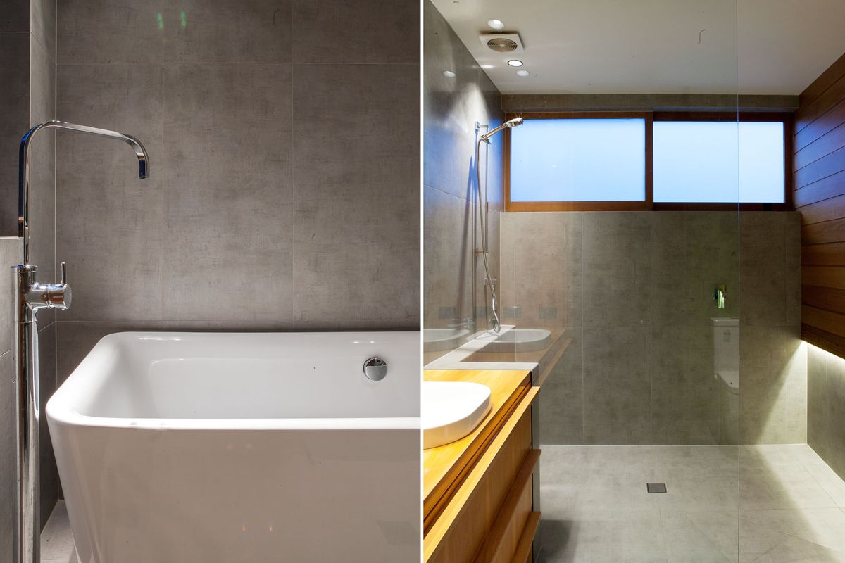
Up another half flight, a bridge looks back down over the entrance and leads to the master suite. The ensuite is, like the three other bathrooms, an understated design in concrete, timber and glass.
“I particularly love the front elevation,” says Dorrington of the project. “I remember doing the initial sketch for that right at the beginning and I’m delighted the composition of the built result is true to that sketch. The owners understood the purity of the concept.”
“We love that we have maintained a big family home,” adds Geoff Suvalko. “We can have lots of people in the house but they are not tripping over each other’s feet. The renovation is new but we have enjoyed letting it blend with the past.”
For an interview with the architect, click here.
Source
Project
Published online: 2 Feb 2015
Words:
Tommy Honey
Images:
Emma-Jane Hetherington
Issue
Urbis, October 2014