If the Google office style represents an haute couture moment in commercial interiors – inspirational and extravagant, yet unbearably self-conscious – then the new Medibank headquarters in Melbourne’s Docklands shares some of its playful flare, yet represents a rather more grounded evolution in workplace design. As seasoned designers in this field, Hassell has carefully calibrated a balance between step-change innovation and common sense. In doing so, it has created a rare hybrid of social interaction, business innovation and space efficiency.
This is rare in a world of office default settings – beige felt dividers and grey carpet tiles, ceilings dropped to minimum heights and a Hobson’s choice of cellular coops or noisy barns. This, despite the many heroic twentieth-century attempts to rethink the office, from Frank Lloyd Wright’s early open-plan experiments, to the brief popularity of Bürolandschaft (“office landscape”) in 1960s Germany, to Richard Rogers’ 1970s machine-like Lloyd’s building in London. So many exemplars, yet as Ricky Gervais so bathetically portrays in The Office , the standard commercial property market remains doggedly obsessed with cost reduction and blithely ignorant of the virtues of value-adding.

The curves of the building convey a softer, more human character than the impenetrable nature of many towers.
Image: Earl Carter
It should perhaps come as no surprise, therefore, that positive alternatives, when they occur, tend to be aligned with higher land values, which necessarily demand more from a building. Nowhere is this more true than in the context of Melbourne’s Docklands, where a progressive attitude to workplace culture has found fertile soil in many an A-grade corporate HQ.
Banks of course were among the earliest adopters of the new work paradigm, and had the resources to follow through. An early trailblazer was NAB on Victoria Harbour by BVN, a project now already a decade old. This low, wide and colourful slab of commercial space anticipates the gospel of ABW (activity based working), with central light-filled atria, breakout boxes, mixed ventilation and extensive planting (albeit a monotonous regime of unkillable Sansevieria ). NAB’s generous interiors were sadly counterbalanced, however, by an exterior glass box that provided rather less generosity to its urban surroundings. Its jaunty coloured spandrels provided little more than a distraction for its otherwise inscrutable and dull envelope. This was particularly unfortunate given one of those default office elevations faced Melbourne’s historic Bourke Street.

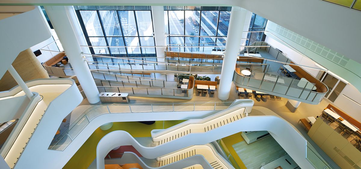
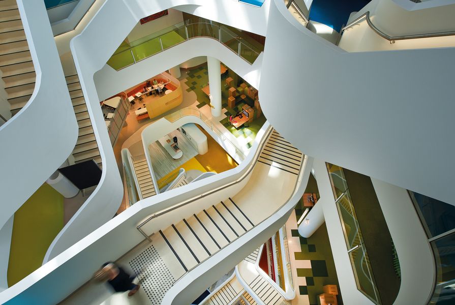
Like a multicoloured fandeck, the atrium’s levels each have a designated colour.
Image: Earl Carter
Medibank Place sits just one block closer to the city facing the same street, yet it presents a significantly greater investment in the city, while also opening up a new chapter in workplace innovation. In some ways this latest contribution by Hassell to Docklands represents one of its greatest site challenges. Unlike its ANZ Centre completed in 2010 (another leader in work culture), with its almost suburban campus-style siting, Medibank Place sits on a slender site that is tightly constrained by neighbouring buildings, with limited water views and saddled with a significant level change between its two principle frontages. It is effectively a remnant site, sandwiched between a colossal stadium, a main street and a highway.
But, at the risk of cliche, good design can take a constraint and turn it into an opportunity. Hassell deployed a range of exterior design features to counter these challenges, including extensive indigenous planting, curving sculptural spandrels that modulate and soften the building’s mass, generous public access between street levels and a large canopy that protects pedestrians along its northern facade. The building, however, really comes into its own when you enter it.

Queensland spotted gum was used in the foyer.
Image: Earl Carter
It was designed to accommodate up to 2,610 people, of which 1,600 are Medibank staff that have been brought together for the first time, consolidated from six disparate offices around Melbourne. As the nation’s largest health insurance provider, Medibank takes health seriously, which includes not only physical health, but also mental and social health. The brief therefore explicitly asked Hassell to reflect the company’s health ethos in its building and its work environment. This aspiration led Hassell to an exploration of four interconnected themes – health, collaboration, innovation and inspiration. Of these, a spirit of collaboration is perhaps most immediately evidenced since the building was first occupied. As mentioned, this development allowed the aggregation of staff from multiple sites around the city, engendering a new spirit of teamwork and group effort from within the organization.

From the main entrance on Bourke Street, a ramp spirals upwards allowing staff easy access to bike storage.
Image: Earl Carter
Before leaving the urban context and focusing on specific design features it is first important to note the degree to which the site drives not only its exterior design treatment, but also its primary interior strategies. The floor plate runs straight along the southern Bourke Street elevation, but bulges out to the north in the middle. Two cores containing lifts and services are placed on either side of the central southern entrance, which allows maximum solar penetration to the northern section of the floor plate. This creates a typical working space approximating the shape of a large open boomerang. Into that boomerang Hassell has vested a series of “civitas” strategies, starting with a central curving “boulevard” that runs east to west, adjacent to which are two piazza-style social spaces. Zoning of this large volume allocates noisy group and team functions to the south, while spaces for solo tasks and deep concentration are located to the north. Finally, a series of meeting rooms and booths carve out “built forms” and help define passageways.
In the middle of this quasi-urban masterplan is perhaps the interior’s master stroke – an organically shaped sequence of punctures at each level, forming a shifting and dynamic central atrium. The atrium brings natural light deep into the building while providing stair connections between all levels. Each level is designated a colour and together this central void becomes a multicoloured fandeck. It is both literally and figuratively a centrepiece of planning and internal activation.
Together these planning strategies generate not one work environment but multiple, providing a diversity of spatial conditions for quiet focus, interaction or confidential conversation, as well as spaces for a ten-minute rest or a quick game of table tennis. Importantly, staff are free to choose their environment to fit their task and their mood. There aren’t any dedicated offices or desks in this organizationally flat, non-hierarchical space.
The jewel in this egalitarian crown is the Plaza, which sits in the middle of the tower. Here Hassell brought the spirit of colla- boration into the design process itself, inviting three other smaller design teams in to participate. Together with Hassell, the three Melbourne-based studios – Chris Connell Design, Russell & George, and K.P.D.O. – designed four “clubhouses,” each with its own brief.
Chris Connell Design was allocated a central area to the south immediately adjacent to lifts and a key circulation spot. This was perhaps the toughest space to imprint the studio’s distinct mark, being the most integrated into the building’s dynamic central form. A soft palette of oak, pale mustard and grey sets a neutral back- ground for the muted orange upholstery, while a custom-designed neon light traces above the primary circulation, continuing this zone’s discreet and recessive tone.

Staff can select from more than twenty- six work settings, from collaborative hubs to quiet indoor spaces.
Image: Earl Carter
Russell & George was given the central north section of the floor plate, which accommodates IT help desks as well as collective team spaces. Here, a pixelated green and timber motif mimics the staccato skyline of the city in miniature. A diverse and flexible arrangement of work and collaboration spaces features green carpeted forms that attenuate noise, strongly contrasted against the highly mirrored box that hangs in the space above. This box is a dedicated collaboration and team-working environment that Russell & George has called The Cloud.
To the east K.P.D.O was given a zone with the theme of “inspiration.” Its focal point, in unapologetic homage to 1970s chic and James Bond glamour, is a central fireplace set within a monu- mental concrete form. Bold colour, texture and geometry establish this territory as a place of dynamic personality and engagement.
Finally, Hassell’s zone was given the theme of “innovation.” While the overall building is a model of Scandinavian democracy and equality, this last clubhouse is a modest concession to convention. Intended for use by senior executives, this western zone becomes effectively a collective corner office, inevitably enjoying the best views. Whereas Hassell’s tonal range for the rest of the building is vibrant and full of personality, here it has opted for a more neutral background – a spatial analogue to a blank sheet of paper.
Taken together this investment in flexible workspaces, light-filled open circulation, bespoke materials and generous urbanity lift the bar by quite a margin on the conventional office. This was always going to be an exercise in value-adding for Medibank, and so far the metrics have vindicated that investment decision. Post-occupancy self-reporting reveals reduced absent eeism, greater levels of collaboration and productiveness, with seventy perc ent of staff reporting that they feel healthier.
There is no question this kind of workplace transformation returns staff dividends and improves performance at the big end of town. But how much of this innovation can translate to below A-grade properties, which after all represents the large majority. While this certainly isn’t an off-the-shelf pret-a-porter office design, there is no question that the connections made here between productivity and quality of work environment, is something that all offices could learn from. Because ultimately the success of Medibank Place is not one that is reliant on bespoke specifications, but rather on an attitudinal change, which understands capital investment in an office as first and foremost an investment in your people.
Clubhouse by Chris Connell Design
Chris Connell Design’s clubhouse make the most of an enormous 11-metre-high volume by inserting a meadering ramp and kitchen pod.

Clubhouse by Chris Connell Design.
Image: Earl Carter
Clubhouse by Russell & George
Situated at the centre of Medibank Place is The Cloud clubhouse by Russell & George. Its design is influenced by what great cities can provide and achieve.

Clubhouse by Russell & George.
Image: Earl Carter
Clubhouse by KPDO
KPDO’s clubhouse in Medibank Place pays homage to 70s chic and James Bond glamour through bold colour, texture and geometry.

Clubhouse by KPDO.
Image: Earl Carter
Products and materials
- Walls and ceilings
- Walls painted in Dulux ‘Vivid White,’ ‘Rollercoaster,’ ‘Raw Sunset’ and ‘Lime Time.’ Timber in foyer is Queensland spotted gum.
- Windows
- Argon-filled facade glass.
- Flooring
- Flooring from Gerfloor. Carpet from Godfrey Hirst Carpets in colours ‘Teal 63,’ ‘Jade 83,’ ‘Purple 146, ‘Peach 132,’ ‘Purple 49,’ ‘Magenta 48,’ ‘Blush 41,’ ‘Rose 38’ and ‘Grey 121.’ Stone in foyer from Limestone Park and Bluestone Co.
- Furniture
- Pictured: In main lobby, Moroso Paper Planes armchair and Moroso Phoenix Table from Hub Furniture. On workfloor levels, Liberty Mesh task chair from Schiavello; HAL stool, NesTable and Organic chair from Vitra; Custom Moodway table from Unifor; and Magis Trattoria chair from Cult.
- Other
- Interior fabrics and selected upholstery from Kvadrat Maharam.
Credits
- Project
- Medibank Place
- Design practice
- Hassell
Australia
- Project Team
- Mark Loughnan, Ingrid Bakker, Robert Backhouse, Steve Coster, Anthony Dickens, Travis Hemley, Robin Deutschmann, David Andrew, Kevin Cullis, Matthew Mackay, Mary Papaioannou, Harley Vincent, Trevor Coolledge, Jacqui Low, Ian Grant, Joel Sampson, Greta Stoutjesdijk, Allison Armstrong, Yi Zhen Kueh, Brenton Beggs, Andrea Giuradei, Benjamin Kronenberg, Bethany Mann, Biljana Lojanica, David Simpson, Ecknaathh Bala, Harry Hrissis, Hendy Wijaya, Horaci Sanchez, Jack Barlow, Julia Zaritaskaja, Maria Bauer, Michael Fouche, Molly Hibberd, Patrick Hamilton, Darren Paul, Pauline Vivaldi, Robbie Peirce, Shalom Ling Choong, Simon Rich, Steven Paul, Stuart Dow
- Consultants
-
Base building structural engineer
WSP Group
Builder Brookfield Multiplex
Building developer Cbus Property
Electrical, Acoustic, ESD, Hydraulic, Mechanical, Lighting, Audio Visual (fitout) Norman Disney Young
Project Management (fitout) Montlaur Project Services
Signage and wayfinding Fabio Ongarato Design
Workplace advisor Veldhoen & Company
- Site Details
-
Location
Docklands,
Melbourne,
Vic,
Australia
Site type Urban
- Project Details
-
Status
Built
Design, documentation 12 months
Construction 24 months
Category Commercial, Interiors
Type Workplace
Source
Project
Published online: 26 Nov 2015
Words:
Andrew Mackenzie
Images:
Earl Carter
Issue
Artichoke, September 2015