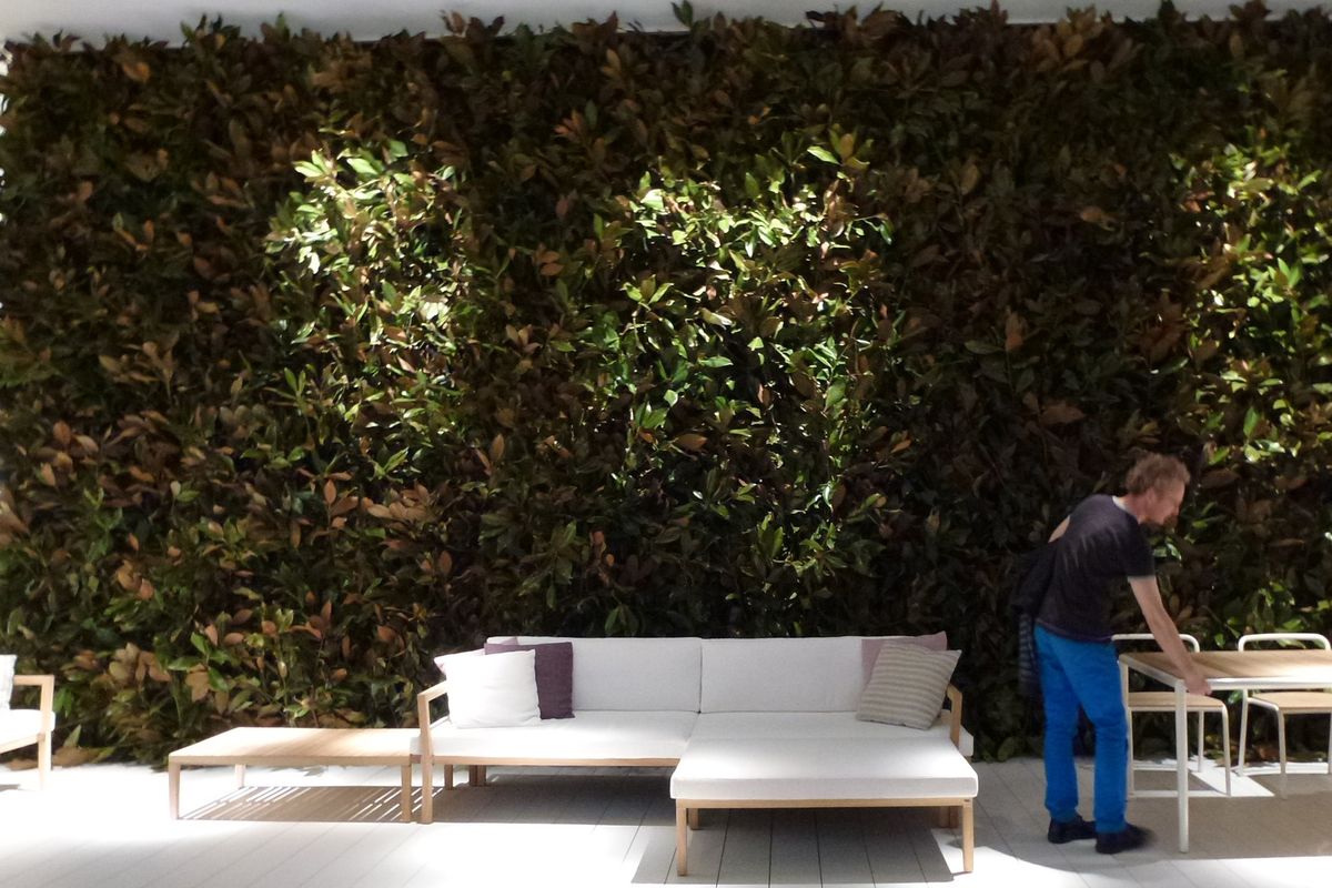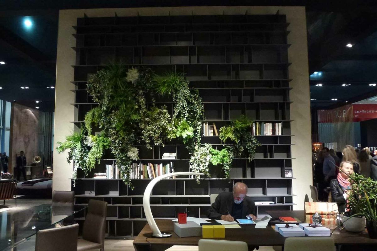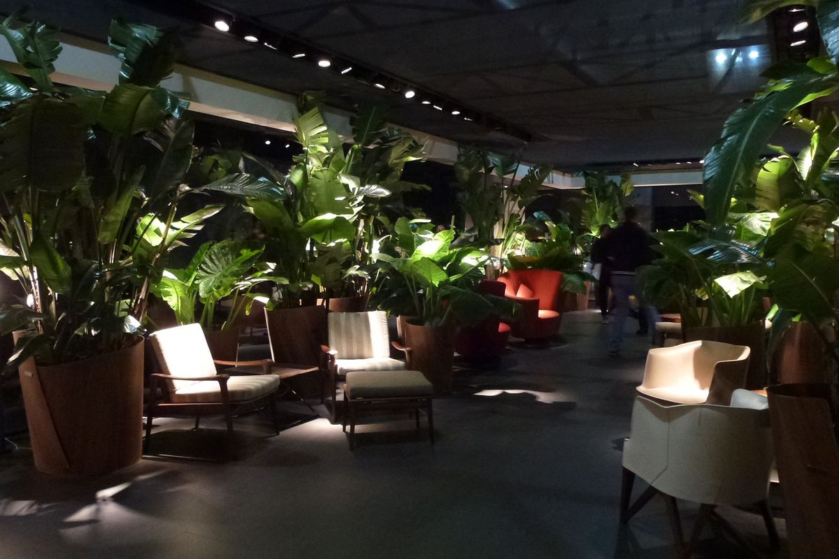
The strongest themes to emerge from this year’s Milan Furniture Fair and all of its creative, innovative offshoot events were related to wellbeing and warmth. If 2012 was the year of the terrarium (well, it was on the desks of our graphic design studio) then 2013 was certainly the year of the indoor plant in Milan. There was moss growing on all kinds of surfaces and potted plants everywhere. They softened the spaces and gave a real sense of a desire to connect to nature, and of a gentler world where indoor plants can come back inside after years of being banished by minimalist architects and designers.

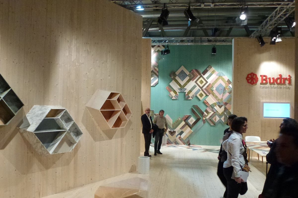
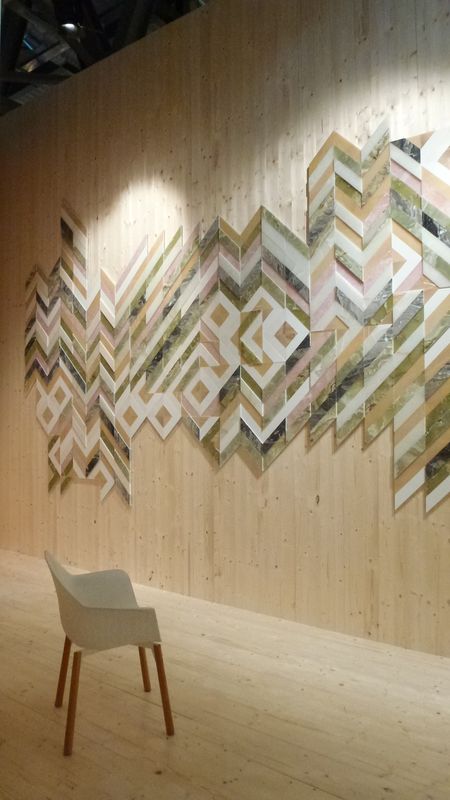
Budri.
Image: Lucy Marczyk
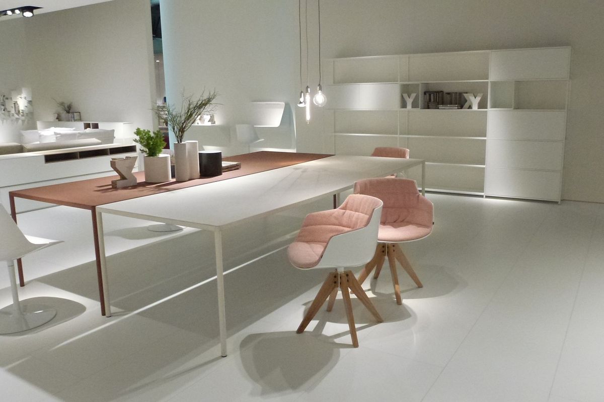
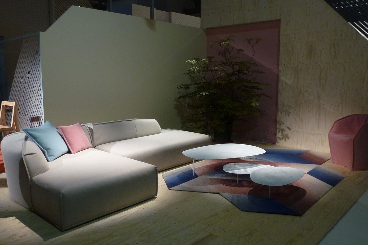
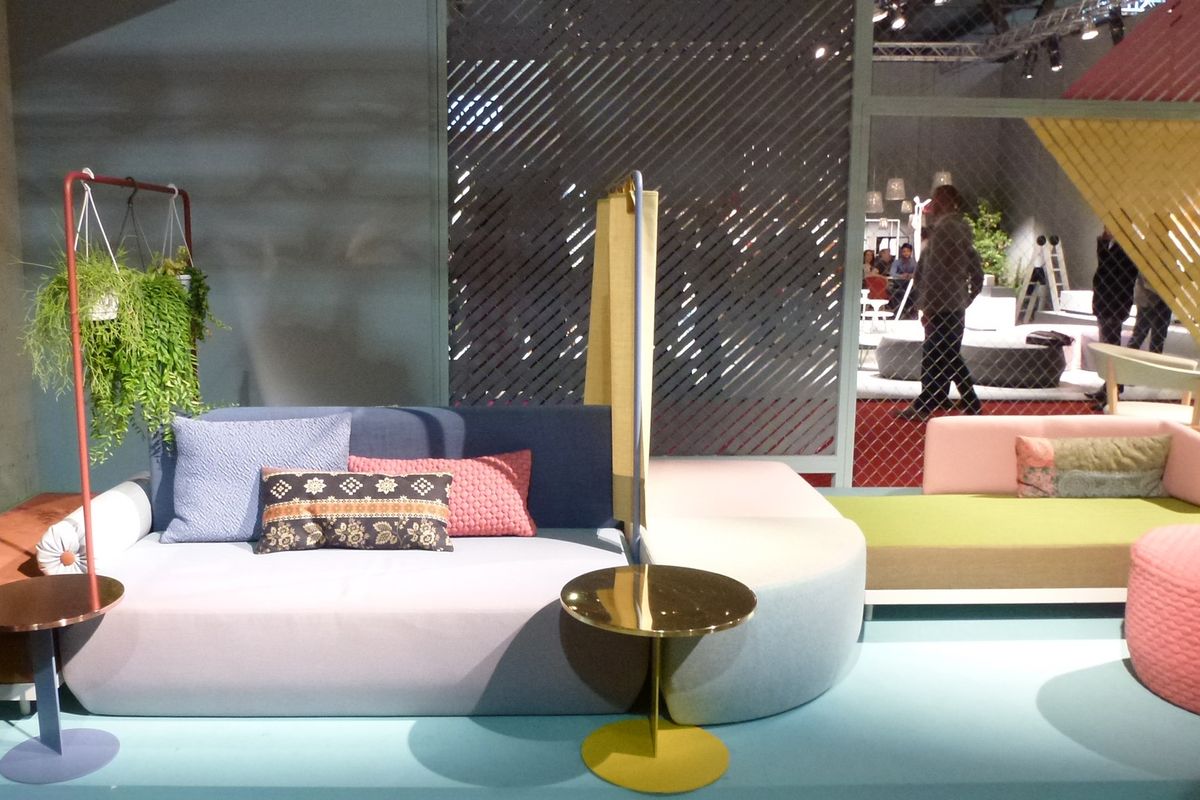
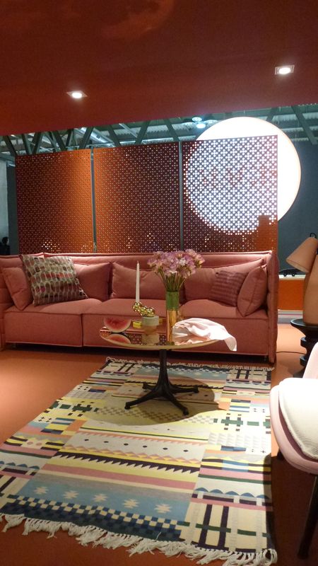
This desire to make interior space feel warmer, more personal and nurturing was also seen in the dominant pastels – dusty pink, particularly – at the Fair itself. Burnt orange was highly visible in the showrooms within the shopping districts, and was often seen alongside forest greens and blues. Other finishes included a lot of gold metal. Tom Dixon has been pushing it for years but now many more have joined in. Gold is no longer gaudy and a bit nouveau, but sophisticated and warm. Rose gold and copper were also quite prevalent.

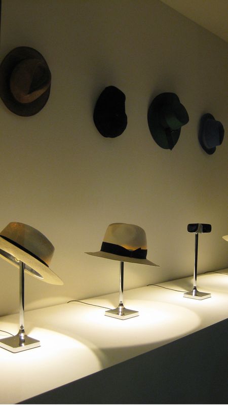
Philippe Starck Chapeau table lamp.
Image: Lucy Marczyk
Jean Nouvel captured this personal, feel-good direction with his fascinating Office for Living project. The French-born architect designed five completely different, comfortable working spaces exploring his rejection of “grotesque clone spaces” and “serial repetitiveness.” The installation at the SaloneUfficio pavilion clearly illustrated the very French but internationally appealing concept of “taking pleasure in life.” Nouvel also invited Ron Arad, Michele De Lucchi, Marc Newson and Philippe Starck to create a ambient VIP lounge.
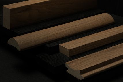
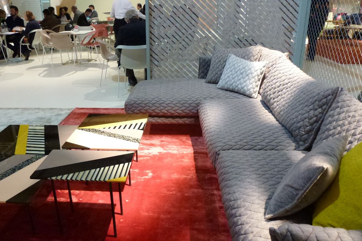
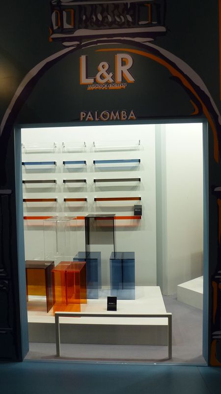
Another inescapable trend was that of large patterns, often textured, on tabletops. One standout example was a new collection designed by Patricia Urquiola for Budri. The pieces have been created from marble and onyx – fragments of “quake struck” slabs. This is a beautiful and clever way of bringing life back to the stone.

Kartell Laufen.
Image: Lucy Marczyk
Lighting continues to be developed and to become more personal and interactive. Philippe Starck has designed the whimsical Chapeau table lamp for Flos, a lighting piece that functions as both a light source and a hatstand. It turns on or off as the hat, preferably a Panama, is put on or removed. My absolute favourite, can-I-please-have-one item. So clever! As you can tell I am a hat wearer.
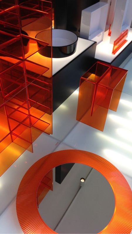
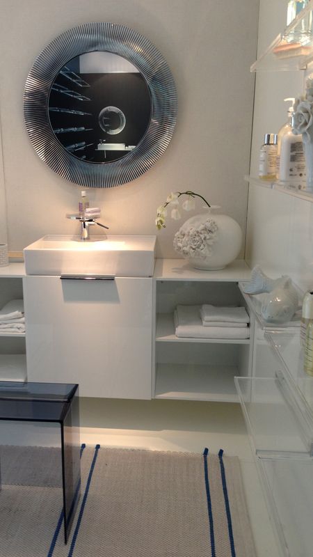
Another favourite was the collaboration between Kartell and Laufen, who showed their reinvention of the bathroom. Recognizing the need for further personalization and colour in the bathroom in order to make this space more desirable, they have provided an innovative integration of sanitaryware and accessories. This impressive new range is fun but sophisticated and I thought the combination of translucent plastics and ceramic was genius. The range comes in orange, midnight blue, gold and chrome.

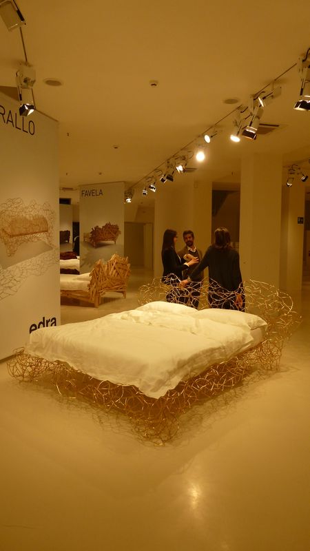
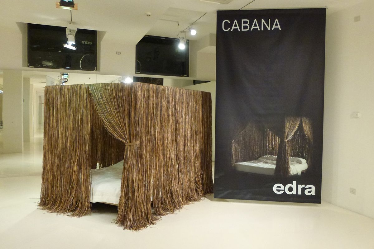
Campana Bros. Corallo bed for Edra.
Image: Lucy Marczyk
Not surprisingly, some of the best fun to be had was at the always-avant-garde Edra. The Campana brothers, Fernando and Humberto, launched five beds for Edra, all further developments of the previously released, highly distinctive chairs, the Corallo, Favela and Leather Works, and the Cabana shelves. The iconic pieces have been transformed into horizontal planes for sleeping that keep the essence of the original concepts. The standout was the cloudy, dreamtime Corallo bed. What would we do without Edra?
The Danish Chromatism exhibition at the Triennale Design Museum in Milan was a brilliantly curated collection of classic and contemporary Danish furniture from thirty suppliers. Any expectations I had of a mass of classic Scandinavian pale timbers and natural colours were instantly wiped out by the intense colour blocking and saturated colour that was used to tie together furniture settings and deconstructed elements in dramatic displays. For Nexus Designs, this new perspective on furniture that we love and specify greatly reinforced the idea that great design lasts forever and that it is the way it’s used that keeps it fresh.
Overall, the Milan 2013 message of using design to deliver warmth, welcome and wellbeing was inspiring, with the attention firmly on the experience of the end user, not the designer.