With Bauhaus-ian finesse, Smart Design Studio has used the ideal materials for Optique, a particularly jewel-like optometry store in Sydney’s Potts Point. Capitalizing on leather’s ability to soften and glass’s ability to be simultaneously translucent and reflective, the designers created a luminous environment that attracts the eyes of passers-by while gently embracing those inside. This is no mean feat given the enormity and set-back of the building that houses the store.
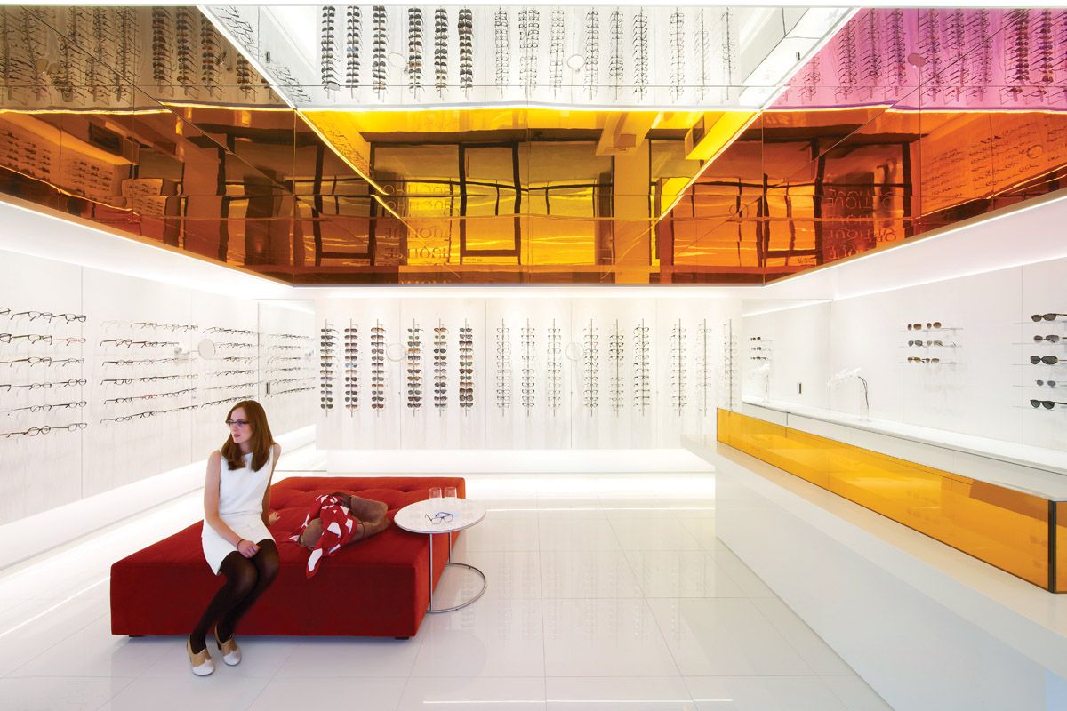
Faced to the street with glass, the interior of the store is a pristine white cube, into which a stunning canopy of orange and purple glass has been inserted. The canopy is translucent on the outer side with its remaining sides mirrored to match the ceiling, and is reminiscent of Robert Irwin’s celebrated 2006 artwork Who’s Afraid of Red, Yellow and Blue. The mirroring causes the orange and purple shades to reflect through each other, softening both and adding depth and richness to their hues. From the outside, a soft gleam is transmitted to the space overall, while the canopy itself is quite brilliant, particularly at night, when the store positively glows.
Moreover, the use of glass links in with the store’s product as William Smart explains: “It’s a play on the name, Optique: as optical reflection, refraction, distortion and light.” The immediate impression inside the store is of solidity; this quickly gives way to a sense of wonder as the floor of white glass tiles and the ceiling reflect light by differing degrees and the space is revealed as open and light.
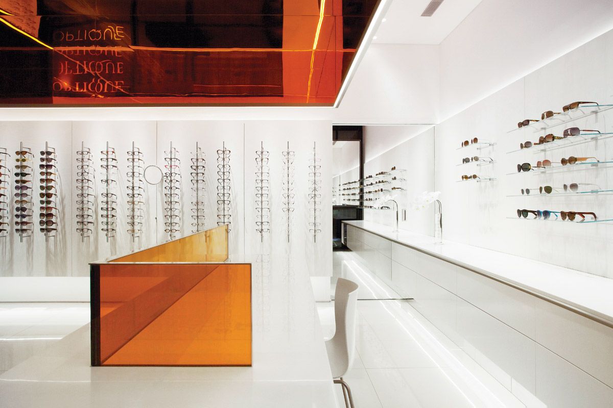
“The challenge we faced with this design was visually connecting the space – conceived of as a gallery – to the passing traffic. This was due to the store’s elevated and set back position, at the base of a dark and imposing building. So the solution turned the challenge into an opportunity – as we focused on contrasting levels of light: to create a brilliant ‘jewellery box’. The multicoloured ‘lantern’ makes use of the high ceilings and uses four different colours of mirror with coloured glass to create a complex array of reflected colours and lights. The effect is captivating and conceptually references what eyewear does – tint, alter or enhance the image.”

The optometry store’s trademark is it’s colourful mirror and glass canopy which reflects colour and light around the space.
Image: Sharrin Rees
Sparsely furnished with a deep rust-orange velvet ottoman and minimalist white desk, the store is tailored so that the customer experiences a natural “flow” through the space. “The view I have on retail these days is [that it is important] to be very customer focused: to bring the customer into the space and make sure they feel welcome and then also look after them when they are here,” says Smart, who had a gallery concept in mind when designing the display. The glasses themselves are suspended on minimal rods of metal and with no impediments to the experience, the customer is free to touch and try them on. Sunglasses have a slightly more secure section but are displayed in the same open arrangement, allowing the customer to see the frame front-on.

Glasses are displayed on a white background to create an art gallery-style interior.
Image: Sharrin Rees
Clad in soft white leather, the walls behind the glasses subtly position the retail experience as luxurious, creating a soft matt textural counterpoint to the otherwise unforgiving materials. The walls are in fact doors that conceal storage and the fire hose: (“fire hose” is spelled out in silver letters below a bank of displayed frames, but it could easily be mistaken for a brand name). The leather continues into the examination room which, like the rest of the store, is pristine white and walled entirely in concealed cabinetry.
A high-level understanding of our relationship to light is important in a project like this and Smart Design Studio passes that test. A single spot positioned directly above each column of displayed frames gives the glasses a sparkling quality, but this type of light is not flattering to the face, explains Smart. “These are quite small technical things, so you need light that sparkles and shines. [But] that’s the very light that makes someone look old, so you need two lighting scenarios. The lantern is illuminated with LED lighting and glows bright orange. These long and narrow ribbon lights provide a base level of lighting to the space and are complemented by spotlights trained on the frames. This creates the ideal lighting scenario, where the product is beautifully lit by sharp directional spotlights, creating strong shadows and highlights, while the customer is bathed in soft and complementary light.”
With absolute clarity and resolute attention to detail, Smart Design Studio has managed to reverse the paradox of an optometrist’s store that cannot be seen.
Products and materials
- Walls and ceilings
- Resene paint in ‘Alabster.’
- Flooring
- White gloss ceramic tiles from Academy Tiles.
- Lighting
- Bronze, pink and orange mirrored acrylic lantern. Viridian Vanceva orange laminated glass.
- Other
- Millennium leather doors in ‘Alaska’ from NSW Leather Co. Corian counter in Glacier White counter CASF.
Credits
- Project
- Optique
- Design practice
- Smart Design Studio
Sydney, NSW, Australia
- Project Team
- William Smart, Marie Burgess, Victoria Judge
- Consultants
-
Builder
Nu Vision Projects
Lighting Architectural Lighting Design
- Site Details
- Project Details
-
Status
Built
Design, documentation 3 months
Construction 2 months
Category Interiors
Type Retail
- Client
-
Client name
Optique Potts Point
Source
Project
Published online: 3 Sep 2013
Words:
Gillian Serisier
Images:
Sharrin Rees
Issue
Artichoke, March 2013