The size of house lots, density of dwellings, width of streets and many other factors all contribute to what urban planners term as “grain.” Toorak, in Melbourne’s first ring of suburbs, has one of the broadest spreads of residential grain in Melbourne – from expansive avenues lined with overfed dwellings to six-pack apartment blocks and everything in between.
Residence M by CHT Architects is secreted down one of Toorak’s many narrow, maze-like streets that feed off the arterial roads. The context is a curious mix of “coarse” grain, represented by the relatively sparse density of residents, and “fine” grain, seen in the compact lot sizes, tight lanes and closely spaced and varied housing stock. Victorians stand cheek by jowl with neo-Italianate villas, postwar red-brick homes and an increasing number of neo-modern architectural numbers. This disparity is a likely result of the incredulous value the market places on detached dwellings in such a blue-chip locale, forcing any new development to over-stretch the brief in order to capitalize on the land value. The result is often a home that grows to one or more boundaries, relying heavily on the skill of the architect to then craft beautiful, practical dwellings that answer the brief, while creating as many opportunities for views, light and space as possible. This is the case at Residence M.

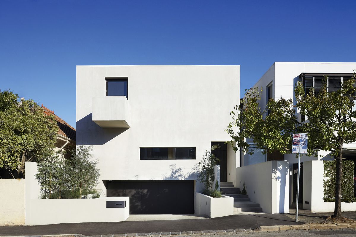
Despite an eclectic streetscape, the house endured a rigorous town planning process.
Image: Christine Francis
The clients, a design-savvy couple looking to downsize, had previously worked with architects and had a stock of great contemporary Japanese and Spanish projects as references. They approached CHT not only because they saw in the firm a design sense that was sympathetic to this, but also because the architects had recently completed a residence of a similar scale on a site just around the corner. The clients understood that some experience in the typology and in navigating the local planning quirks would be of great benefit – they were not wrong.
Emily Gilfillan of CHT barely conceals the obvious grief the town planning process must have caused: having to flip the plan, which left the house with a southern courtyard (in the end a bonus, with a softer and more constant light now filtering into the house than a northern courtyard would have offered); wrangling over neighbourhood character (hard to fathom given the aforementioned description of the street); responding to enforced changes to the pitch of the basement ramp, which required the lifting of the front of the house (again a bonus, with the subsequent change in level enhancing the notion of “retreat” within the front sitting room) and adhering to the utility company’s guidelines, which required the Juliet balcony’s “nose” on the vaguely anthropomorphic facade to be given a serious nip and tuck.
Navigating these parameters and drawing on the client’s modernist leanings, the design adopted a strategy of subtraction, beginning with a pure block and removing mass in carefully computer-modelled incisions that brought maximum light and air deep into the building as efficiently as possible. The result is a coherent, logical and beautiful series of living zones that have been stitched together successfully using double-height spaces, courtyards, surprise windows and changes in level.

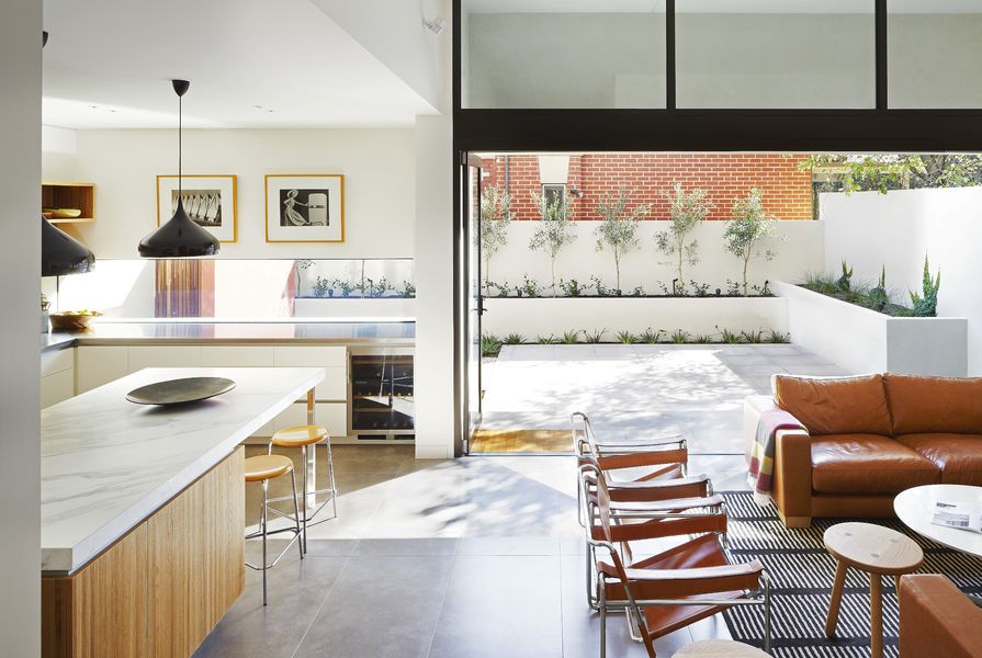
A lowered, long slot window in the kitchen focuses the view out to the courtyard. Artwork: Max Dupain.
Image: Christine Francis
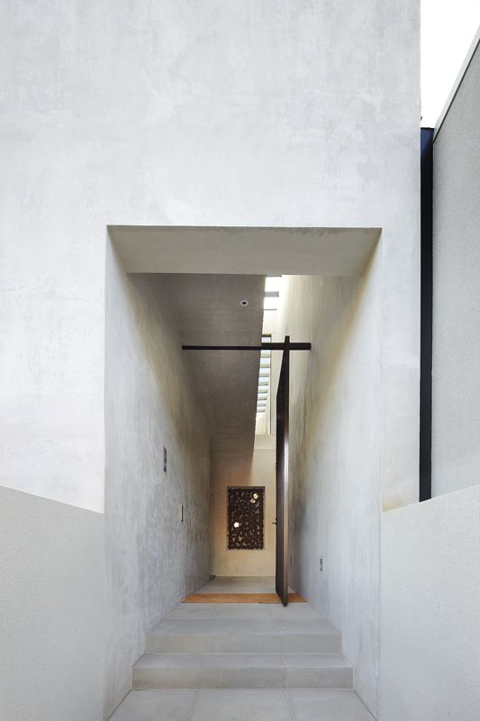
The house is entered via one of these double-height spaces, about which all the planning pinwheels – the stairs and lift wrap around a services core of powder rooms, storage and, curiously, a first-floor laundry room (which now seems like an obvious location given this is where all the shedding of clothes takes place!). This void over the entry, which could have easily been filled with more floor area, is used at the top of the stairs and in the main bedroom’s robes to bring in a surprising amount of reflected light (given the overcast day I visited) as well as sneaky views from the first floor down into the external entry lobby.
At ground level the entry also splits the plan into the quiet sitting and study area up two steps at one end of the home, and the livelier kitchen and living areas down four steps at the other end. A microcosm of the project generally, what this zone lacks in pure real estate it easily makes up for with a series of clever gestures. These include elevated ceilings, large expanses of glass opening to a considered terrace, and a generous kitchen and island bench accompanied by a long slot window with a deliberately lowered head that focuses the view onto the garden.
Emily points to CHT’s folio of efficiency-driven multi-residential projects as instrumental to achieving this brief. I would also suggest the success came from using the diagram of subtracting from a single block. This simple yet effective strategy allowed the architects to embrace the complexity and resolve the planning so that each space flows naturally and efficiently, with more than a few moments of delight along the way.
Products and materials
- Roofing
- Kingspan Kooltherm under-slab insulation; Lysaght Klip-Lok in Zincalume; Emmetti panels hydronic heating insulation.
- External walls
- AFS Walling Solutions LogicWall with Unitex render; blockwork planters in Dulux AcraTex render.
- Windows
- Alspec general windows and bifold doors in dark bronze finish; Capral St Lucia double-height glazing in dark bronze finish.
- Doors
- Designer Doorware hardware in satin chrome and black anodized finishes; Studco Building Systems Ezy-Jamb door jambs.
- Flooring
- Earp Bros general floor tiles; Signorino bathroom floor and wall tiles; Victoria Carpets carpet.
- Lighting
- Delta Light wall lights; Lighting Partners Australia downlights.
- Kitchen
- Gaggenau cooking appliances; Fisher and Paykel fridge; Liebherr wine fridge; Rogerseller Fantini tapware; Calacatta stone, honed; Lignapal Feathers joinery veneer in oak with sandblasted finish.
- Baathroom
- Rogerseller Tonic tapware, Tondo fittings and Miky basins.
- Heating and cooling
- Real Flame Pure Vision gas fireplace; Nobo drying cupboard heater; hydronic floor slab heating.
- External elements
- Anston Paving Stones pavers.
- Other
- Easy Living Home Elevators integrated lift.
Credits
- Project
- Residence M
- Architect
- CHT Architects
Melbourne, Vic, Australia
- Project Team
- Emily Gilfillan, David Carabott, Chantelle Balliro
- Consultants
-
Builder
VCON Builders
Engineer Irwinconsult
Landscaping Philippa Springall Sculpture and Garden
Lighting Lighting Partners Australia
- Site Details
-
Location
Melbourne,
Vic,
Australia
Site type Suburban
Site area 655 m2
Building area 287 m2
- Project Details
-
Status
Built
Design, documentation 6 months
Construction 14 months
Category Residential
Type New houses
Source
Project
Published online: 26 Feb 2015
Words:
Brett Seakins
Images:
Christine Francis
Issue
Houses, December 2014