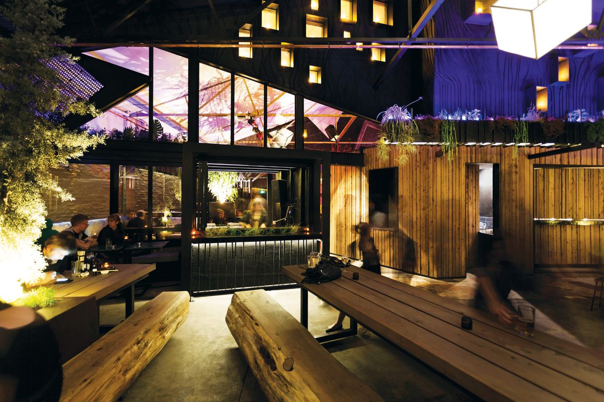
Just what is a “splinter society”? The name conjures visions of some kind of ersatz Bolshevik red wedge. Yet far from having any revolutionary intent, the Melbourne-based architecture firm’s approach is more Far Eastern than Eastern bloc. Reminiscent of the Japanese concept of wabi sabi, Splinter Society Architecture’s practice is about juxtaposing seemingly contradictory elements, discovering preciousness in imperfection and the handmade. It is the artisan and the masses forging together in a civil act of creation.

Asha Nicholas and Chris Stanley of Splinter Society Architecture.
Image: Tom Ross of Brilliant Creek
“We like the idea of a society or a group of people who do stuff together, but fumble a bit,” says co-director Chris Stanley of the firm’s name. “We also like the idea that we do projects that divide people. They either really like them or hate them.”
Stanley formed Splinter Society Architecture nine years ago with his life partner Asha Nicholas. Since then they’ve produced fitouts for advertising agencies, designed multi-residential apartments, retail outlets, hipster bars and clubs, and numerous residential projects. Each contains remarkable, arresting features that are intrinsic to each project: the by-product of collaborations with artisans in knitwear, sculpture, upholstery and metalwork to name a few.
Professing no fixed style, Splinter Society creates moments of delight by inserting surprising elements – “glitches,” Stanley and Nicholas call them – such as a monolithic bench in a house in Kew, yarn bombing in an advertising agency or, suspended from the ceiling of an open-plan office, a log of Himalayan cedar with sprouting plants that cascade down and act as a reception screen.

A log used as a hanging planter and suspended from the ceiling of this fitout for creative agency AFJ Partnership adds an element of surprise.
Image: Tom Ross of Brilliant Creek
“Our early work was governed by form,” says Stanley. Nowadays the emphasis is on texture and materiality.
“I love timber, Asha likes steel and stone,” he continues. “We try and get a variety of texture and grain, warmth and roughness, patina and age into our projects. It gives the space a richness and allows light to do different things. You can sit and enjoy a space in many ways at different times because it’s not all just blank, flat finishes.”
“It’s also less sterile, particularly for residential work,” says Nicholas. “Clients like that slightly lived-in feel when they arrive.”
“Hard and soft” is how Stanley describes their dynamic dualism.
“It’s detailed and raw at the same time,” adds Nicholas.
“It’s not a ‘rustic’ aesthetic at all,” Stanley qualifies. “We don’t do ‘rustic’ or ‘hippie aesthetic.’ It only works if it’s offset against clean and sharp. For the residential client, it needs to read as a special environment and a unique one that gives a sense of craftedness, as opposed to mass-produced.”
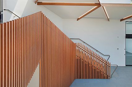
The three-storey adaptive re-use House in a Warehouse epitomizes this “detailed and raw” approach. Industrial grating surrounds the upper floors, doubling as balconies and screens for shade and privacy. The stair balustrade, made from threaded rod, continues the raw aesthetic without being too literal. Old tie bars and steel plates from the former warehouse are used to build new joinery items.

House in a Warehouse, an adaptive re-use project that incorporates materials found on the former industrial site.
Image: Tom Ross of Brilliant Creek
If the contrasting typologies of this project most clearly highlight the contrapuntal nature of the Splinter Society approach, the material juxtapositions of Kew House are no less dramatic. In this rear extension to a postwar brick house, a monolithic marble bench with rough-hewn edges echoes the texture of the hand-glazed ceramic tiles on the kitchen wall. The large chunk of unfinished stone contrasts with the “quite clean, sharp surfaces” of the rest of the house, Stanley explains. Mass, too, is used for effect as the marble contrasts with slender steel legs. The mix of materials – solid recycled beams and burnished concrete floors – also lends the space a soft “marbled” look. Created while curing the concrete, the dappled look of the floor is another “super cheap” technique that looks valuable. This knack for using affordable detailing while adding a handmade preciousness to the house is also evident in the subtle repetition of the 90-degree peak in the hall ceiling. It provides the main formal manipulation in the house and has been used as a motif in the front timber fence palings and in a laser-cut metal screen by the interior stairs.
In this balancing act of opposites, disruption, imperfection and glitches paradoxically add preciousness to Splinter Society’s projects. They are also cheaper and more sustainable. The architects recycle materials that others might discard, from cleaved stone to split timber.

Kew House epitomizes the studio’s interest in contrasting material textures.
Image: Tom Ross of Brilliant Creek
“We like broken finishes,” says Stanley. “Broken stone that shows chisel marks and fractures. But it’s put back together to show these abnormalities or glitches. They give it a unique finish that is sometimes hard to specify. We end up spending a lot of time on site just going ‘that’s perfect’ or ‘that doesn’t quite work’.”
A good deal of time is also spent testing these techniques at a small scale. Nicholas is both an architect and a jeweller. In her jewellery, she explores the materials the studio commonly uses in the built environment – steel, brass and stone – honing their facility for dealing with anomalies. Her work acts as a testing ground for the clash and refinement of disparate elements: the grind of stone, the addition of a salve of brass that dresses the surface and elevates the whole piece. Flaws in a piece of stone might be dressed up by framing it with a piece of steel, for instance.
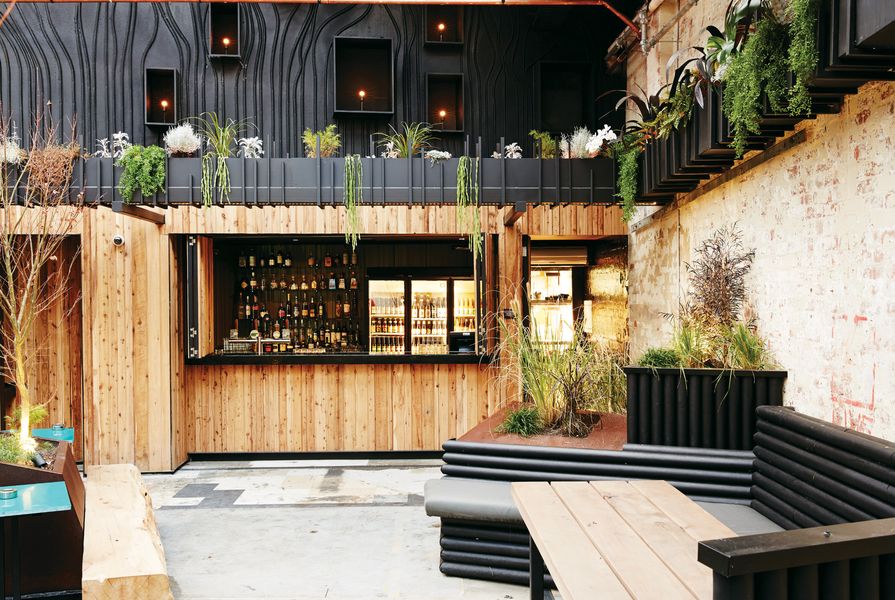
But perhaps the most natural – and affordable – material Splinter Society relies on is also the most ephemeral. Firm believers in the power of lighting, both architects love the intimacy it creates, and not just in nightclubs.
“You can achieve a lot more value in the feel of a place for a client by lighting it well,” says Stanley. It’s not about decorative fittings, but discreet light sources. “You can create drama and warmth and sexiness. Even with the most amazing finishes, if it’s not lit well, it looks horrible.”
Herein lies yet another contradiction in the Splinter Society approach. When it comes to lighting, there is no room for imperfection.
Source
People
Published online: 6 Jan 2015
Words:
Ray Edgar
Images:
Sean Fennessy,
Tom Ross of Brilliant Creek
Issue
Architecture Australia, September 2014