Highly edited, angled and brushed, the architectural hero shot – the signature image of a building – is used to complement a project review; however, these images can give a false impression of the way the building behaves in three dimensions. In our web-centric culture, the dissemination and reproduction of an image (and convergence on one’s RSS feed) seems accelerated. In fact, there are innumerable platforms that allow for alternate representations of buildings that are outside of the architect’s control and which can contribute to a critical architectural discourse. Yet the ability to put forward alternative representations of a building generally requires visiting the project in person.
Pixel
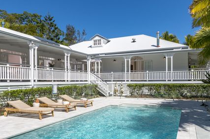
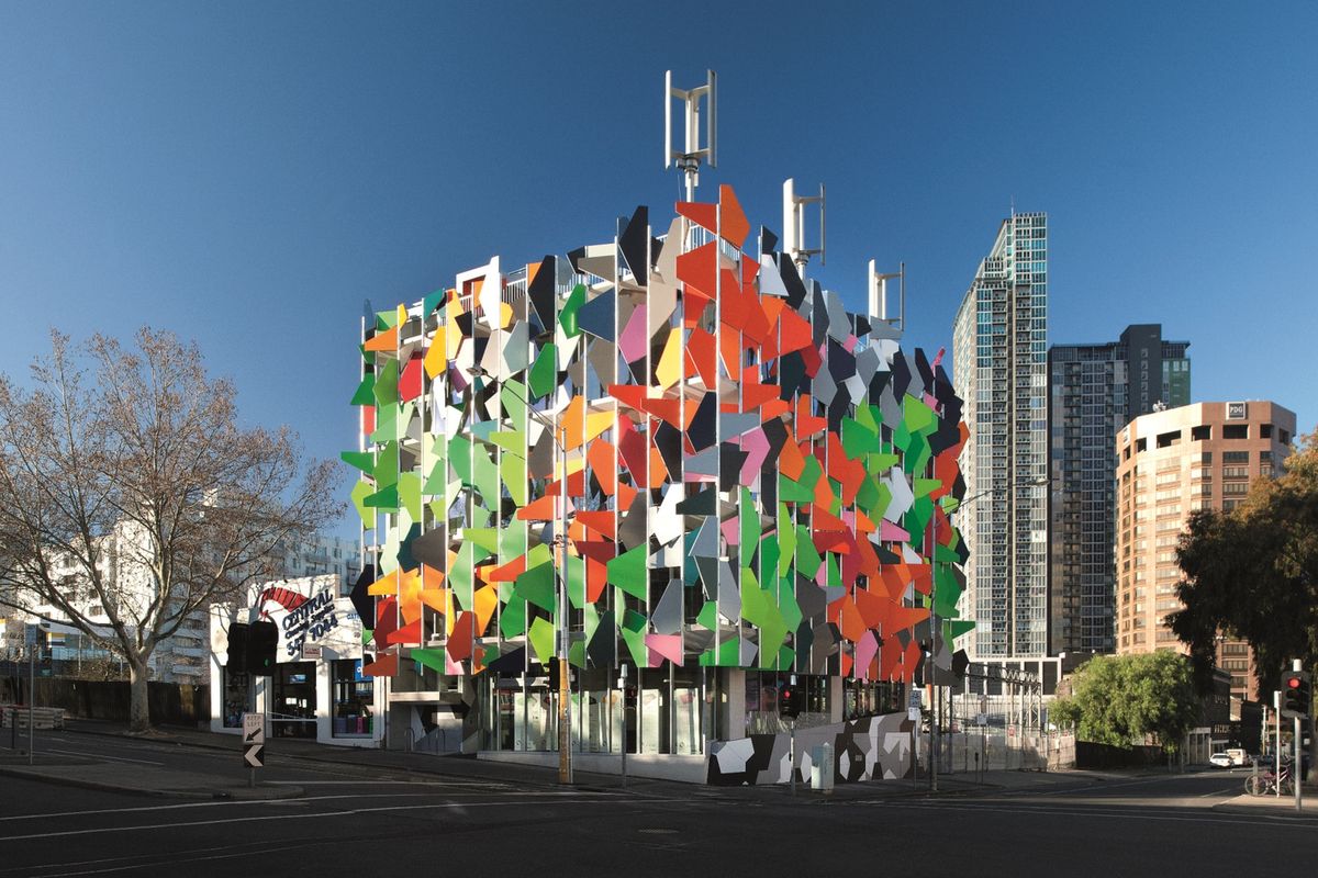
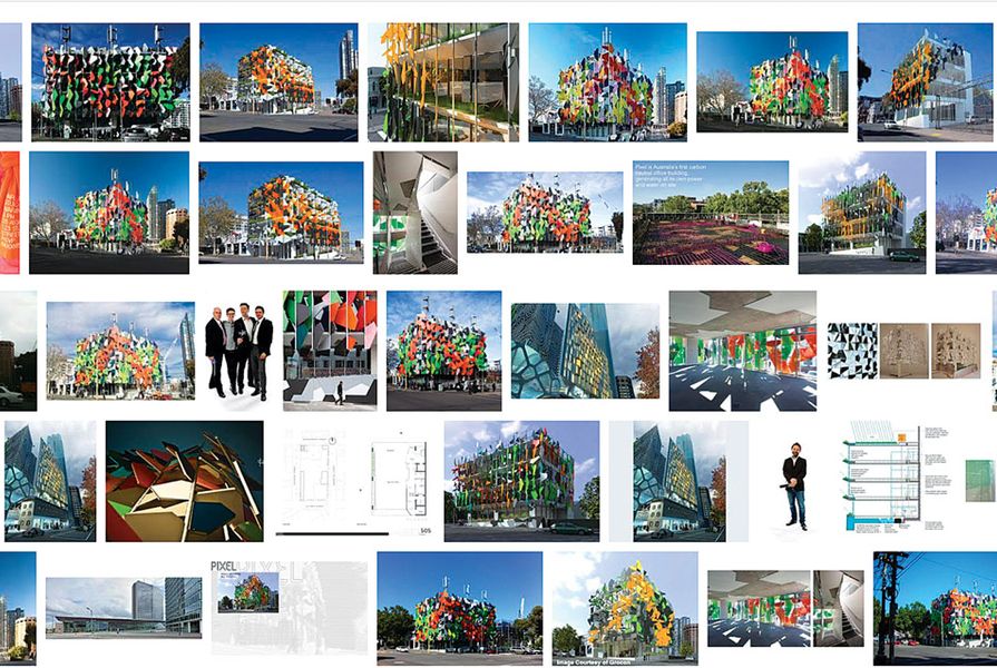
The shallowness of the hero shot became apparent after physically visiting the Grocon Pixel Building, designed by Studio 505, on the edge of Melbourne’s CBD. From our observations, the representation of Pixel in print and online is shown through the same hero shot or “big idea” – a tightly cropped shot from the opposite north-west corner that highlights the colourful shading fins from which the building gets its name.
The repeated use of this image, supported by the elevation drawings of the project, creates the illusion that the building’s facade treatment is “pixelated” on all four sides. The building is not, in fact, covered by continual, consistent wrapping. The back of Pixel is a large, flat concrete wall; possibly designed this way to accommodate an adjacent future neighbouring building. The “pixel” aspect of the project to some extent is a paint job.
In their report on the building, the world’s “most visited” architecture blog, ArchDaily, stated, “The most publicly visible element is Pixel’s colourful facade. A system comprising perimeter planters, fixed shading louvres, double-glazed window walls and solar panel shading. Creating a harmonious surface that wraps around all sides of the building, giving Pixel a vibrant and unique identity (sic).” This (architect’s?) statement perpetuates the myth of the building enabled by the recycled hero shot, and denies the fact that there is a more complex system of components that exist.

An Instagram snap of Pixel.
Image: James Harbard
ArchDaily may reuse the hero shot found in a print magazine, but there are many peer-to-peer tools available to disrupt the myth created by the shot. When we visited we took an assortment of photos on an iPhone. The portability of the device and its instant connectivity meant it was only moments before we shared the images on Flickr and Instagram.
Quickly created, these images add to the overall complexities of the project through alternate perspectives and narratives. We wonder why more magazines do not publish photographs outside those supplied by the architect in order to add depth to the already critical review.
There are many notable aspects of Pixel, such as the fact that it is Australia’s first carbon-neutral office, but its online representation ignores this: the pixelated facade is a distraction. It is the back of the building – still waiting to be pixelated – that holds the key to its future. The building stands alone on a mostly empty building site, like an infant’s first tooth in an otherwise gummy grin. The current representations of the project ignore the fact that the building is the seed of a much-anticipated development on the former Carlton and United Breweries (CUB) site – a site that has been untouched for over twenty years. To push the dental metaphor, Sean Godsell’s RMIT Design Hub is the next tooth pushing through, but there is still little movement in the other buildings planned for this site, which are sitting on the drawing boards of ARM, DCM, NH Architecture and MCR.
It is frustrating that the images isolate and remove the building from its current and future context, or lack thereof. Context could easily be achieved with representations that capture the process of time, growth and human experience. They could feature a moving image of the project’s context within the site rather than merely drawing attention to the project’s facade. Pixel’s actual “back” facades could also be included in the visual representation. We wonder, what does Pixel conceal by excluding them? With the painted pixel elevations exposed, it highlights that its planned neighbours are yet to be built; that is, that the site is not yet under development. Thus, who is occupying carbon-neutral Pixel, the site office of the redevelopment?

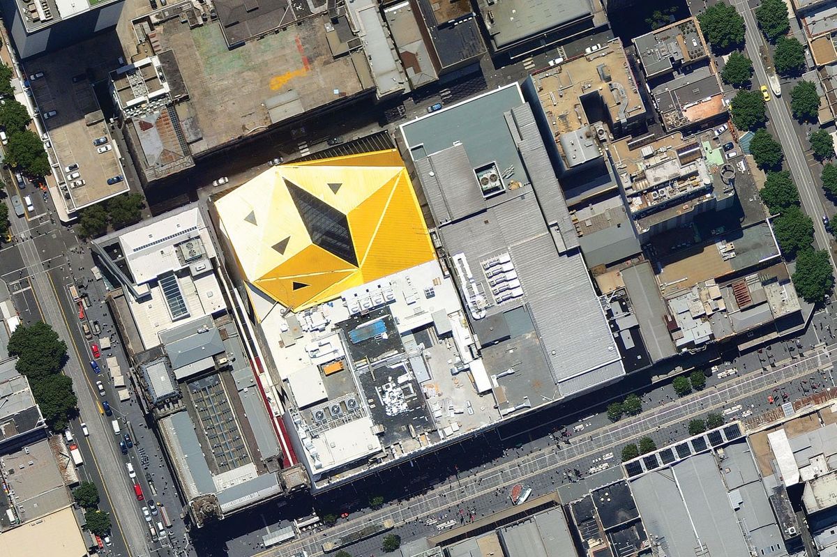
An aerial view of NH Architecture’s Myer redevelopment.
Image: John Gollings
Myer redevelopment
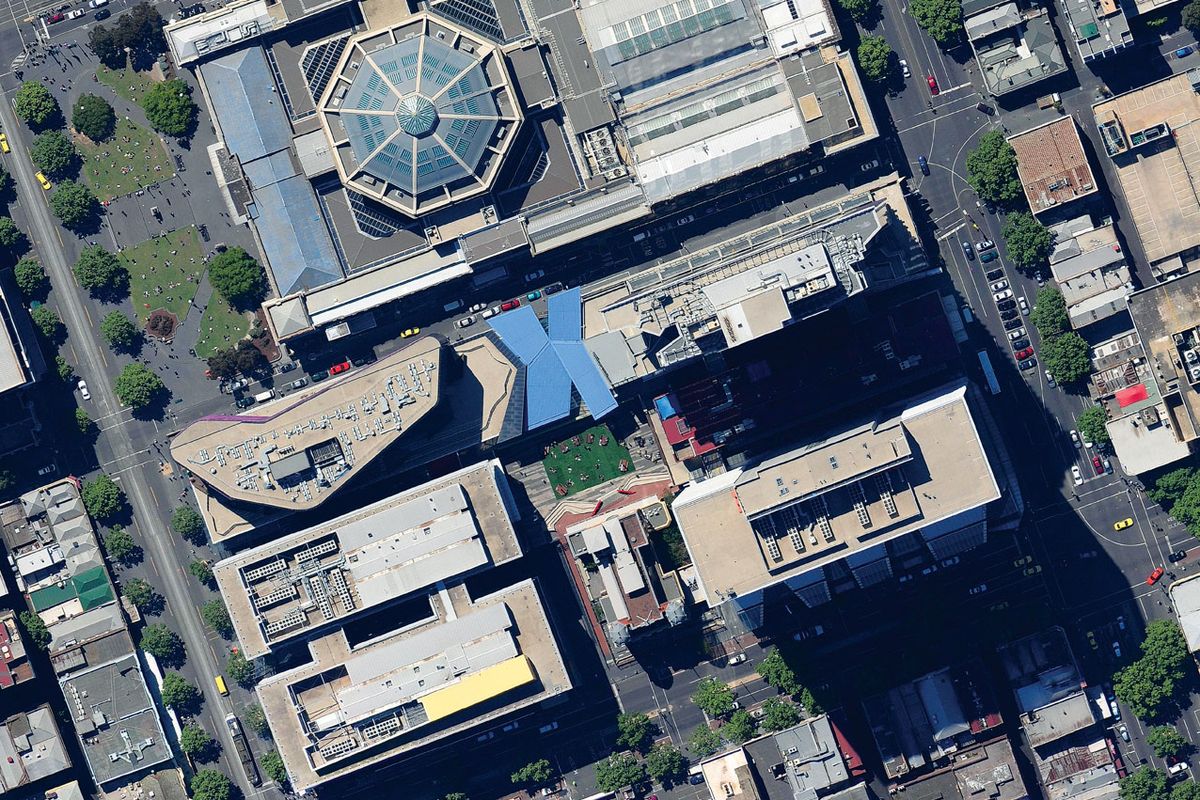
The previous two decades of the digital age have seen the diminishing of the notion that facade treatment is applied in two dimensions. Now, more emphasis is placed on geometry in three dimensions. More than ever, we imagine the backs, bellies and tops of buildings to be just as relevant and intriguing as their fronts, and the standard photograph is morphing into a range of new imagery that reveals important aspects of projects that the traditional hero shot, sparkly and polished, could never have divulged. Due to site constraints, NH Architecture’s Myer redevelopment in Bourke Street, Melbourne, only allows one facade to be photographed in a narrow, restricted environment. This angle was never going to demonstrate the complexity or the ambition of the project. It creates its hero shot in a unique, uncontrolled and innovative way. The building places a very high degree of emphasis on the way it appears from satellite mapping technology, such as Google Earth.
The increasing relevance (again) of the bird’s eye view, or the plan, was cited by Roger Nelson from NH Architecture as being influential on the Myer redevelopment. As more and more people use satellite imagery, they are introduced to a view that was once reserved mainly for architects. It gives the architect the potential to create plans as symbols viewed from space, rather than in space (like Dubai’s Palm Jumeirah). Nelson cited the graphic nature of the strong circular geometries of Melbourne’s stadiums and aspects of previous NH projects (such as the Melbourne Convention Centre’s logo-like clean geometries, the “x marks the spot” design of their QV project and the camouflage of Costco in Docklands). Inspired by the way the Eureka Tower’s gold top gleams in the sun, Myer uses colour and geometry to create a strong mark within the fabric of the city and this serves as a complementary image that further enhances understanding of the building as a volume in print.
Photographer Dianna Snape, who has worked with NH Architecture on photographing Myer, notes that architects are trying harder to control a commissioned photographer’s representations of their projects so that they match renderings and other imagery produced by the firms. While this helps to prove that these projections became a reality, it takes out the extra layer of the photographer’s discretion and experience of visiting the project.
As architects endeavour to control a building’s representation, the post-internet era of peer-to-peer applications connecting in real time allows alternate representations to be created and accessed by everybody. Architects may feel that these images place them in a vulnerable position but, in reality, thinking about how their projects appear in uncontrolled Flickr imagery or other public forums may encourage innovative architecture and new ways of presenting architecture to those who have not experienced it in person, and challenge architects to think about how their buildings will be perceived.
Source
Discussion
Published online: 4 Dec 2012
Words:
Virginia Mannering,
Camilla Burke,
Laura Courtney,
James Harbard,
Mitch Keddell
Images:
John Gollings,
Studio505,
courtesy of NH Architecture
Issue
Architecture Australia, September 2012