Best Visual Identity Design — Joint winner
Baker D. Chirico by Fabio Ongarato Design
Jury comment
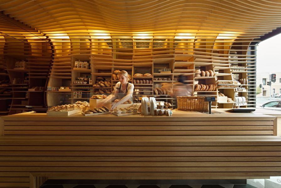
The original cleverness of the Baker D. Chirico brand has been extended and celebrated in a visually arresting and playful series of design moves. From the refined typeface that evokes early European modernist simplicity, to the surreal inspired collaged images in the packaging, there is both cerebral and sensual appeal; all of which is appropriate to the notion of artisanal bread that is both a staple and a luxury. The detail and tactile variation in the various items of branding are precise and satisfying. Fabio Ongarato Design have merged elements of both the curious and the comforting in this exemplary suite of graphic and packaging solutions.
Design statement
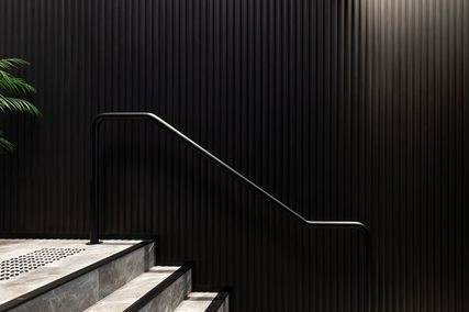
Baker Daniel Chirico is Australia’s most recognized artisan bread maker. He launched his second store in the Melbourne inner-city suburb of Carlton with a new identity and a fitout that combines the old with the new and the traditional with the playful, and which focuses on the craft of bread-making.
Baker D. Chirico
178 Faraday Street
Carlton Vic 3053
+61 3 9534 3777
bakerdchirico.com.au
Credits
- Project
- Baker D. Chirico.
- Design practice
- Fabio Ongarato Design
Richmond, Melbourne, Vic, Australia
- Project Team
- Meg Phillips, Fabio Ongarato, Misha Hollenbach, March Studio, Perks and Mini (PAM)
- Site Details
-
Location
178 Faraday Street,
Carlton,
Melbourne,
Vic,
Australia
- Project Details
-
Status
Built
Category Hospitality, Interiors
Type Retail