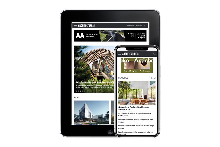
Today, ArchitectureAU launches its new responsive website with an improved user experience across desktop, mobile and tablet devices.
This new-look website is the first major redesign ArchitectureAU has undertaken since its inception in 2011. ArchitectureAU has always been the favourite site of the built environment sector, providing extensive news coverage, project reviews and critical commentary for industry professionals and enthusiasts alike.
Over the past five years, we have seen an almost three-fold increase in readers on mobile and tablet devices. Therefore this responsive design has been developed to provide a considered, seamless experience for our readers.
Now, our readers can enjoy the same high-quality content on any device and it will display perfectly on any screen size.
Similarly, the ArchitectureAU companion newsletter also has a new-look responsive design and is delivered to our readers’ inboxes four times a week.
ArchitectureAU is Architecture Media’s premier website and is endorsed by the Australian Institute of Architects and the Design Institute of Australia.

