Contrary to popular opinion, Los Angeles does have a style, in architecture as well as in other forms of culture, and few designers have come closer to defining its elements with more care and verve than Hank Koning and Julie Eizenberg. By mining the basic elements of the vernacular that has shaped homes, apartment buildings and commercial structures, these Australian-born architects have put together a kit of parts from which they have been able to create forms that give identity and clarity to the messy vitality of Southern California.
Most architects bridle at the designation of style, but Koning and Eizenberg understand the necessity of creating coherence in their work, in both visual and compositional terms. They base their work not on precedents that manipulate facade or plan treatments, however, but on aspects of the reality they inhabit: the appearance of everyday buildings (what, in the United States, passes for a vernacular), and the codes and regulations, standardized building materials and common practices that lie beneath those appearances.
With the zeal of converts who emigrated from a place half an earth away, yet similar in many ways in culture and climate, and with complementary skills and backgrounds that include Jewish argumentation and Dutch stubbornness, Koning and Eizenberg have, with their team, taken on the most quintessential global city of the twenty-first century and both made themselves thoroughly at home in it, and made homes for it.

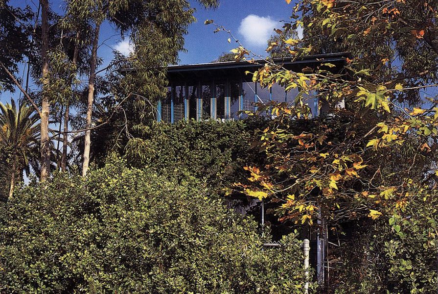
Sketch of 25th Street House from the south.
Image: Koning Eizenberg
To wake up in their own house, as I have had the pleasure of doing on several occasions, gives you a chance to become aware of their achievement. Because from the way in which a small window placed high on the wall catches the morning sun, and the view from the standard “sliders” over the muddle of residences and palm trees that make up their neighbourhood, you immediately know you are in Southern California. Walk out of the room, one in a row of cubicles that leads to the twisted square of the master bedroom at the front of the house, down the staircase with its steel handrail and into the open dining area, kitchen and family hangout, and you find yourself drawn out into the overgrown garden that runs the whole length of the house. Inside and outside flow into each other in a rhythm modulated by the plaster and stucco walls, the wood frames and the occasional colour accents that focus your view and attention. The house seems so natural that you almost forget its radical stance: by figuring out how to use the building codes to align the house along the lot’s east–west spread, rather than splitting the lot down the middle (which would have left the usual vestigial front and back yards), Koning and Eizenberg were able to create a courtyard house that appropriates the yard’s fence as its fourth edge. By using standard and cheap building materials, but playing with the placement of elements such as windows and allowing themselves one twist – that of the front section of living room with the master bedroom above – they were able to energize and even monumentalize the structure without removing it from its context.
Visit one of their more recent public structures, such as the Pico Branch Library in Santa Monica (2014), and you can see their ability to squeeze beauty out of conditions at a civic scale. The Pico Branch Library is, at least as far as its appearance goes, all roof and screen: a range of planes jutting up to echo the ranges of the Santa Monica Mountains and the Angeles Crest far to the north, while also abstracting and enlarging the roofs of the residences around the park in which the library is housed. The planes are interrupted by screens and scrims that hide the interior structure’s bulk, connect its pieces and collect solar power.

Pico Branch Library by Koning Eizenberg, 2014.
Image: Eric Staudenmaier
Designed to both make room for an existing farmers’ market and provide a place for community learning, the library is a civic structure that is big enough to answer to the open space around it, and low enough to be not only acceptable, but also inviting to its users. Inside, the angles of the roof planes create a play of light and define separate reading areas, all without interrupting the flow of space or building unnecessary structure. The detailing is minimal and efficient, but the scale of every opening is slightly larger than it really needs to be, adding to the sense of both ease and vernacular grandeur.
While their designs have evolved considerably over their years of practice, and also have no doubt been influenced by their collaboration with the office team, Koning and Eizenberg’s search for a Southland style has been consistent. The firm’s work is based on research into modes of practice, as well as on their own keen observation of their surroundings. Starting with their graduate work at the University of California, Los Angeles (UCLA) in the 1980s, Koning and Eizenberg looked at both the most common forms of buildings, such as the “dingbat” apartment buildings and the bungalows that mixed Spanish and Prairie School derivatives (stucco walls, shingle roofs, oversized horizontal windows and curved plane edges), and the basic elements that allowed these structures to appear.
Over almost four decades of practice, Koning and Eizenberg have developed a visual palette that has become a completely innate part of their work. They have abstracted the buildings that fill out the neighbourhoods of Los Angeles’s Westside (where most of their buildings have appeared) and that were constructed in the period after World War II (when the bulk of that vernacular appeared) into a menu of stucco planes, wood slat walls, both sloped and flat roofs, tucked-in parking and loose, sometimes even rambling, compositions. In doing so, they have paid particular attention to how they can change the scale of those simple elements, both to create a clearer relationship between those windows, doors and niches that address the human body, and to answer to the necessity of creating an overall sense of community. This is true even at the scale of their single-family houses, but it is in their low-cost housing – a fundamental part of their work – that their ability to create a sense of common space works most effectively, achieving qualities that elevate the buildings from being mere boxes into which people with fewer means are deposited.
Behind these appearances, or embedded in their often super-thin walls, lies a manipulation of building codes and practices that seeks to leech every single possibility out of the restrictions these regulations and modes of production impose. Regulations that to other architects appear as a hindrance to the full expression of their work often seem to delight Koning (in particular) and Eizenberg. They make full use of the demands for energy efficiency that have become ever more demanding in California to create buildings that open up to natural conditions while harvesting solar energy. They find ways to turn the economic necessity for packing as many units as possible into small lots, with restrictions on heights and requirements for setbacks, into an opportunity to make places that feel dense and lively. Wizards at both public participation processes and negotiations with planning officials, Koning and Eizenberg manage to produce buildings that are welcome and affordable additions to the neighbourhoods in which they work.

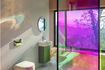
See-Through House by Koning Eizenberg, 2015.
Image: Eric Staudenmaier
This is not to say that Koning Eizenberg’s work is perfect – but then again, the point of their mode of operation is to delight in imperfection. The thinness of the buildings means that they do not always provide all creature comforts. At times this is on purpose, as when they worked with the clients of See-Through House (2015) to create an open play area and shared bathroom for their children, rather than the private areas that are common to such structures. At other times, as when they use only single- glazed windows and thin walls in their hotel designs (as in their downtown LA Standard Hotel, and in another hotel they designed in Beverly Hills), it is the result of their willingness to build in the cheapest manner possible. But always they focus on getting the most out of what they have to work with – and making it fun.
Beyond their willingness to work with style and codes, this is the most remarkable aspect of Koning Eizenberg’s work: it has an element of pleasure, joy and even fun. For that, ultimately, is the effect of choosing to work with the forms and practices around them and open them up to new scales and uses. It is also a reflection of the oft-derived, but crucial part of Southland culture: its dedication to finding some form of pleasure and satisfaction in both nature and artifice. Koning and Eizenberg find the beauty in the everyday and then have fun kicking up its scale and making it denser, and then making better places for people to live, work and learn in. Along the way, they also get a kick out of working with clients who often become friends, communities they treat as collaborators and bureaucrats who become their chess partners.
So, what is Koning Eizenberg’s style? It is the dream of Southern California as a relaxed, open-to-nature and hyper-diverse community that delights in its ramshackle, continually changing and adapting reality, while remaining fully aware of the social and environmental catastrophes that are lurking in its social conditions and under its tectonic plates, turned into form. Its components are stucco, plaster, metal studs and aluminium sliders, but also things that are a little too big or too close, all put together in compositions that are as simple and open as possible. It sounds straightforward, but Koning and Eizenberg’s craft and cleverness, as well as their delight, is exactly to make it seem so.
— Aaron Betsky is the President of the School of Architecture at Taliesin. Having trained as an architect, he is an author, critic and curator who works around the world.