When a fitout and a logo are both designed by the same firm, where is the line drawn between interior architecture and graphic design? In the new national headquarters of the Australian College of Massage (ACM), South Melbourne, interdisciplinary practice Red Design Group started with the logo. After fifteen years, ACM wanted to move, grow and refresh its identity. The existing logo was an abstract organic shape that could be seen as representing hands, or a pair of human bodies. Red graphic designer Sarah Hotchin tweaked the shape slightly and changed its colours from blue and yellow to shades of green, expanding its symbolism to embrace nature.
“Everything came from the brand,” explains Emma Schaeche, interior designer at Red. The revised identity for ACM was based around the feel of being in a relaxing massage environment – ACM students receive a Diploma of Remedial Massage after a year of study, and the mostly-female graduates generally seek employment in day spas. To use Schaeche’s expression, ACM is a “boutique offering” as distinct from its competitors which are more generalist institutions like TAFEs.
Red Design Group is led by a managing principal with a background in business marketing, the science behind retail sales and branding strategies. At Red, graphic designers work alongside interior designers, architects and visual merchandizers. “If we get to create a brand, that sets the tone for the rest of the design,” says Schaeche. They began by sourcing a huge library of hand-drawn images of flora and human anatomical studies. “We thought they were really in tune with each other, the human body and nature, so we entwined them,” say Schaeche and Hotchin. The choice of illustrations over photography was a deliberate one, creating a point of difference to competitors who, in this field, tend to use photographs of relaxed-looking people with big smiles. “But those photographs always age,” explains Hotchin.

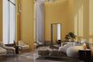
Graphic illustrations appear throughout, even layered onto timber.
Image: Dianna Snape
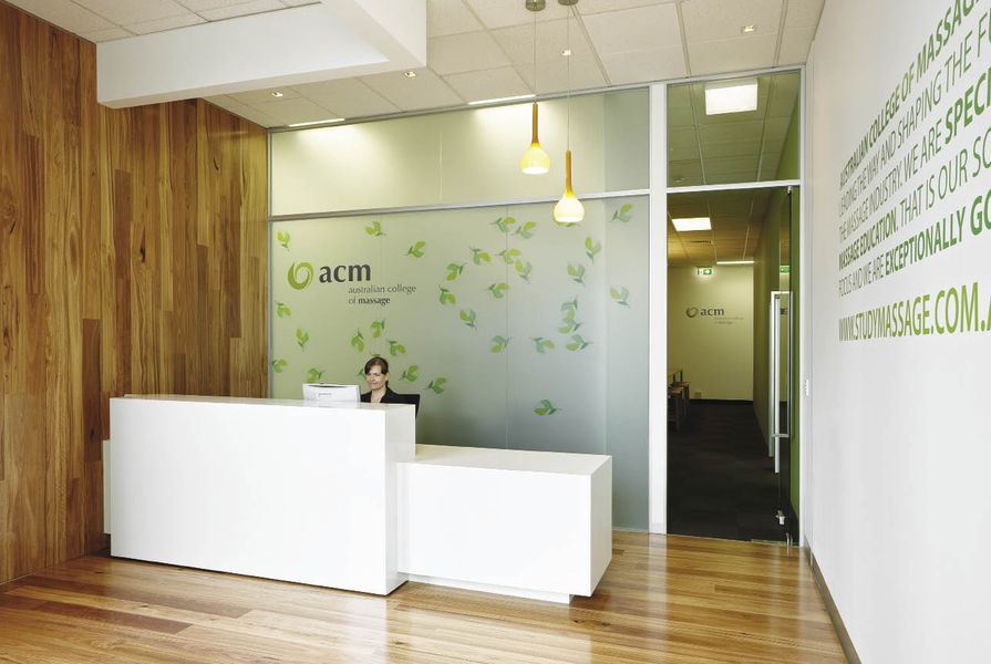
So, from a logo and a marketing brochure that “reads” like a relaxed massage, to an educational space that feels like one? “The colours we chose were replicated throughout the space. It blurs the distinction between graphics and interior design,” says Schaeche. The entry reception has a spotted gum timber floor that wraps up one wall, to create a warm and inviting feel. The wall behind the reception desk displays the logo surrounded by illustrations of leaves. Statements sourced from ACM’s educational ideals are applied to the walls, in various shades of green type. From the waiting area, sight lines lead to another ACM logo on the far wall.
The existing space was an open-plan office, uninspiring apart from an unusually tall ceiling. New walls were introduced, demarcating office space, the two large teaching rooms, and a break-out area with a kitchenette and communal dining table in timber. The existing carpet was removed and replaced with grey recyclable carpet tiles from Interfaceflor. Neutral colours dominate, plus the signature green. “Emotionally, green is time-going-fast, but calming as well,” explains Schaeche.

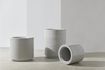
The illustrations are based on the human form, seen here in the massage training room.
Image: Dianna Snape
Much of the furniture is from Interstudio, including organic coat hooks that mirror the anatomical graphics on the walls. The coat hooks and their placement were pivotal parts of the teaching program at ACM. “They pride themselves on how they do the draping, so you feel comfortable,” explains Schaeche. The students learn in pairs, each massaging the other in turn. The distance between disrobing and the massage table needed to be as short as possible.
Initially specifying block-out blinds to the street, the designers are happy with the cheaper alternative of opaque vinyl. “It creates a light-box effect on the inside,” says Schaeche. And, as elsewhere, the vinyl carries marketing messages, this time addressing the street. Light filters from the front training room into the one behind via a clerestory window high up in the partition.
Is this interior architecture with applied graphics, or a three-dimensional brochure? Two other training facilities have been constructed in Sydney and Brisbane using the same formula, the same colours, the same library of illustrations. Surprisingly, the building was ahead of the printed word – when I visited, they didn’t have their new brochures printed yet. I fancied the idea of flipping through the new brochure while walking through the new space. But then, I suppose I didn’t need to.
Products and materials
- Walls
- Dulux paint finish; Digitally printed vinyl graphics; Silkwood floating flooring on walls in break-out space; Blackbutt timber.
- Windows
- Digitally printed vinyl graphics to shopfront and partitions.
- Flooring
- Interfaceflor carpet tile is Solid Foundation; Boral Silkwood timber flooring with Blackbutt finish.
- Lighting
- Feature lighting by Switch Lights.
- Furniture
- Reception desk Diamond Gloss laminate by Laminex; Waiting chairs and table by Temperature Design; Break-out area solid American oak communal timber table and stools by Interstudio; Flosion ottomans by Interstudio with Svenska KJ upholstery; In training rooms; Hob Nob chair upholstered in Woven Image and Instyle Contract Textiles vinyls; Chairbiz tables; Massage tables by client in Instyle vinyl; Clothing hooks are Camouflage by Interstudio; Interactive whiteboard by Soundcorp.
- Kitchen
- Laminex laminate to bench and cabinet joinery; Tapware by Caroma; Floor and wall tile by Classic Ceramics; Appliances by Fisher & Paykel.
- Bathroom
- Caroma fixtures; Classic Ceramics floor and wall tiles.
Credits
- Project
- Australian College of Massage
- Design practice
- Red Design Group
Melbourne, Vic, Australia
- Project Team
- Emma Schaeche, Sarah Hotchin, Robert Ovcaric
- Consultants
-
Builder
Advance Management Commercial Fitout and Building Specialists
Building surveyor Design Guide Consultants
Lighting design Switch Lighting
Signage and graphics Visual Graphics
- Site Details
-
Location
98 York Street,
South Melbourne,
Melbourne,
Vic,
Australia
- Project Details
-
Status
Built
Design, documentation 1 months
Construction 1 months
Category Commercial, Interiors
- Client
-
Client name
Australian College of Massage
Website studymassage.com.au
Source
Report
Published online: 1 Dec 2010
Words:
Tobias Horrocks
Images:
Dianna Snape
Issue
Artichoke, December 2010