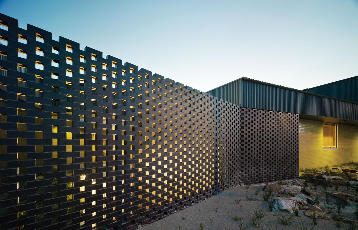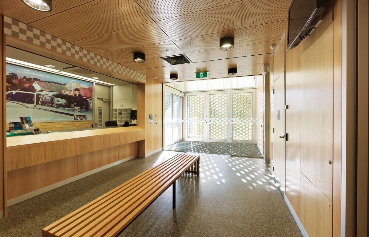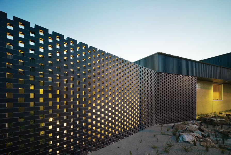

The brick screen at the entry admits dappled light to the entry foyer.
Image: Peter Bennetts
The Carrum Downs Police Station is a low building sitting on an anonymous arterial road in Melbourne’s outer south-east. It’s a banal environment, the kind of suburbia that architects and urbanists for the most part despise. But despite this and its down-at-heel reputation, Carrum Downs is a comfortable enough place, its suburban gardens grown and lush, and driving around (of course the norm in this barely-there place), glimpses of the nearby “green wedge” constantly move in and out of view. KTA’s design addresses its broad, leaky suburban context modestly: it appears to the road as a series of slightly offset brick walls, mostly black but with a shot of yellow at the western corner, adjacent to the entry, set against scrubby bushland. The bricks in some of the walls are laid so as to make pierced screens, but there is little apparent fenestration as such. The yellow brick element signals an entry point at the north-western corner of the building, not only by its assertive colour – yellow as in glazed sulphur yellow – but also by being scaled up to make a kind of abstract billboard.
KTA has a deserved reputation for incorporating subtle responses to context in its work. This is not to say that the practice’s approach resiles from overt marks of architectural difference; rather, in addressing the found conditions of site it attempts to supplement the found to improve amenity, to subtly enhance experience of the ambient condition and so on. I think this is so at Carrum Downs, but perhaps not so clearly as in other projects by the office. The Carrum Downs Police Station is the third that KTA has completed for Victoria Police, the others being in the woodsy and relatively well-off outer north-east of Melbourne at Warrandyte and Hurstbridge. These are smaller than Carrum Downs, and differ from it in being community-oriented stations located near shops and other suburban amenities. However, they share with Carrum Downs the use of coloured bricks – their fronts of vivid green a nod both to the bushy settings of these suburbs and to their reputation as the haunts of an older generation of environmental activists.
Kerstin Thompson describes the three police stations together as part of a network of civic amenity, a kind of dispersed urbanism. The use of the colourful glazed brick establishes a family connection between them. And while this connection may be known only to architectural insiders, the motivation common to each of the projects – to make an architecture suited simultaneously to a modest place and a public purpose – drives the common approach. In considering this strategy, Thompson is mindful of the series of suburban fire stations done a generation ago by Edmond & Corrigan, which likewise added new civic dignity to each of their locations while collectively making a set.

Staff facilities open into a courtyard with brick-clad barbecue.
Image: Peter Bennetts
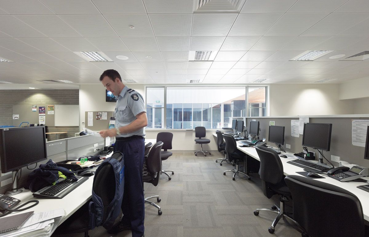
The Carrum Downs Police Station, however, departs from its Warrandyte and Hurstbridge siblings insofar as its location is quite isolated from other amenities that could produce a sense of local belonging, and also insofar as its role is a more broadly regional one. Moreover, it is in a district where perhaps the perception of the police is less benign than in the others that KTA’s police station designs have addressed. In this context, the sense of the civic is as much directed internally to the police personnel and support staff who work here as it is projected externally. KTA has conceived the plan of the Carrum Downs building as the delineation of a collection of building volumes, each defined by its own brick enclosure. This strategy is manifest in the diagram of the building parti. Each of these volumes is separated from the others by circulation space – the “streets,” so to say, along which a series of discrete “building” volumes, civic in their bricky abstraction, are disposed. Practically, this approach accommodates the appropriate zoning of various different activities within the complex. Voids in this plan arrangement become courtyards. As built, these are simply planted with local indigenous vegetation, opportunities for outlook within a relatively inward-looking complex.
Each of the building volumes is made distinct from the rest by the particular palette of bricks used: glazed yellow, white, black, pale green, grey; standard “yellow” clay bricks, some new, some recycled from a building previously on the site; grey concrete bricks. And so on. These bricks are both modest and weighty. I was reminded of the suburban infant and maternal health centres of mid-century Melbourne: brick, house-like in scale and form, but often with a parapet at the front partially hiding the roof, such that the slight increase of the scale of wall gestures to the public realm in an almost-monument.

View of the northern facade, showing the heavy roof fascia and two-storey tower at the western end.
Image: Peter Bennetts
The loose assembly of building volumes of the Carrum Downs Police Station is covered by a rather thick roof, its depth and footprint economically fitted to the slightly irregular overall plan shape of the building. The resulting fascia around the building edge is not an elegant thing, but the architectural game of the roof seems to be to establish a datum coinciding with the top of the brick walls, and otherwise just to be tucked and trimmed as needed, simultaneously pragmatic and a gesture of pragmatism. The datum is broken on the exterior facade three times – by two-storey sections of brick wall on the south and east facades, and by the bright yellow two-way “billboard” at the entry point. Embracing the volumes behind these walls, dark green metal cladding is fitted over the whole of the roof in a pattern of give and take: eaves needed here and there to shade glazing are shorn off where they are unnecessary; the roof expands up into an observation and communications tower and so on. The roof’s fundamental treatment as surface sitting over matter-of-fact structure is apparent from within the building, where the roof fascias to the courtyards are white, matching the white plaster surfaces of the reveals through the roof thickness where skylights appear in the building. This simple difference between green and white in the revelation of the depth of the roof volume distinguishes the interior and exterior of the complex, even as the courtyards and interstitial external spaces and the treatment of circulation spaces as “exterior” otherwise complicate this difference. The roof tells it like it is – this is a biggish building in a suburban nowhere – while the walls of the building narrate their own ideal of loose-fit urban assemblage through their snazzy bricks.

A circulation “street,” flanked by discrete “building” volumes.
Image: Peter Bennetts
It is, then, not as if the design here is simply invested in the brick walls and KTA has let all else go. Rather, there are two design strategies played in contrast to each other: design as ideal and design as real. Both have their pleasures. But it is the unexpected aesthetic charge of the bricks that is really beguiling here. By comparison, the roof does not give enough away without an observer really working at it. But the bricks, the bricks! On the one hand, they are often just beautiful; the glazes are gorgeous (a word it would not be possible to anticipate using in relation to a police station) and the bricks are disposed in expanses big enough that the range of types and colours creates an impression of architectural plenitude rather than the bitsy-ness that might have eventuated in less capable hands. On the other, they keep the circulation spaces of the place clearly defined. The interiors of the brick volumes are finished and furnished with conventional workplace stuff – plaster walls, office furniture, carpet tiles which look as if they anticipate hard use. They accommodate the inevitable paraphernalia that workplaces need.
KTA’s design for Carrum Downs Police Station extends the firm’s meticulous investigation of architecture’s contexts of site, program and constructional means. In its strategy of a loose grouping of spaces as a little brick township sitting under a baggy roof, context is addressed in this design both as something at hand that requires immediate pragmatic response and as something inviting an imaginative transformation. These responses are subtly and tautly syncopated.
Credits
- Project
- Carrum Downs Police Station
- Architect
- Kerstin Thompson Architects
Melbourne, Vic, Australia
- Project Team
- Kerstin Thompson, Kelley Mackay, Scott Diener, Michael Macleod, Laurence Dragomir, Jacqui Alexander
- Consultants
-
Acoustic engineer
AECOM
Building surveyor Philip Chun & Associates
Civil and structural engineer JMP
DDA Philip Chun & Associates
Landscape architect Simon Ellis
Project manager Aurecon
Quantity surveyor Padgham Sweett
Services engineering Irwinconsult
Traffic engineers Traffix Design
- Site Details
-
Location
Carrum Downs,
Melbourne,
Vic,
Australia
Site type Suburban
- Project Details
-
Status
Built
Category Public / cultural
- Client
-
Client name
Carrum Downs Police
Source
Project
Published online: 10 Oct 2011
Words:
Paul Walker
Images:
Peter Bennetts
Issue
Architecture Australia, July 2011