<b>REVIEW</b> Julia Gatley
<b>PHOTOGRAPHY</b> Ray Joyce
More Froebel than Mondrian, 1+2 Architecture’s latest project gives civic presence to a small building that celebrates play and childhood.
The bold colour and form of the day care offices as seen from the entry path.
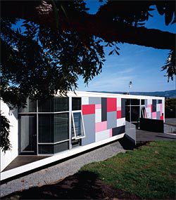
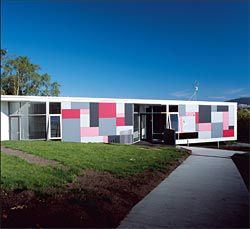
The front facade, with the Hobart skyline beyond. The colours and pattern of the facade are influenced by Froebel blocks.
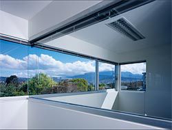
The ribbon window continues into the internal partition between the manager’s office and main office, accentuating the view.
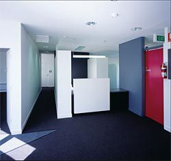
The colours of the facade are brought into the foyer space.
1 Plus 2 Architecture’s recently completed Clarence Family Day Care Centre, in the Hobart suburb of Bellerive, demonstrates that it is possible to give presence to a small civic building, even when the site is tight and the budget even tighter. Form and colour together generate initial impact, while beyond the front facade, well-resolved spatial planning and particular care with sun and views have left the clients glowing, not only with satisfaction, but also with gratitude. This building surpassed their every expectation.
The Clarence Family Day Care Centre is not a childcare facility per se, but the headquarters for a Clarence City Council programme whereby individual childcare workers look after small groups of children at home. An earlier 1+2 project, the Richmond Public Toilets and Bus Shelter (Architecture Australia, March/April 2005), for a different branch of the Clarence City Council, led to this second council commission. The new building includes offices and facilities for the seven staff who run the childcare programme, a seminar room for training sessions and meetings, and a library for the storage of toys that are available for lending.
Built on an internal suburban site, the building is not visible from the street. A driveway provides access to the sizeable council car park onto which the building fronts. Appropriately for a purpose-built civic building, the Clarence Family Day Care Centre is differentiated from the houses and adapted domestic buildings that neighbour it.
This is achieved by the use of a white modernist box form, grounded at one end and cantilevered at the other, and a punchy front facade.
Despite these differences, the building is very sensitive to its neighbours. Careful siting and a skillion roof ensure that it does not block the view of the Derwent and Mt Wellington from the house on its east side, nor the sun’s light and warmth from the house to the south. Indeed, retention of the view shaft from the eastern house led to the angle of the front facade and thus to the building’s triangular footprint. This arrangement is also advantageous in that the angled facade faces towards the driveway and the main point of arrival.
1+2 made a conscious decision to focus attention on the front facade in order to give the building presence. First impressions might suggest references to both De Stijl art and Post-Modern architecture, but such a reading would be conjectural. Indeed, the facade is more Froebel than Mondrian. 1+2 found inspiration in the coloured building blocks developed by the nineteenth-century educationalist Friedrich Froebel as educative toys for young children. The colour scheme that adorns the fibro-cement sheets was then developed collaboratively, with contributions not only from 1+2 but also from director Fred Ward’s two young daughters and the seven Clarence Family Day Care Centre staff. These women are unlikely to associate the pinks and greys that they selected with Post-Modern architecture in the way that those of us with an interest in and/or a memory of 1970s and 80s architecture might. The reference to children’s building blocks and the colour scheme together create an architecture that celebrates childhood and play.
In plan, public spaces are located in the triangular area immediately inside the main entrance and private spaces in the orthogonal wings that flank the triangle. Public spaces get the sun while staff offices get the view of the Derwent and Mt Wellington. This is amplified in the south-west corner by a continuation of ribbon windows from the exterior into the internal partition that provides acoustic separation between the manager’s office and the main open-planned office area. In addition to the differing geometries, public spaces are also more voluminous than private ones, with the roof and ceiling both falling from the north-east corner.
Though not a childcare centre, this is nonetheless a building that children do visit, when accompanying childcare workers and/or parents.
A small play space has been provided, just inside the front door. A window at floor level means that children at play can be seen from outside the building, further identifying this as a child-focused facility. In addition, a miniature (child-sized) version of the front facade, complete with coloured panels and transparent windows, creates separation between the play space and the entry and circulation route. Doors with high handles ensure that children can be contained within the foyer area.
The pinks and greys of the front facade are continued into the foyer, complemented by the introduction of red. Red then replaces pink in other parts of the interior, notably for furniture. Ironically, the use of screens and partitions internally, at a range of widths and heights, supports the unintended reading of the front facade as a Mondrian painting – such screens and partitions typify De Stijl interiors and thus suggest a De Stijl connection inside as well as out.
With the Clarence Family Day Care Centre, 1+2 have reaffirmed their skill in producing well-resolved, interesting civic buildings, on time and within budget. As was the case with the Richmond Public Toilets and Bus Shelter, the new building demonstrates a considered response to context, site, programme and the full range of user groups. Though not intending to become specialists in child-focused architecture, 1+2 are currently working on a series of childcare centres. Given the many merits of the Clarence Family Day Care Centre, these next projects should be awaited with interest. DR JULIA GATLEY IS A LECTURER IN ARCHITECTURAL HISTORY, THEORY AND DESIGN AT THE UNIVERSITY OF TASMANIA, LAUNCESTON.
CLARENCE FAMILY DAY CARE OFFICEArchitect 1+2 Architecture.
Quantity surveyor WT Partnership.
Structural and hydraulic engineer Gandy & Roberts.
Building certification Pitt and Sherry.
Electrical and mechanical engineering ECOS. Builder Bennett Construction. Client Clarence Family Day Care Scheme. Building owner Clarence City Council.