What makes a house a home? This rather prosaic question sprang to mind when I visited East Melbourne House, a renovation by Zoë Geyer Architect of a historic terrace in that venerable inner-city suburb. The quality of “home,” and how it can be achieved through design, is particularly relevant when the house in question is a twenty-two-room, five-level nineteenth-century mansion with two staircases (the “good” stair at the front, the servants’ stair in the rear), an elevator, and a host of guest and occupant accommodations spread over its many levels. Despite the sheer abundance of this residence, and its urbane character, it still manages to feel homey in the best sense – and I was keen to understand why.
The home is one of three conjoined triplets, known collectively as Queen Bess Row, which were designed by the influential firm of Tappin Gilbert and Dennehy and completed in 1886. The building is unique in that it was one of the first in Victoria to be used as apartments, in as early as the late 1880s, only later being used as three separate dwellings. In fact, the architects intentionally designed this flexibility into the planning of the structure. The Row’s past as a temperance hotel or “Coffee Palace,” and as a brothel at one stage, is also of interest, and these layers of meaning seem to settle about the structure, which carries the evidence of its colourful past with some ease.
Zoë’s approach to the building has been respectful and thoughtful without being overly reverential – it is a robust pile after all, and well suited to an equally robust contemporary interpretation, which the designer has applied in all respects. The result is a contemporary home that embraces the values of the past, while suiting its occupants well now and into the future. Refreshingly, the occupants have no desire to move out of their home at any stage, and the renovation has been designed in consideration of their future “ageing in place,” to borrow a rather ghastly term from urban planning.

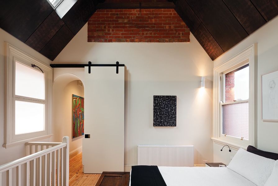
Main bedroom. Artwork (L–R): Dick Watkins, John Peart, Ken Whisson.
Image: Dianna Snape
The first impression of the house from inside the entry hall is of stairs winding up into a distant, seemingly endless interior. In fact, the house is divided into two distinct parts: the main block at the front, which contains the larger and grander rooms on each level, and the secondary block at the rear, which is narrower than the width of the lot, thus creating a pleasant courtyard. A glazed elevator is positioned right on the boundary between the front and rear wings.
All of the house’s wet areas, including bathrooms, toilets and the kitchen, are confined to the rear wing, and concealed behind colourful sliding doors that divide each upper landing and provide privacy between guests and hosts. On the ground floor, a glazed black-painted steel door separates the two wings, marking a resolutely contemporary entry into the social space of the kitchen, described by Zoë as the “heart of the house.”

An elevator between the front and rear wings. Artwork: Otmar Höve.
Image: Dianna Snape
On each level, the rooms in the front wing are grandly proportioned, and the renovation is a work in progress in that some rooms have not yet been treated to the finishing and fitout work evident elsewhere in the house. Despite this, the impression is of a harmonious whole.
Zoë has been canny about where to make her mark, and where to let things be. By far, the most definite interventions are around the colourful wet areas, and in the fully renovated, split kitchen. This latter space is interesting in that it is actually made up of two rooms: a “social” kitchen space, and a working kitchen space. The remnant arched alcove where the stove originally stood – a feature that frames contemporary art – now divides the rooms.
The bathrooms are remarkable in that they are comfortable, personable rooms, variously containing fireplaces, artworks, warm timber seating benches and minimal glazed shower enclosures. Zoë’s attention to detail has been exacting, and each wet area is a concise poem of aligned datums and rich, touch-friendly materiality.
On the topic of art, the owner’s remarkable art collection is reportedly the product of a lifetime of collecting, and there is contemporary art and sculpture in all media imaginable throughout the house. The designer’s response to this abundance has been to let it breathe – there is enough room, both physically and conceptually, for each piece to claim a space and shine along with its fellows. The result is a feast for the senses, with something remarkable around every corner.
So what of my original question: what makes a house a home? In this case, I can say that it is Zoë’s skill in introducing a contemporary note to a canvas that was far from blank to begin with. Queen Bess Row has such a rich history and a big personality, but to defer too much would have been a mistake. Instead, Zoë has created a place with strong character and occasional bold elements of colour, avoiding the conceits of minimal restraint on the one hand, and the trap of over-expression on the other.
Products and materials
- Roofing
- Recycled slate from P & S Roofing.
- Internal walls
- Hard plaster, plasterboard and Viridian Colourback Glass panelling, all painted in Dulux ‘China White’; Artedomus Inax wall tiles; Signorino Grigio Armani marble slabs, honed; MDF lining with custom grooves in Dulux paint, various colours.
- Windows and doors
- Custom steel reveals, doors and windows painted Dulux black; Window Energy Solutions window films; Velux VSE top-hung skylights; Viridian Decor Pattern Squarelight; Centor door tracks; All-good D-Line door handles.
- Flooring
- Timberzoo salvaged blackbutt in Bona Traffic sealant (interior) and Cutek sealant (courtyard); Bisazza Bianco tiles; existing timber flooring to front of house in Danish soap and water finish, and to rear in matte polyurethane finish.
- Lighting
- Artemide Talo lights; Ares Mini Ada lights from Versalux; Delta Ultra 250 Hi light from Inlite; Viabizzuno Lenticchia suspension light and C2 Semincasso Tutta Lucce wall lights from Xenian.
- Kitchen
- Franke Planar sink, and Ideal Standard Tonic mixer, both from Reece; Smeg dishwasher, gas cooktop and Linear ovens, and Liebherr fridge, all from Elite Appliances; Zip Hydrotap; Qasair rangehood.
- Bathroom
- Agape Pear basin from Artedomus; Alape wall basin, Pozzi Ginori wall basin, Phoenix Liscio tapware and fittings, Cosmic basins, and Mizu bath, all from Reece.
- Heating / cooling
- Crystal Clear Engineering hydronic panels.
- External elements
- Custom lattice fencing in Weathershield black paint.
- Other
- Bedroom furniture and coffee tables in Signorino Grigio Armani marble offcuts on black steel frames; metal joinery cupboard to ensuite in aluminium with custom laser-cut patterns, with black anodized finish; hoop pine ceiling to main bedroom.
Credits
- Project
- East Melbourne House
- Architect
- Zoë Geyer Architect
Melbourne, Vic, Australia
- Project Team
- Zoë Geyer
- Consultants
-
Audiovisual
Wyatt Audiovisual
Boilermaker R & I Dekker Design
Builder and landscaper DC Construction
Engineer JSC Consulting Engineers
Heating Crystal Clear Engineering
Joinery Gillron Services
Lifts consultant Lift Shop
Lighting Ben Lüder
Metalwork Outdoor Nation
- Site Details
-
Location
East Melbourne,
Melbourne,
Vic,
Australia
Site area 523 m2
Building area 209 m2
- Project Details
-
Status
Built
Design, documentation 14 months
Construction 11 months
Category Residential
Type Alts and adds, Heritage, New houses
Source
Project
Published online: 30 Jul 2013
Words:
Marcus Baumgart
Images:
Dianna Snape
Issue
Houses, June 2013