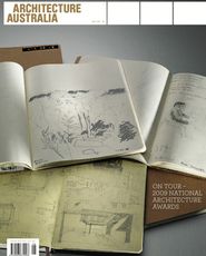
Mapping Sydney
Overview of Mapping Sydney, with its rear wall of postcards.
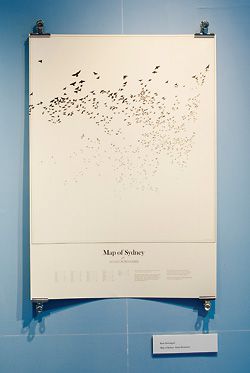
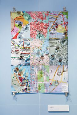
Map of Sydney: Avian Surnames, by Kate Sweetapple.
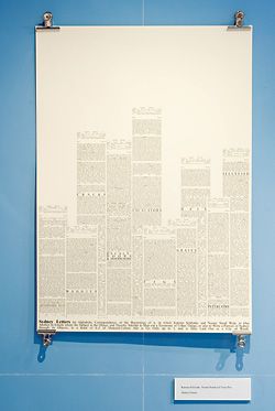
Sydney Letters: An Alphabetic Correspondence, or the Beginnings of it, in which Katrina Schlunke and Naomi Stead Write to One Another in Emails where the Subject is the Object, and thereby Attempt to Map out a Taxonomy of Urban Things, or also to Write a Portrait of Sydney through its Objects, in a Kind of A–Z of Material-Culture that is Yet Only up to J, and is Here Laid Out as a City of Words.
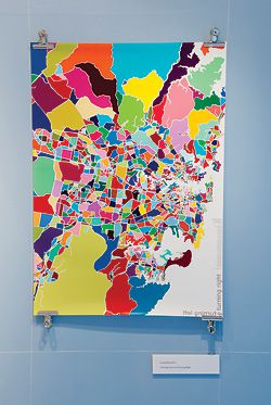
Turning Left and Turning Right, by Louisa Bufardeci.
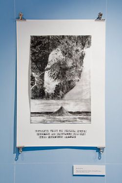
Map and Coastal Profile of Sydney, shewing Mt Prospect and the Blue Hillocks beyond by Katrina Simon.
Ruth Watson, Maps That Cried (1995–2005), by Ruth Watson.
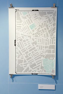
Map 9 K11 by Jane Shadbolt.
Lee Stickells reviews Mapping Sydney: Experimental Cartography and the Imagined City, curated by Naomi Stead.
E151°12”8.82’; S33°52’59.7”
Where I had a coffee before looking at the maps
I recently heard a woman on talkback radio describe how, in order to read maps, she imagined herself as the map: her limbs became the branching roads of the landscape being traversed. It was a striking image: outstretched body as map, flowing arterial roads, lungs of the city – the Lilliputian king advancing along Gulliver’s leg with his retinue.
It also emphasized the ubiquity of maps. They are everywhere: endlessly flexible, manipulable and reproducible. Changing technologies have only increased their penetration and familiarity. Geographical, ecological, political, genetic, touristic – spatial conventions and referencing give cartographic rationality a centrality in our lives. The Mapping Sydney exhibition connected to a wider, ongoing cultural response to that boundless growth. As Naomi Stead notes in her catalogue essay, the conventions of scientific cartography have been ruthlessly deconstructed within the academy, the elisions and distortions explored in a host of books. Alongside that critique the processes of mapping have become fertile ground for artistic expression and intervention. The exhibition brought some of those reflective and creative strands together.
Specifically, Mapping Sydney emerged out of Stead’s interest in the much-maligned tourist map and was initially intended to address the way that tourist media represent and “construct” Sydney. Eventually, the desire to revise the traditional “objectivity” of the map, and to reveal other Sydneys repressed or ignored by those conventional maps, inspired what Stead calls “anti-tourist maps”. To interrogate the practice of mapping, she invited eight collaborators to produce alternative maps drawing on their own perceptions, ideas and knowledge of the city.
E151°8”12.28’; S33°53’0.06”
Where I looked at the maps
The exhibition layout reflected that project history. The gallery’s rear wall was covered with a collection of Sydney postcards that in itself mapped a particular Sydney territory. Collected over a number of years, they ranged from tasteful, sepia-toned images of The Rocks to lurid visions of koalas straddling Centrepoint Tower, as well as many, many Sydney Opera Houses. An invitation pinned to the centre of the wall encouraged visitors to jot a message or memory on the rear of a card and replace it on the wall, message-side out. Consequently, a new map of idiosyncratic commentary and reminiscence began to replace the limited subjects of picture-perfect postcard Sydney. In the centre of the room, Stead continued that exploration of the subjective, and of experience as a mode of mapping, with a sound and image installation May the Fourth: The Story of a Sydney Walk – an attempt to map the experience of a dérive.
The flanking walls, painted map-ocean blue and crisscrossed by a cartographic grid, were taken up with the commissioned maps. If Sydney’s commercial tourist maps are concerned with the significant – locating the must-see itinerary – then the maps exhibited here largely paid attention to the insignificant, the personal and marginal. They ranged in approach: from Kate Sweetapple’s Map of Sydney: Avian Surnames – where hundreds of bird silhouettes picked out the locations of all avian-surnamed families in Sydney – to Stead’s own collaboration with Katrina Schlunke and Trina Day – a cityscape formed by towers of text taken from a writing game. The Stead Schlunke Day map’s tongue-in-cheek title not only spelt out the creative process but also hinted at the broader concerns of the exhibition: Sydney Letters: An Alphabetic Correspondence, or the Beginnings of it, in which Katrina Schlunke and Naomi Stead Write to One Another in Emails where the Subject is the Object, and thereby Attempt to Map out a Taxonomy of Urban Things, or also to Write a Portrait of Sydney through its Objects, in a Kind of A–Z of Material-Culture that is Yet Only up to J, and is Here Laid Out as a City of Words.
The maps were also beautiful things in themselves. Louisa Bufardeci’s Turning Left and Turning Right created a luminous Sydney: a cracked, vivid patchwork of neighbourhoods in candy-cane colours. By contrast, Katrina Simon’s rendering of a looming Mount Prospect re-figured Sydney as a city on a volcano. The melancholic graphite vision, collaged and layered, evoked a post-apocalyptic landscape even while based on ancient geological forms.
E151°12”8.1’; S33°53’0.06”
Where I talked to Lucas, who printed some of the maps
“The city … [consists of] … relationships between the measurements of its space and the events of its past: the height of a lamppost and the distance from the ground of a hanged usurper’s swaying feet[.]”1 When dealing with the imagined city, as this exhibition did, it’s obligatory to quote Italo Calvino. But Calvino’s beautiful text is relevant here as it entwines two concepts of space that maps deal with: the measurable and the experiential. Jane Shadbolt’s Map 9 K11 embodied just such an interweaving: in tiny text it detailed a mass of tall tales and true, all precisely forming the street layout of their locality. It is the map I pored over longest and derived the most pleasure from – the funny, sometimes disquieting scraps of narrative evoking a complex social and physical territory. It also embodied the strength of the exhibition. Slight, whimsical and occasionally exploring well-worn tropes (such as the Situationist dérive), it was still a compelling exercise in creative mapping. Given the tendency within architecture and planning to view maps as stable, accurate mirrors of reality, this seemed an especially useful characteristic.
E151°12”7.02’; S33°52’59.7”
Where I collected my bike after looking at the maps
Dr Lee Stickells is a senior lecturer in architecture at the University of Sydney.
1. Italo Calvino, Invisible Cities (New York, Harcourt Brace Jovanovich: 1974), p. 10.
Transclimatic
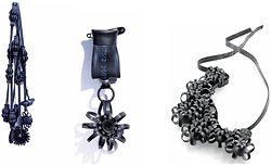
Bunsch, 2008; Grey Rain, 2008; and Royal Broche, 2009, by Sasja Saptenno (accessorylab). Made from bike tyre rubber. Photographs by artist.

Tube, 2005, by Sasja Saptenno (accessorylab). Photograph by Raoul Matulessy.
Dusty Relief, 2002, by R&Sie(n). A proposal for a museum that attracts dust from the polluted city air to its skin through electromagnetism.
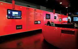
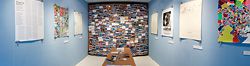
Overview of the installation at Customs House, Sydney.
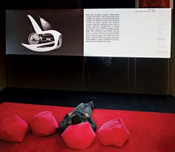
Most of the work was presented digitally. Move Your Energy, 2009, by Novague (seen on the screen) is a power-independent rocking chair with an LED lamp designed for reading.
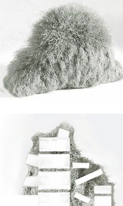
Cloud, 11th Venice Architecture Biennale, Italy, 2008, by An Te Liu.
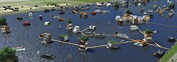
Pampus Harbour (Landing Stage 3), 2007, by MDRDV.
Sandra Kaji-O’Grady reviews the recent exhibition at Sydney’s Customs House, curated by Frank Minnaërt.
Under the auspices of manager Jennifer Kwok, Customs House has become Sydney’s de facto gallery for architecture. Its architectural exhibitions have ranged from Global Studio + Emergency Architects to Beijing Iconic Olympic Architecture, and have included installations in the atrium, retrospectives, group shows and student work. Lacking white-walled galleries or black box space, Customs House, at first, seems an unlikely venue for all this activity. It’s a working library, so a large proportion of viewers are momentarily distracted readers. Positioned directly opposite Circular Quay and housing restaurants and bars, it also attracts curious tourists, diners and commuters whiling away the time between ferries.
Kwok understands the limitations and potential of the Customs House spaces well and knows her audiences. She has overseen layers of ever-changing exhibits that tend towards the topical and didactic – documentary photographs with social themes, for example, rather than objects of aesthetic contemplation. On all the library levels, exhibits share space with a rich texture of information – books and newspapers, signage and images. Architecture, and architects, fit well in this scenario. Kwok appreciates that architects understand the library space and how to use it. She also likes exhibits that engage architecture with pressing social questions or that contemplate the future of key sites in the city – exhibitions that seem to ask the viewer what they think.
Customs House has been a godsend for the architecture school at UTS, whose faculty, lacking a gallery space of its own, has found in it a place to test architectural research and ideas beyond the limited audience of the campus. All three exhibits in the venue during August and September have an association with the school. On the first floor is a show of student work from a design studio on the future of the Ultimo urban precinct, curated by architects Adam Russell and Simeon King. The artist Dr Lisa Anderson, whose iceberg sculptures hover over the City Model on the ground floor as part of her show Attla, is a Visiting Fellow at UTS and architecture students have been working with her on the technical resolution of large icebergs for a future show that is still in the planning stages.
Anderson’s work explores climate change in the fragile icescapes of the High Arctic and the student work on Ultimo is also concerned broadly with sustainability. It’s a nice complement to the exhibition curated by Frank Minnaërt, an architect and lecturer at UTS, which is also concerned with climate change. The work selected by Minnaërt for Transclimatic is a departure from prevailing concerns with green credentials and metrics. The works Minnaërt has brought together actively register the phenomenal shifts in weather or express the flux of waste, light and water. One of my favourite inclusions, by French practice R&Sie(n), is a proposal for a museum that attracts dust from the polluted city air to its skin through electromagnetism, producing a dirty, hazy and fuzzy surface that contradicts the white box of its interior. Emergent is represented by a proposal for sculptural structures for a public space that house artificial photosynthetic algae colonies that produce luminosity at night. There is a proposal for the drowning city of Venice, jewellery made of discarded bicycle inner tubes, a children’s playground constituted largely of shipping containers and structures animated by hydroponics, sound and wind.
With the exception of a corrugated cardboard screen designed by Minnaërt to create a quieter space for the main video, the exhibition itself relied entirely on virtual means – a liability when it came to opening night, which arrived, to everyone’s consternation, without an exhibition. Minnaërt sought contributions from international architects of renown and many of these came in the form of animations and fly-throughs. He set out to bring all the material together into a continuous video loop, grouping the works thematically. The result is a long watch, just short of feature-film length, but most audiences will enjoy dipping in and out. The format works well enough – two or three related projects are appreciated and the viewer moves on. But to realize Minnaërt’s ambitions and appreciate the whole it needs a thorough edit and narrative voice-over, and cinema conditions so that the soundtrack is audible and the images sufficiently large to fully appreciate. While Minnaërt’s previous exhibition at Customs House worked so well with the space that the illuminated plinths he designed are still in use, this one exceeded the constraints of the venue.
Nevertheless, what may be discerned from the fragments gleaned in a discontinuous viewing is something larger than a positive take on creativity in the face of the challenges of climate change. Most current architectural practice can be understood in terms of a continuity, a return even, to modernist principles of technological positivism and rational form making. The obsession with “media facades” and “interactive architecture”, for example, is touted as new but extends the mechanistic model of architecture and its object relationship with the viewing subject. Where there are shifts in the form or appearance these are repetitive or at least predictable. Some of the proposals in Transclimatic, by contrast, are architectures of a radical responsiveness and uncertain appearance. Some are incomplete without the agency of human activity or the vagaries of the weather. They are constituted by their registration of changing conditions, such as waste production. The mechanical is less evident here than the chemical or biological. Performance is understood in theatrical and phenomenal terms, rather than quantitative terms. It’s a nascent architectural movement that deserves greater investigation. While it is not always satisfying as an exhibition, this reviewer thinks Minnaërt is on to something in finding common ground between the architects and artists in this show.
Sandra Kaji-O’Grady is associate professor of architecture and Head of School at the University of Technology, Sydney.
Draw the Line
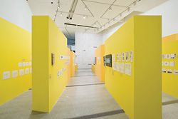
The aisles of yellow, “like oversized yellow trace”, form the backdrop for the sketches and notes of Lab Architecture Studio at the Ian Potter Centre, NGV.
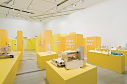
Model of Federation Square.
Overview of the first gallery space, with its mood of “joyous revelry in early design process”.
The second primary gallery space, which exhibits “maturation through a necessary confrontation with global economies”.
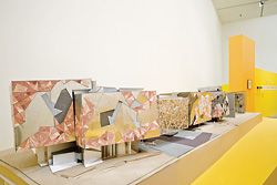
Models of various unbuilt projects. Photography Christian Markel, NGV
Hélène Frichot reviews a recent exhibition on the work of Lab Architecture Studio.
Draw the Line Hélène Frichot reviews a recent exhibition on the work of Lab Architecture Studio.
The Alberto Giacometti line does not trace a singular, definitive path around its subjects, but blurs their shimmering outlines across the dark traceries of a multiplicity of lines, drawn and overdrawn. This multiplication of the line and its flickering shadows allows for a profound communication between subject and surroundings – the line that begins by separating the two concludes by drawing them together. It is this lively line of multiplicity to which Lab Architecture Studio aspires when they present their ongoing design research at the Ian Potter Centre, NGV, under the title, Draw the Line. The line in question does not determine a fixed identity, but opens up the possibility of new kinds of relations between place and inhabitant, and is even suggestive of new formations of a public.
It is fitting that Federation Square is the exemplary work that is unfolded in Draw the Line with the greatest care and detail. On our visit we perform the stations of Fed Square by wandering up and down aisles of yellow, like oversized yellow trace, where conceptual sketches have been pinned up and notes inscribed on the wall by hand. Uniformed flocks of schoolchildren squeeze past us and patient teachers explain the difference between two- and three-dimensional modes of representation. This first gallery is an invitation into the volatile and confounding realm of design process, with an emphasis on the surface effects and varied conditions of sculptural relief of the multifaceted facades of Federation Square. The germination of the idea of the now familiar pinwheel geometry is explained as it emerges into shards and agglutinated panels of muted, fleshy pinks and icy greys.
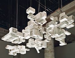
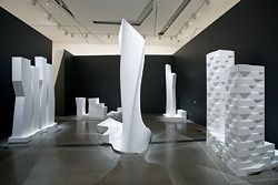
From this joyous and formative expression, we enter a further gallery that houses a large grey chamber, darkly lit, within which is to be found a silent theatre of white polystyrene towers, CNC-milled for the exhibition. Around this chamber is wrapped a corridor where a dado line of digitally rendered architectural projects, nearly all of which remain unbuilt, are pasted to the walls. A narrative of design thought necessarily unfolds, and it would seem that the investigations undertaken in the first room find continuity in the second through a panoply of global projects. There is also a taxonomical code, which arranges the architectural production of Lab, post-Fed Square, beneath the headings of compositional design procedures including filament, aggregations, networks, embedded, surface, crystalline. Such taxonomies are topical in this biotechnological age, where innovative research trajectories are often collaboratively forged between architecture, computation and the mapping of life processes, and where design research sometimes becomes a question of the evolution of form, surface and material development. Consider, for instance, the fold-out classification system to be found at the rear of Foreign Office Architects’ Phylogenesis: foa’s ark (2004), popular with those who like to explore digital breeding programs. One of the risks in such systems is a self-referential rigidity of classification that results in the loss of context specificity and local idiosyncrasies.
The two primary galleries present distinct moods – the revelry in early design process presented in the first gallery can be seen to mature in confrontation with global economies in the contexts of China, the United Arab Emirates, and so forth, in the second gallery. If this process of maturation has resulted in the development of a generic style, this no doubt has its benefits for the firm. In addition to the two galleries there is an intimate side room where a video documentary depicts the vicissitudes of the construction of Fed Square – its material architectural expression as well as the mounting anxiety as to how it would be marketed as a brandscape to the Melbourne public. Charles Jencks himself makes an appearance and speaks of the daring of young architects, and how what has been achieved is less an icon, such as the Sydney Opera House, than a dispersed identity, which, after all, seems more fitting to the urbane Melbourne demeanour.
How fortuitous that a survey of a studio’s architectural investigations can be placed on display in a series of galleries over which the studio itself has dedicated much design labour. A vertiginous mise en abyme can result: we traverse the building we are simultaneously viewing across a series of representational registers. The models work especially well in this regard, as confirmed by four-year-old Felix’s sudden exclamation that he was inside the building he was at the same time examining in modelled miniature! But what is it that happens when architecture exhibits itself? Built-to-life-scale architecture already flaunts its material insistence in the world, so what further contribution can be made through the laying bare of all the collected documents of architectural design work? This is the third exhibition of architectural work that has been displayed at the NGV, and as there is no national nor any state museum for architecture in Australia, the discipline finds that its wares are to be presented alongside the artefacts we usually associate with art. Don Bates explains that the challenge within the context of an art gallery is the question of authenticity. As the work undertaken by architects is usually collaborative, and involves complicated networks of expertise and skill, not to mention social, cultural and political opportunities and impediments, the question of authorship, that is, who has drawn the line, comes into question. The other issue is that of the audience. How does Draw the Line speak to a potentially argumentative collective of architectural peers, as well as to a general public? From elaborating on architecture’s aesthetic position in relation to the arts to educating a diverse public on the creative and professional work of architects, as well as promoting the importance of design research, there is no doubt that such exhibitions are invaluable. NGV has acquired much of what is to be seen on the walls, and plinths, of Draw the Line, and is committed to exhibiting national and international architecture and design into the future.
When the competition for the design of Federation Square was resolved, and the lucky ticket was drawn by Lab, with Bates Smart, nothing short of the future identity of Melbourne and the outline of its civic identity was at stake. Verbal and other battles ensued at various junctures throughout the process of the construction of this important public infrastructure, for any body politic is composed of both agonistic and convivial encounters. In the end identity cannot be decided once and for all and the challenge instead becomes how to acknowledge a past, operate in a perpetual present and remain open to the expressive lines of a people to come. Draw the Line succeeds in bearing witness to many of these diverse narrative lines and to some of the creative and pragmatic struggles with which architects must continually grapple.
Dr Hélène Frichot is a senior lecturer in architecture at RMIT University.