It’s a popular misconception that the architectural antidote to the compartmentalization of an old house is a vast, open-plan box. The typical approach – bedrooms at the front, kitchen-dining-lounge at the back – might work for some homeowners, and in small houses on tight inner-city sites it might be difficult to do too much else. But in most cases, the best model for modern living lies somewhere between the two extremes. The project documented here – the renovation of a red-brick house built as part of a mid-twentieth-century State Savings Bank initiative in the Melbourne suburb of Hampton, by Kennedy Nolan Architects – is an exemplar.
For passers-by, a timber fence tracing a curved path to the front door offers the only hint of modern architectural work behind the original brick facade. The front door itself has been recast so that visitors approach the entrance from the side and are delivered to the middle of the house. This moment of arrival provides the first point of distinction between Kennedy Nolan’s approach and the suburban status quo: where an open-plan box design lays bare every detail immediately upon arrival, this house greets the visitor with surprise (“I didn’t expect this!”) and intrigue (“I wonder what’s through there!”).
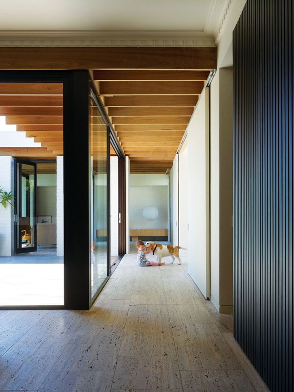
Inside the entry, a timber-veneer-clad blade wall leads the eye to the right, along a simple white bench, past a couple of timber stools and through to a small open kitchen. The height of the blade wall sets a datum well below the ceiling for overhead cupboards on the opposite wall, creating a buffer between these new elements and the original cornices and ceiling detail. The impression is of a discrete timber module inserted into the old building. Importantly, it’s the only part of the house where “old” and “new” interact in any significant way. The kitchen thus plays a vital role in reconciling what might otherwise have been a difficult juxtaposition of architectural styles. As a result, every other space in the house is free to be “old” or “new” without provoking conflict.

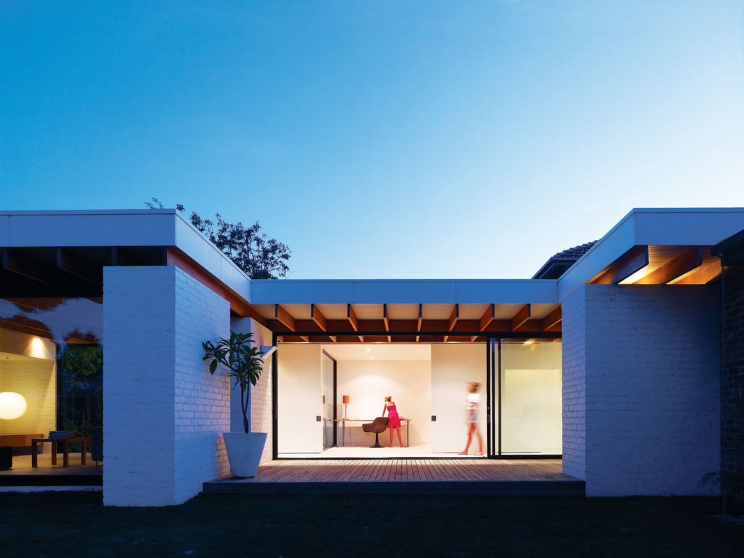
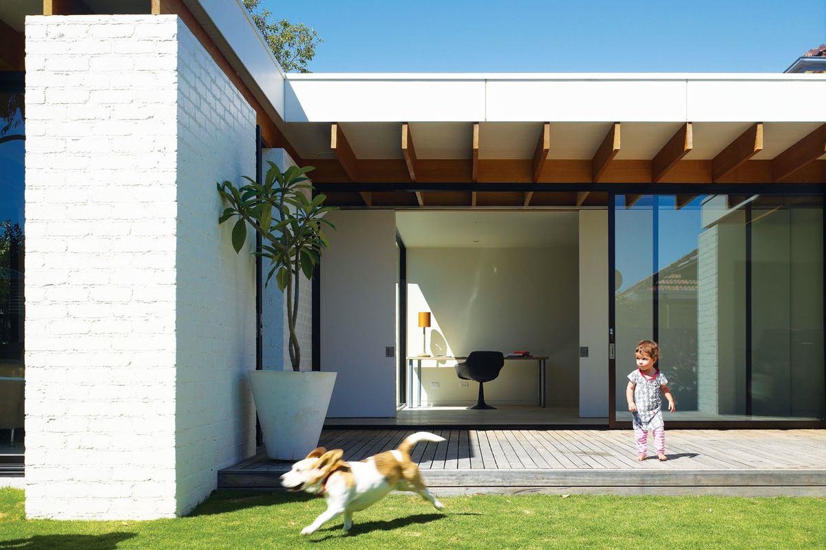
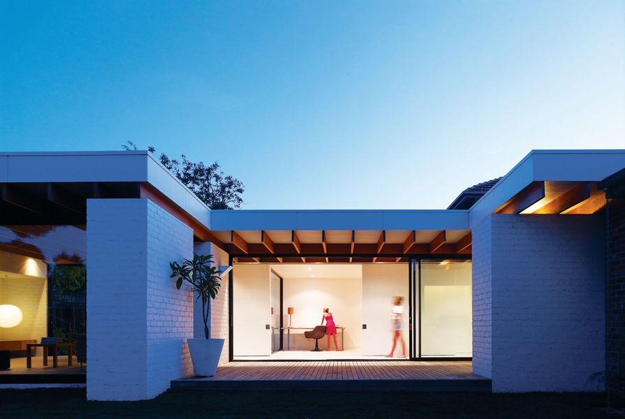
Connection to the garden and north sun were a key focus.
Image: Derek Swalwell
To the left of the kitchen, the front two rooms of the house largely retain the original period character, and are given over to a dining room and main bedroom, accessed via a walk-through robe. To the right of the kitchen, stolen glimpses of and through other spaces encourage exploration of a home that, it quickly becomes apparent, has more in common with mid-century SoCal modernism than with State Savings Bank sobriety.
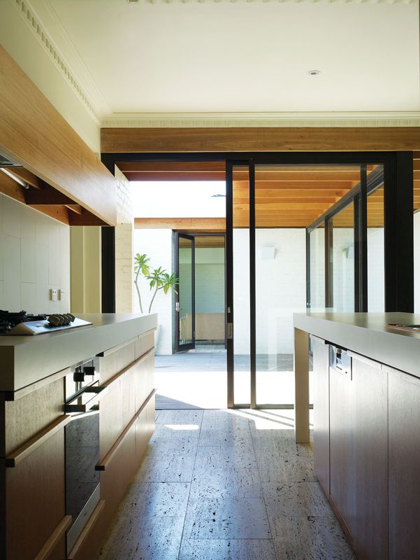
The modernist aesthetic had its origins in a client brief referencing architects Richard Neutra and Craig Ellwood as key influences, and is clearly recognizable in a lean, rectilinear structure composed primarily of white-painted brick and floor-to-ceiling glass. Three primary zones – a living room, a study and a timber-decked courtyard – are arranged for maximum access to northern sun and, while the addition is probably one pool and two palm trees short of official resort status, these airy, light-filled spaces feel at least equal parts Hollywood and Hampton.

The lean, linear structures of Neutra were a reference in the revision.
Image: Derek Swalwell
Indeed, another key element of the brief was the desire for a home with a holiday ambience – something that has certainly been achieved in this part of the house. The living room is particularly inviting. It’s large enough to accommodate the necessary accoutrements of modern life but small enough to feel intimate and protected. Extensive glazing admits northern light and provides views out to the garden and to large eucalypts in a neighbouring property; to the south, the space opens out onto a second, smaller courtyard planted with bamboo. The mass of the brick walls, coupled with the abundance of natural light and unmitigated outlook, evokes feelings of refuge and prospect that are undeniably relaxing.
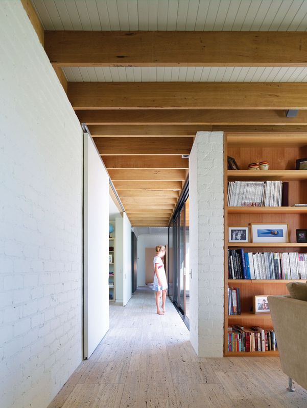
This feeling can also be attributed to the selection of materials and finishes. The colours are uniformly neutral, but a range of textural finishes gives the house a feeling of the natural, of the handmade, that prevents the detail-free and minimally furnished spaces from becoming clinical or alienating. Floors are clad in directional, saw-cut travertine tiles; brickwork is painted but not rendered; and ceilings are faintly striated by neutral-painted lining boards, interspersed with exposed, natural-finish hardwood rafters.
The study is a simpler space, demarcated by a transition from the exposed rafters and lining boards to a flat, white-painted plasterboard ceiling. This more generic materiality is appropriate given the flexibility demanded here. With sliding panels pulled into place, the study closes off from the rest of the house and becomes a private bedroom for guests, with the adjacent bathroom serving as a dedicated ensuite.
In addition to the front part of the house and the new section, a third zone that occupies part of the old house at the rear of the kitchen accommodates the clients’ two children. This treatment of the kids’ quarters – two bedrooms, a bathroom and a study/recreation space – as a separate section within the home acknowledges the complexities of family cohabitation, and the need for an individual to have control over socialization and separation.
That these complexities are addressed so effortlessly is indicative of an incredibly thoughtful approach to residential architecture that is a credit to the architects and also, in many ways, to their clients. Together they have created a modern home of understated glamour that meets a family’s needs generously but eschews excess, and that challenges the prevailing orthodoxy for open-plan residential extensions.
Products and materials
- Roofing
- BlueScope Lysaght Trimdek Zincalume cladding; James Hardie Scyon fascia in Dulux ‘Stowe White’; exposed kiln-dried hardwood rafters with a clear finish.
- External walls
- Face brickwork painted Dulux ‘Stowe White’; James Hardie Scyon wall cladding in Dulux ‘Fairoaks’.
- Internal walls
- Face brickwork painted Dulux ‘Stowe White’.
- Windows and doors
- Capral 200 Series bronze anodized windows.
- Flooring
- Classic Ceramics 400 x 600 directional saw-cut, unfilled, classic travertine tiles; Supertuft Escape Velour Series 1 carpet in ‘Vamoose’.
- Lighting
- Masson For Light Wedge Wallight and Mondo Blok downlights.
- Kitchen
- Miele gas cooktop, oven and dishwasher in stainless steel; AEG concealed rangehood; Scala sink mixer in chrome; George Fethers & Co Natural Timber Veneer cupboard front in ‘Eucalypt quarter cut’; Laminex ‘Parchment’ benchtop; white rectified tiled splashback; Abet Laminati splashback in ‘485-Sei’.
- Bathroom
- Pozzi Ginori Lavabi 500 hand basins in white, Scala shower/bath mixer and shower taps in chrome, Porcher Cygnet toilet, Nikles XL 180 shower rail in chrome, Ideal Standard Moments towel rail in chrome, all from Reece.
- External elements
- Unfinished timber decking.
- Heating
- In-slab hydronic heating to new slab.
Credits
- Project
- Hampton House 2
- Architect
- Kennedy Nolan Architects
Melbourne, Vic, Australia
- Project Team
- Patrick Kennedy, Rachel Nolan, Victoria Reeves
- Consultants
-
Builder
T & S Hoar Builders
Engineer JSC Consulting Engineers
- Site Details
-
Location
Hampton,
Melbourne,
Vic,
Australia
Site type Suburban
Site area 600 m2
- Project Details
-
Status
Built
Design, documentation 12 months
Construction 9 months
Category Residential
Type Alts and adds, New houses
Source
Project
Published online: 21 Jun 2013
Words:
Mark Scruby
Images:
Derek Swalwell
Issue
Houses, April 2013