Architects Rachel Nolan and Patrick Kennedy are hard taskmasters – it’s not enough for their designs to simply look good; they have to work – hard. “It’s something we do in our plans,” says Rachel. “We like them to look simple, but they do lots of work.”
Take, for example, that tall wall of spotted gum battens that undulates through the backyard. It relieves the boxiness that can afflict a small backyard. It alleviates overlooking from a two-storey neighbour. And it neatly conceals a garage, workshop and service yard – replete with water tank and washing line – freeing up the garden proper for Tonka trunks and the gentle swell of a grassy knoll.
It’s not just this wall that’s put to good use; the other walls play a multitude of roles too. The blocky swath of timber that appends the addition to the existing weatherboard house provides capacious storage and a concealed door into the intimate family zone beyond. It also does a neat double act with the curving garden wall, bookending the addition with walls of timber. Inside the front door, a wall-sized mirrored panel encloses the entry space, or it can slide open to reveal a compact galley study.

A curving wall of timber battens caresses the lawn. It conceals a garage, workshop and service yard.
Image: Emma Cross
On the eastern edge of the open-plan space, a wall of painted brick brings texture and character to the space – Rachel likens its solidity to that of Jimmy Watson’s Wine Bar, a Melbourne institution designed by Robin Boyd on nearby Lygon Street, hidden behind a magnificent wall of white-painted bricks punctured with a few small but carefully placed windows. “The craft of the recycled bricks really comes up at that scale,” Rachel says. “It’s a very robust material for family life.”
Exhibiting a similar sturdy loveliness, a heavyset cruciform pillar does more than just anchor the rear terrace – in the employ of these architects, it draws attention to the craftsmanship employed throughout the project. “The cruciform timber column is something that we’ve often explored – that idea of the handmade, of seeing the hand of the maker,” says Rachel.
Underfoot, the capricious angles of hand-laid crazy paving play a dual role. Spreading from indoors to out, the stones pave the living room and the terrace and then break up as they scatter into the lawn, connecting the outdoor and indoor spaces. Their unpredictable lines counterbalance the linear regularity of the building form, furniture and joinery.

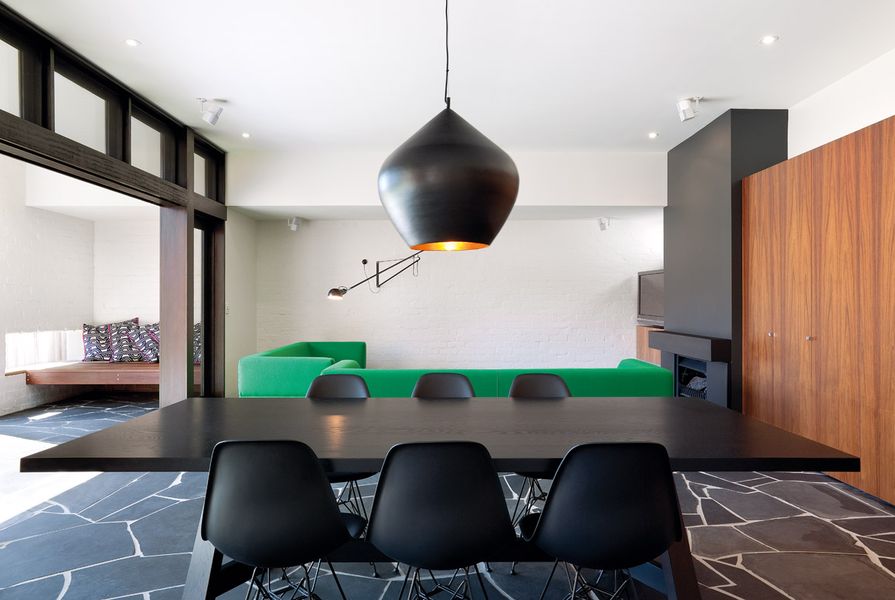
Dark timber beams, white-painted brickwork and a block of timber veneer storage are robust and family friendly.
Image: Emma Cross
The kitchen bench too is a hard-working element that evidences the team’s efficient planning. A step up from kitchen to dining and living space means the bench operates at two heights – from the kitchen side, it is the perfectly sized work surface; from the dining side, it is a desk, sideboard or casual table.
Solid materials and a pared-back aesthetic lend the project a hint of seventies charm. It’s not overt or overplayed, but subtly realized in the extension’s detail. “With those early seventies houses, when you saw something new or exciting or innovative in architecture or design, it had such pull when you were young. That period of architecture always appealed to us,” Rachel says. “There’s a lovely weight and mass to those materials – when you break it down, that’s why you love it.”
The gestures here are big – from the bulbous pendant light, like an overturned urn with a gleaming gold interior, hanging above the dining room table, and the heavy, dark timber beams that span the rear wall, to the oversized sliding glass panels suspended below them. “They’re top hung,” Rachel explains. “Seeing no track in the ground apart from the grout lines is quite lovely.” They open wide to welcome the garden into the addition.
“We do have a big involvement with landscape – we don’t design without thinking about what might happen outside,” Rachel continues. “We’re not landscape architects, but we could imagine this space with a beautiful lemon-scented gum and the smell of it. A tree in lawn – not quite a suburban gesture, quite a park-like grand gesture where a trunk comes down to the lawn.” Like the extension to the house, the garden design is deceptively simple.

Top-hung sliding doors open wide to connect the indoor space to the swell of lawn in the rear yard.
Image: Emma Cross
A small grove of lemon-scented gums has been planted behind the berm in the north-eastern corner of the garden. Rachel says, “We think quite carefully about how you handle those views beyond. This corner’s handled by landscaping, and the wall does something similar on the other side.”
By making each of the elements work hard, the architects have crafted a series of simple, efficient spaces perfectly tailored to a family with young children. The neat lines of the floor plan belie the thoughtful and refined approach that allows it to so effortlessly meet the family’s brief. Spaces are proportioned for activity; materials were chosen for endurance.
“We like that it isn’t all shiny, that it doesn’t start off that way and degenerate from there. It’s about the spotted gum of the rear wall greying off, and the lovely solidness of the bricks. They’re good materials for a family home, because you don’t feel that it’s so precious it can’t wear,” explains Rachel. “You throw the doors open, you have people over. It’s a space to be shared.”
Products and materials
- Roofing
- Zincalume Trimdek.
- External walls
- Painted brickwork; black-stained horizontal timber shiplap boards; James Hardie Scyon Matrix sheeting cladding system.
- Internal walls
- Plasterboard, painted Dulux ‘Antique White USA’; George Fethers & Co. blackwood timber veneer panels.
- Windows and doors
- Black-stained KDHW window and door frames and strapwork.
- Flooring
- Mintaro black slate crazy paving; Edwards Slate & Stone Black Velvet tiles.
- Lighting
- Flos 265 wall lamp from Euroluce; Tom Dixon Beat light from Dedece.
- Kitchen
- Dupont benchtops in Corian ‘Genesis Bisque’; Laminex ‘Parchment’ flint finish cabinets; Miele oven, cooktop and dishwasher; Abey sink and mixer; AEG Electrolux fully integrated rangehood; Fisher & Paykel fully integrated fridge.
- Heating/cooling
- In-slab hydronic heating; Jetmaster gas fireplace.
- External elements
- Spotted gum curved batten fence; spotted gum bench; black-stained KDHW cruciform column.
- Other
- Horizon sofas covered in green Kvadrat Divina; Flynn table in American oak ebony from Jardan; Black Eames moulded side chairs from Living Edge.
Credits
- Project
- Hickford House
- Architect
- Kennedy Nolan Architects
Melbourne, Vic, Australia
- Project Team
- Patrick Kennedy, Rachel Nolan, Catherine Blamey, Matilda Blazey
- Consultants
-
Builder
Greg Scott Constructions
Engineer JSC Consulting Engineers
Interiors Kennedy Nolan Architects
Landscaping Kennedy Nolan Architects
Lighting Kennedy Nolan Architects
- Site Details
-
Location
Melbourne,
Vic,
Australia
Site area 426 m2
Building area 230 m2
- Project Details
-
Status
Built
Design, documentation 6 months
Construction 8 months
Category Residential
Type New houses
Source
Project
Published online: 11 Jan 2013
Words:
Peter Davies
Images:
Emma Cross
Issue
Houses, February 2011