When I ask Keith Brewis, managing partner for international operations for Grimshaw Architects, to explain how the practice came to be involved in the design of the latest addition to Highpoint Shopping Centre in Melbourne’s north-west, he tells me, “Normally, we don’t do retail. Fifty percent of Grimshaw’s portfolio is engaged in trying to civilize heavy engineering.” I can’t tell if the second part of that response is simply intended as background, or as explanation by way of a qualification.
In terms of sheer scale, Highpoint would comfortably compete with many of the infrastructure projects the practice has been involved in. With the new thirty-thousand-square-metre addition, the mall’s floor area now stretches to 156,000 square metres, dwarfing Melbourne’s sixty-thousand-square-metre Southern Cross Station, perhaps Grimshaw’s most well-known local work.
“Civilizing” would also be a good way of describing what Grimshaw has attempted to do with Highpoint, now the third largest shopping mall in Australia.
The architect Victor Gruen is widely credited with the design of the first modern shopping mall, built in 1956 in Minnesota, in the US. The townscape of Gruen’s native Vienna inspired his original vision, which was a heterogeneous mix of parks, residential dwellings and community amenities hung around a pedestrian-friendly shopping centre. Only the retail component was ever built, and the shopping mall typology went on to become the anti-urban, homogenized vanilla box we know it as today – a machine for shopping, sealed off from both its climate and its context by airconditioning and acres of asphalt car park.
Over the past decade, though, the mall has been undergoing a bit of a makeover. Concerns about its social and environmental sustainability have converged neatly with pressure on its economic model from online shopping. Suddenly, radical urban notions, like how you make a place attractive to people and pleasant enough for them to spend time in, are back on the shopping list for big retail.
The GPT Group would be one of the more progressive players driving change in the retail sector. As Australia’s oldest property trust, it has been responsible for a number of benchmark retail projects, most notably Rouse Hill Town Centre by Allen Jack + Cottier, Group GSA and Rice Daubney, which won the Australian Institute of Architects’ Walter Burley Griffin Award for Urban Design in 2008, drawing praise for its sustainability and good practice town planning. In 2006, The GPT Group bought a 50 percent stake of Highpoint from the Besen family, the mall’s long-time owners. Shortly after, plans were afoot for a $300-million expansion.
To hear Brewis and Grimshaw associate director Jason Embley talk about the project is to be reminded of Rouse Hill Town Centre – the pair describe sustainability as a key driver in the brief, as well as the need to draw connections to place, both culturally, in terms of the area’s demographic diversity, and physically, in terms of its surrounding environment. As Brewis explains, “We tried to find a language that was appropriate to [Melbourne’s] west … It’s more about character than ostentation. It’s more diverse.”

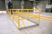
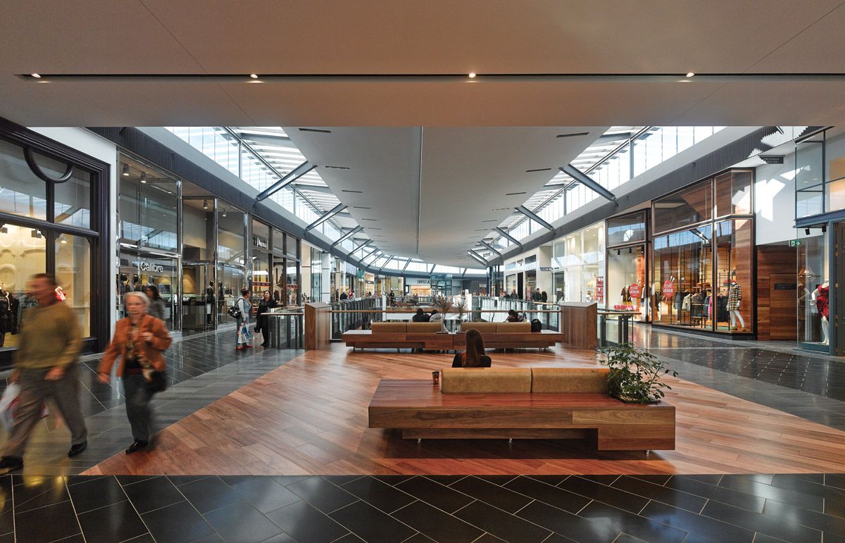
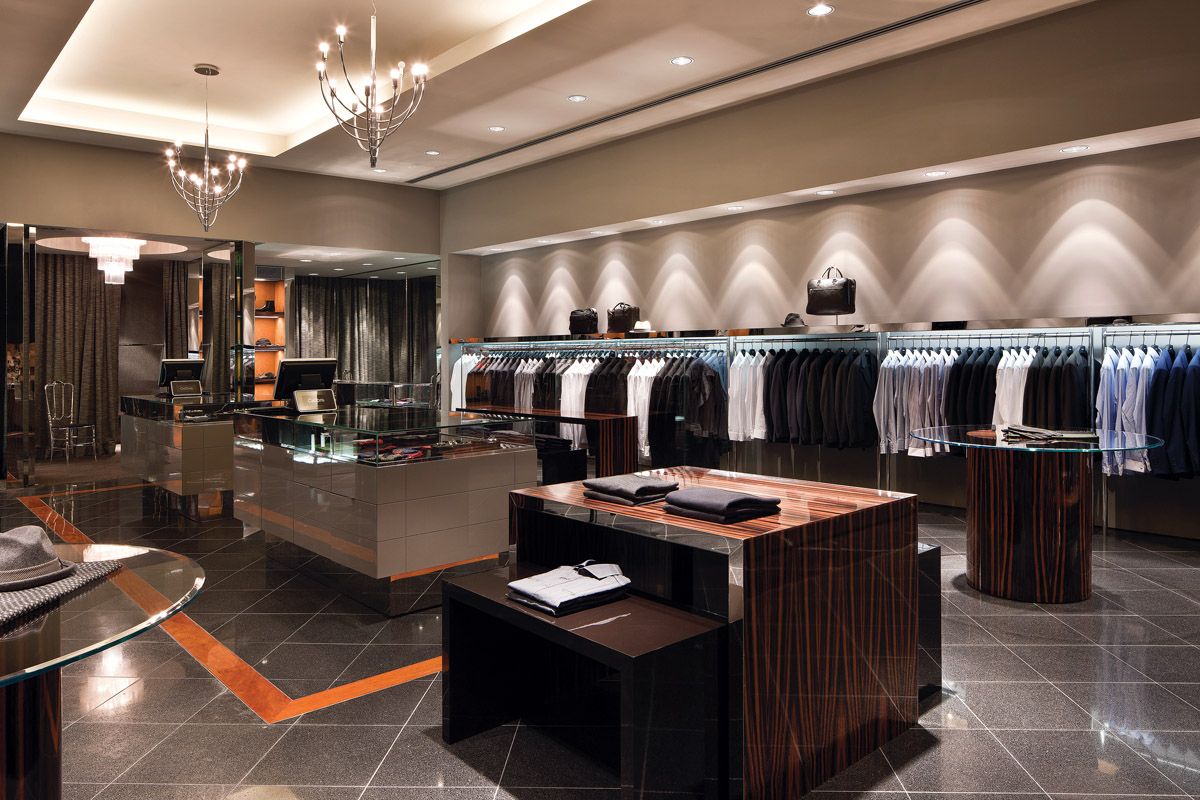
Lounge-style rest settings in the new “crescent mall”.
Image: Peter Bennetts
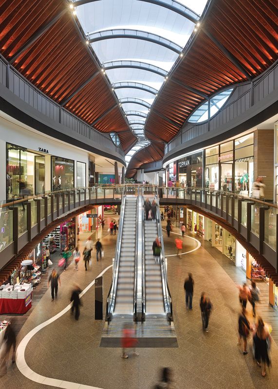
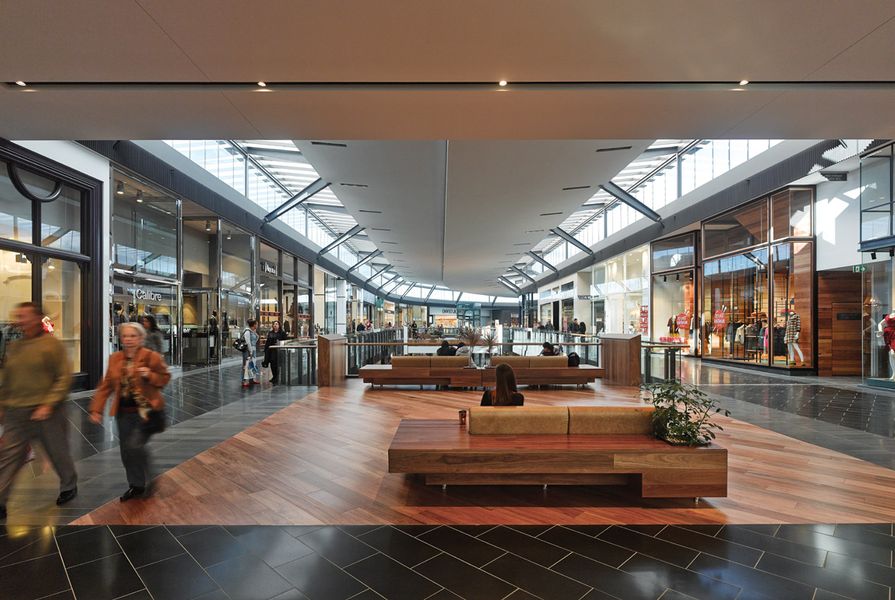
There is certainly a sharp, qualitative difference between the experience of Highpoint’s new addition and its older tracts. The old bits are easy to spot – they’re of the vanilla-mall variety. By contrast, the two new sections, which Embley describes as the “crescent” and “eco mall,” boast natural materials, exposed structures and ample natural light. Importantly, though, they actually feel different, and frankly healthier, thanks in large part to natural ventilation. This flows in through automatically adjusting vertical louvres that sit just below the ceiling plane in the new building’s arcades.
In the crescent mall, so-called because of the sweeping arc it forms in plan, fashion retailers make up the bulk of the tenants. The atmosphere here is fittingly slick – glazing works to flood the space with natural light and floor surfaces are largely bluestone tile, a nod to the site’s previous history as a quarry. The notable exception to this is the spotted gum tongue-and-groove flooring on the bridges that span the arcade. Grimshaw has proportioned these bridges to allow room for both pedestrian circulation and a lounge-style setting; the practice designed the seating, too, as reconfigurable units in warm brown leather and spotted gum. The intention was to create an inviting space where people might find a brief respite from all that feverish fashion shopping – and it works, up to a point (they’re still hovering in the middle of a shopping mall, after all).

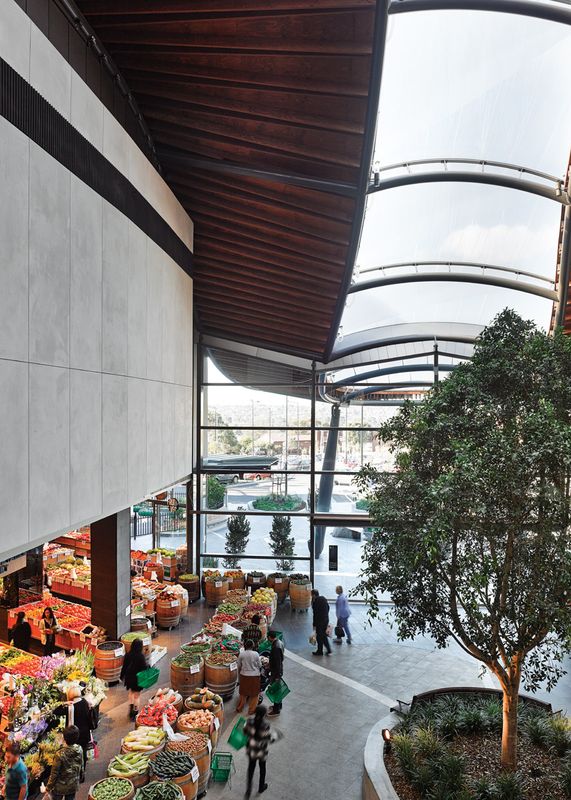
At Highpoint’s eastern entry, mature trees and a greengrocer lend a “public square” feel.
Image: Peter Bennetts
Beyond the natural ventilation and light, though, the design team’s most important accomplishments are the views out. Because of the positioning of the glazing, you see shopfronts against a backdrop of sky, much as you would on a traditional high street. This might seem an inconsequential detail, but it is unusual for a sector that usually prefers to keep shoppers oblivious to the passage of time and the world outside.
The other major component of the expansion is the eco mall. Here, the design’s flavour makes its most obvious departure from conventional vanilla. Where the fashion part of the mall reads as a crescent in plan, the eco mall takes on a snaking, riverine shape. In place of glazing, the roof is translucent Ethylene tetrafluoroethylene (ETFE) sitting on supports of structural steel and laminated veneer lumbar (LVL) beams. This structure, in turn, sits atop solid grey automated louvres (as opposed to the clear glass louvres in the crescent). The combined effect is moodier than what you’d expect in a shopping mall, even a little gloomy in points, but walking this section is easily the most memorable experience of my visit. What struck me most was the considered way the design team and the various consultants have worked to create active, habitable “public” spaces. Plantings feature throughout, with real live plants no less, including mature fruit trees and edible herbs. There is also bespoke seating for visitors to make use of without feeling obliged to buy anything.
The most convincing attempt at placemaking is at the eastern entry, in effect the formal access to the new additions, where you find a public square, of sorts. The square has a trendy-looking cafe facing onto it from the south and a greengrocer to the north, complete with barrels of fruit and veg spilling out into the thoroughfare, market style. It’s a bit of a suntrap and a little centrepiece garden crowned by a mature ficus tree lends it a vaguely idyllic feel. On the day that I visited, it was convincingly alive with people doing all the things people might do in a real town square – shopping, drinking coffee, reading the paper, gossiping. But step through the automatic glass doors, stroll past the contextual bluestone water feature (made, of course, from boulders found on site), and you quickly find yourself adrift in a sea of baking asphalt.
It would be fair to say that for many communities, not just in Melbourne’s north-west, but all over Australia, the mall has become civic space by default. It is refreshing to see a shopping centre undertake the implicit responsibility to provide such a space with a little more humanity and generosity than most. In lieu of any meaningful urban connections or genuine programmatic diversity, civilizing this particular machine was always going to be an uphill battle.
Retail design statements
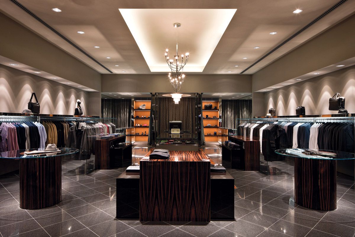
Calibre, by David Hicks

Highpoint Shopping Centre: Calibre by David Hicks.
Image: Shannon McGrath
Having worked with the client for more than a decade, we wanted to push the design for the latest Calibre store towards a more bespoke feel. The store size, along with the client’s willingness to eclipse what other retailers were doing, allowed us to explore this and we opted for a high level of luxury for the store design. Lighting has been used to highlight certain areas of the store such as the central sales area, shoe and accessory shelving and display cases. To create warmth and depth in the design, layers of luxurious materials were used, including high-gloss ebony veneer, starphire glass, carbon fibre, suede wallpaper, knitted wool curtains and terrazzo and mahogany inlaid flooring. The rich palette combined with modernist clean lines has created an international shopping experience for Calibre customers – something that is often forgotten in Australian design. —David Hicks
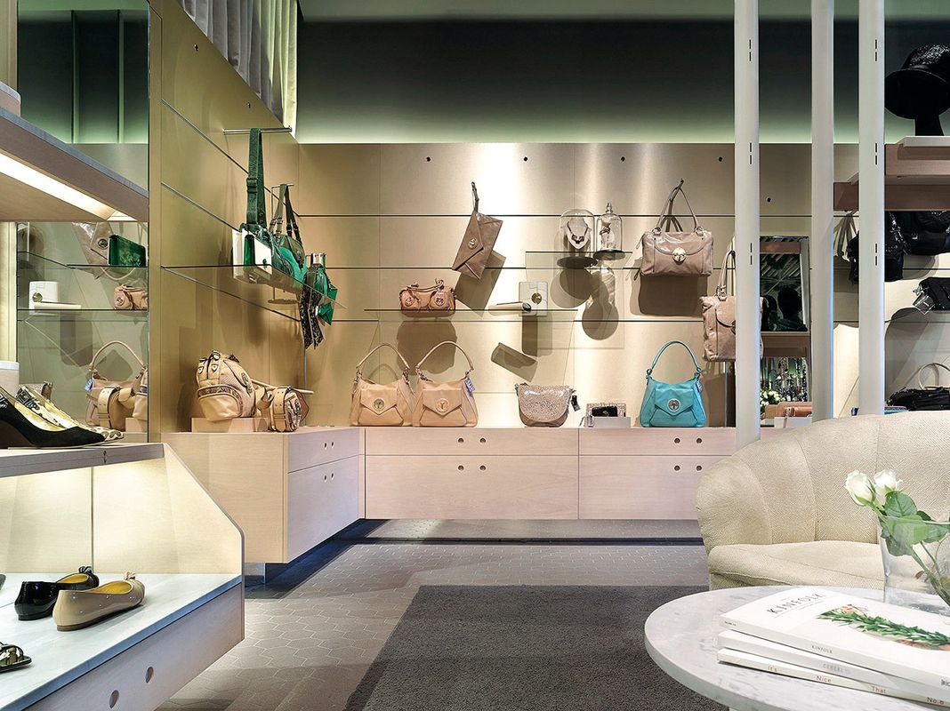
Mimco, by Designoffice

Highpoint Shopping Centre: Mimco by DesignOffice.
Image: Scottie Cameron
DesignOffice worked with the creative team at Mimco to design this new store for the Australian label at Highpoint Shopping Centre. Our aim was to create a wondrous garden salon, inspired by hotel and residential interiors and grounds. The palette mixes reflective metallics, mirror and glass with warm timber, natural stone and soft neutrals to provide a rich and encompassing environment – one that is able to work with the seasonal variations in thehues, tones and scales of the products.
The store is lined with a metallic, champagne-coloured primary merchandising wall and a multilayered shoe proscenium to the rear. This system provides the store with necessary display flexibility and on-floor storage. Central to the space is the folly, a freestanding pavilion that aims to be a new interpretation of the iconic Mimco beauty bar. The folly is a structure of reconfigurable timber rails and trays designed to display scarves, hats, bags and other hero pieces from the collection. It is anchored in the space by a suspended ceiling of greenery and clear acrylic. A complementary family of freestanding floor fixtures completes the suite, accommodating the full Mimco product range. —Designoffice
Urban Attitute, by Meme

Highpoint Shopping Centre: Urban Attitude by Meme.
Image: James Geer
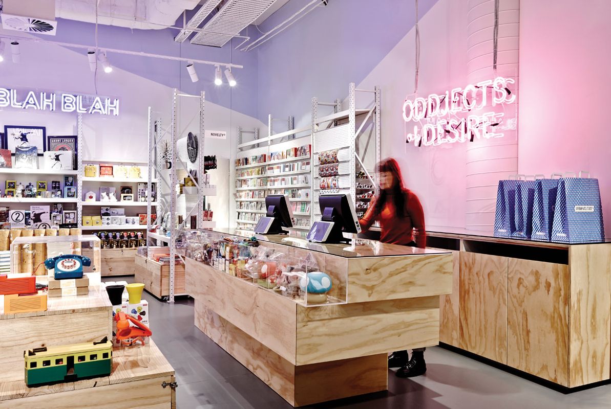
Meme’s design of Urban Attitude’s Highpoint store brings life to the brand, creating a lively, fun, energetic, humorous and young-at-heart character. The design not only draws customers to the store through visual cues such as the playful neon lighting and slogans, but it also provides customers with an enjoyable shopping experience once inside, where they can easily browse the merchandise. The design captivates them, holds their interest, invites them to linger, to explore, to enquire and to purchase.
The store’s look and feel is industrial. Exposed services painted in white create an urban warehouse aesthetic with a twist. The high ceilings of the Highpoint store add to the robust and spacious feel of the shop. The shopfront itself features large glass windows framed in black steel, allowing customers a clear view into the shop. The palette consists of repetitive and uniformed lines and monochromatic colours, which contrasts with the colourful and playful nature of Urban Attitude’s products.
White shelving customized with perforated screens has been used along with plywood storage crates for storage and flat displays. The vertical and horizontal display systems, deliberately controlled by set dado lines, allow product ranges to be grouped by colour, type or size, ensuring easy viewing and access for customers and staff. Custom-made clear perspex cases have been designed to hold fast-selling items and are grouped for easy access.
As part of the project, we provided Urban Attitude with systems and rules for consistent merchandising to be implemented across all stores. The design is practical, distinct to the Urban Attitude brand, and made up of an affordable kit of parts for easy implementation across the stores. —Meme
Rozzi’s, by Mim Design

Highpoint Shopping Centre: Rozzi’s by Mim Design.
Image: Shannon McGrath
Rozzi’s Italian Canteen reflects the heart and soul of Italian food, show-cased in a friendly, home-style kitchen environment. The brief from our client was to create an interior that reflected the menu and the modern, authentic products used throughout. It was also important that Rozzi’s customers “lived” in the space and took ownership of it, making it their own kitchen. Timber floors combined with custom-detailed concrete tiles work to anchor the venue. The bar, central to the interior, is clad in Atlantic blue granite, which offsets the surrounding glazed white bricks and soft black joinery. A series of custom-designed pendant lights, shaped from original Italian wine carafes and oil bottles, line the opening aperture of the venue, creating a soft, glowing look. In Rozzi’s, we wanted to give Nonna’s traditional kitchen a clean and fresh approach and give people a place to enjoy the ambience. —Mim Design
Products and materials
- Walls and ceilings
- Blackbutt and red mahogany class 1 timber slats on external walls. Stainless steel mesh screen with climbing plants. Profiled precast concrete. Eco mall and level 3 ceilings are faceted stained Copperform plywood and stained Casello LVL timber. Central roof light three-layer is ETFE from Vector Foiltec. Level 2 ceiling is off-form in-situ concrete with stained plywood slats. Crescent mall ceiling is white translucent polycarbonate, plasterboard and high-performance glazing roof light. Fresh Food area uses off-form concrete and angled plywood.
- Windows
- Vertical louvres (glazed and metal panel) to the perimeter of each mall connected to BMS by Colt.
- Flooring
- Large-format bluestone tiles. Concrete terrazzo. Spotted gum timber.
- Furniture
- Furniture designed by Grimshaw Architects. Solid timber and spotted gum/leather and integrated planting. Curved, stained plywood with leather and sliced bluestone boulders. Spotted gum, slatted timber to herb planters.
- Bathroom
- Curved Trespa panels to parents’ room and male/female amenities. Curved stone benchtops.
- Heating/cooling
- Perimeter louvres by Colt. Roof lights optimized to daylight. Projecting roof edges to shade facades. Tenancy spill air to provide free cooling.
- Roofing
- Eco roof uses structural timber (LVL) from Casello, Stilcon steel and exposed plywood soffits from Copperform. Undulating form is clad with zinc.
- External elements
- Large-format sawn bluestone paving. Cut bluestone boulders. Water feature. Edible landscape with fruit trees and herbs in planters are free to take home.
- Other
- Art installation by Kerrie Poliness.
Credits
- Project
- Highpoint Shopping Centre
- Architect
- Grimshaw Architects
Australia
- Project Team
- Keith Brewis, Tim Cox, Jason Embley, Alastair Hudson, Richard Morrell, Cameron Ritter, Jarrod Smith, Neil Stonell, Michael Wu
- Consultants
-
Architect
The Buchan Group
Builder ProBuild
ESD Arup
Flooring De Fazio
Landscaping Rush\Wright Associates
Lighting Electrolight
Project manager APP Corporation
Services engineer Simpson Kotzman
Structural engineer Baigents
- Site Details
-
Location
120-200 Rosamond Road,
Maribyrnong,
Melbourne,
Vic,
Australia
- Project Details
-
Status
Built
Design, documentation 18 months
Construction 28 months
Category Commercial, Interiors
Type Retail
Credits
- Project
- Calibre
- Design practice
- David Hicks
Richmond, Melbourne, Vic, Australia
- Project Team
- David Hicks
- Consultants
-
Builder
Krueger Shopfitters + Commercial Interiors
ESD Sustainable Built Environments
Engineer CIR Consulting Engineers
Lighting Masson for Light
Project manager David Hicks
Surveyor Metro Building Surveying
- Site Details
-
Location
120-200 Rosamond Road,
Maribyrnong,
Melbourne,
Vic,
Australia
- Project Details
-
Status
Built
Category Commercial, Interiors
Type Retail
Products and materials
- Walls, ceiling and joinery
- Lumiere and Mystere curtains by Warwick Fabrics. CREA Metal Selenio Gold joinery wall lining by Halifax Vogel Group. Elba Marble finishes from Artedomus. Beech and maple veneer and solid timber joinery.
- Doors
- Custom beech and maple timber veneer doors.
- Flooring
- Zahna Fliesen Industrial Hexagonal floor tiles by Ceramic Solutions.
- Furniture
- Vintage lounge chair by Geoffrey Hatty. Custom-made daybed and table.
Credits
- Project
- Mimco
- Design practice
- DesignOffice
Melbourne, Vic, Australia
- Project Team
- Mark Simpson, Damien Mulvihill, Karina Harvey, Peter King
- Consultants
-
Project manager
Natasha Raykhtin, Country Road Group
- Site Details
-
Location
120-200 Rosamond Road,
Maribyrnong,
Melbourne,
Vic,
Australia
- Project Details
-
Status
Built
Design, documentation 4 months
Construction 3 months
Category Commercial, Interiors
Type Retail
Products and materials
- Flooring
- Sikafloor in Dusty Grey.
- Lighting
- Lighting by Ambience. Neon designed by Meme, made by Premier Graphics.
- Furniture
- Meme customized steel racking system to suit giftware range.
Credits
- Project
- Urban Attitude.
- Design practice
- Meme Design
Balaclava, Melbourne, Vic, Australia
- Project Team
- Megan Hounslow, Melanie Beynon
- Consultants
-
Builder
Storepro
Lighting Ambience Lighting
- Site Details
-
Location
120-200 Rosamond Road,
Maribyrnong,
Melbourne,
Vic,
Australia
- Project Details
-
Status
Built
Design, documentation 2 months
Construction 2 months
Category Commercial, Interiors
Type Retail
Products and materials
- Walls and ceilings
- Euroa Clay Products glazed bricks in Satin Off White to external elevation and in Silver Black (matt) and Wattle in external feature stripe.
- Windows
- Interpon Black Sable powdercoated aluminium.
- Flooring
- French oak timber boards from Timber Flooring Services. Encaustic cement tile in custom colours from Bespoke Tile & Stone.
- Lighting
- Aglo Systems custom lighting using wine carafes and oil bottles.
- Furniture
- Custom tables using timber from Mafi timber. Porta Venezia chair by PGR Furniture. Stools by Meizai.
- Kitchen/bar
- Commercial-grade equipment with stainless steel benchtop and splashback surfaces.
- Other
- Custom-coloured feature tiles by Bespoke Tile & Stone. Custom lighting by Aglo Systems. Menu, uniform, coffee cups and collateral by Mim Design.
Credits
- Project
- Rozzi's
- Design practice
- Mim Design
South Yarra, Melbourne, Vic, Australia
- Consultants
-
Builder
Elmdane
ESD Ambient
Engineer Elmdane
Lighting Ambient
Project manager Elmdane
- Site Details
-
Location
120-200 Rosamond Road,
Maribyrnong,
Melbourne,
Vic,
Australia
- Project Details
-
Status
Built
Design, documentation 2 months
Construction 1 months
Category Hospitality, Interiors
Type Restaurants
Source
Project
Published online: 5 Feb 2014
Words:
Maitiú Ward
Images:
James Geer,
Peter Bennetts,
Scottie Cameron,
Shannon McGrath
Issue
Artichoke, September 2013