It would seem that designers never wear their credentials as strongly on their sleeves as when they design the spaces in which they realize their work. For small-scale design operations with razor’s-edge cash flows, the idea of lavishing funds on the fitout of their own studio is only a dream. For larger corporate design firms, the branding – or in many cases rebranding – of their work space is an essential component of marketing (both to clients as well as peers within the design community) and market positioning. In the past two years major practices such as BVN (see BVN Sydney studio) and Woods Bagot (see Woods Bagot Sydney studio) have grabbed much attention with the designs of their respective Sydney premises. Jackson Teece has followed suit with its new offices in Walsh Bay, on the harbour’s edge.
In its forty-year history of architectural and design service, Jackson Teece has accumulated a diverse stable of clients. The positioning and pitch of its new offices needed to adhere to the difficult brief the firm set for itself of addressing its traditional – mainly institutional – client base, while simultaneously promoting its developing business streams and reinvigorated design direction. Through a combination of judicious site selection and a refreshing approach to the interior, Jackson Teece has attempted to shift itself and its image to meet the changing demands of the market. Paul Brace, director of interiors at the firm, comments that it was “a juggling act of comfort and creativity.”

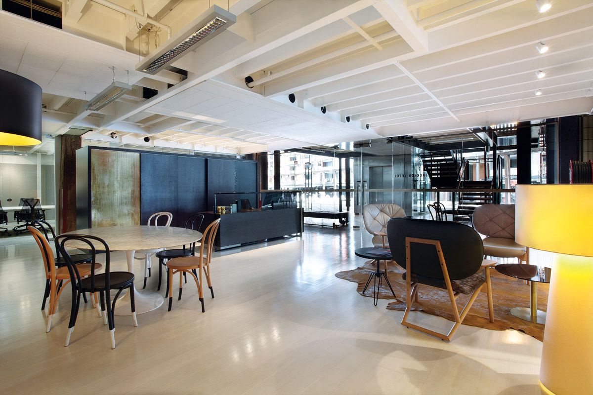
The reception area signals a comfortable and creative space.
Image: Sharrin Rees
The offices are located at Pier 8/9 at Walsh Bay. The design of the reception makes a concerted effort to signal to the visitor that they have entered a space that is free of the pretentiousness that so marked design practices of the nineties and the early noughties. The feel, pitched somewhere between high-end retail and chic urban hotel, is a deliberate typological blur, according to Brace. The reception desk is not monumental, nor overly architectonic in its assertion. Scaled and detailed like a jewellery box, it features flashes of polished gold that pick up on the sparkle of the glistening harbour outside. The storage unit behind, reminiscent of an ebonized Aesthetic Movement screen, restates the black-and-gold theme in perforated metal mesh. Opposite, a loose grouping of Moroso Klara armchairs sitting on a hide rug forms a conversation hub in front of a large-scale abstract landscape painting in bold “outback” tones, while the informal meeting table – placed perpendicularly at the end of the space – defines the limit of the public zone. Refreshingly, Brace handpainted the “socks” on the Thonet chairs around the table, demonstrating the freedom, and in many respects risk, that the firm has taken in presenting its design brand.

The reception area features flashes of polished gold.
Image: Sharrin Rees
One of the main challenges that the relocation to this privileged harbourside location presented was dealing with the physical constraints of the space, with Brace stating of the move, “We didn’t have the luxury of scale.” The fifty or so staff had to be reaccommodated from an office of 850 square metres to one of half the size. In order to maximize the amount of space allocated to the workstations many traditionally discrete spaces have been amalgamated into the reception area, whose configuration and furnishing supports meetings, activity-based work, spontaneous discussions and socializing.

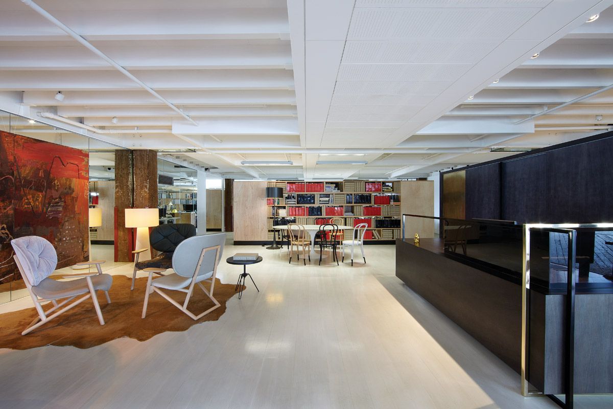
Plywood was chosen as the principal material for the box units.
Image: Sharrin Rees
The spatial efficiency that the self-imposed downsizing has brought about has also been translated to the configuration of the workspaces. Referencing the industrial heritage of the site, which could not be any more Sydney, Brace chose to use plywood as the principal material for the box-like units that form the banks of shelves and display. A modular system of “shelf and end” was based on standard sheet sizes, reducing waste to a minimum and maximizing economy. Brace prefers to describe this approach as “sensible” rather than “sustainable” as he believes that this should be an underlying principle of all design decisions. The use of these plywood units meant that no new plasterboard walls had to be built in the space, allowing views to be maximized from the workstations as well as increasing access to natural light. The furniture used in the project is a mix of new pieces and furniture brought over from the previous premises, unpacked, as it were, with the plywood crates.
While the churn rate for office fitouts may not have eased up, the perceived pressure to dispose of the past and buy up the future with regard to fittings and furnishings has come into question post GFC. In all three of the recent revamps of venerable Sydney architectural practices the clean-cut, all-black-wearing look has been softened with texture, tone and a bit of a three-day growth. Whether this signals a genuine shift in the way practice is realized and represented, or if it is just another season in fashion, remains to be seen.
Design statement
The brief for this project was to create a new environment for Jackson Teece, a forty-year-old design firm that works on architecture, infrastructure, interiors and heritage projects. The design had to represent a vigorous creative company, reflect the company’s new directors and retain visual approachability to its long-standing client base.
The new office is a 480-square-metre rectangular tenancy within a historic wharf at Walsh Bay. A budget of five hundred dollars per square metre was set to cover everything from floor finishes to desks and boardrooms. With glazing to three sides of the office and views of the harbour from all locations, the design approach was to create order in the office using desks and storage pods running perpendicular to the skin, to enable cross views and a sense of openness.
The office shell has enormous visual texture, with the storage pods conceived as monolithic colour blocks that modulate in size and arrangement. A pale plywood palette was selected for its presence, but does not overwhelm the historic fabric and view. The “order” of the storage units defines breakout spaces, the reception, workspaces and amenity spaces without the use of plasterboard walls or enclosed spaces. —Jackson Teece
Products and materials
- Walls and ceilings
- Plasterboard internal walls, painted in Dulux ‘Natural’ white. Ceilings are part of the underside of the structural floor plates, painted white.
- Doors
- Syncopation carpet tile in ‘Beach’ from Interface. Existing timber floor limewashed. Cow hide in ‘Mustard Tecno’ from NSW Leather Co.
- Flooring
- Reception features surface-mounted downlights from Reggiani. Flos ‘Spun’ floor lamp in black from Euroluce.
- Lighting
- Reception features surface-mounted downlights from Reggiani. Flos ‘Spun’ floor lamp in black from Euroluce.
- Furniture
- Morosa Klara armchair. Moroso Diesel collection coffee tables in ‘Indigo.’ Tom Dixon Flash Circle coffee table. Saarinen black marble dining table used as meeting table and oval white marble dining table used as meeting table. Desks and tables by Schiavello. Thonet Bentwood chairs.
- Kitchen/bar
- White laminate and mirrored splashback. Zip instant boiled and chilled water tap.
- Other
- Elizabeth Cummins artwork in reception.
Credits
- Project
- Jackson Teece Sydney office
- Design practice
- Jackson Teece
Walsh Bay, Sydney
- Project Team
- Paul Brace, Uta Wolf
- Consultants
-
Joinery
GDK Group
- Site Details
-
Location
Ground Floor, Lot 1, Pier 8/9, 23 Hickson Road,
Walsh Bay,
Sydney,
NSW,
Australia
Site type Urban
- Project Details
-
Status
Built
Design, documentation 2 months
Construction 2 months
Category Commercial, Interiors
Type Workplace
Source
Project
Published online: 7 Feb 2014
Words:
Sing d'Arcy
Images:
Sharrin Rees
Issue
Artichoke, September 2013