When Lord of the Fries approached Byron George and Ryan Russell to design their latest chains at Melbourne’s Northland and Chadstone suburban shopping centres (and more recently at Melbourne Central), they were asked to envision a “future diner.” George and Russell have previously worked together in various capacities, but this was their first equal collaboration on all aspects of the job. Alternating as winners of the Best Retail Interior at the Idea Awards for the past three years and having both been named the best Emerging Interior Design Practice at the Interior Design Awards, the pair came together with an impressive background.
Designing for fast-food outlets is more complex than one might think. Designers need to be able to articulate and reinforce the branding concept, produce identifiable outcomes that can work in a variety of locations, and deal with the complexities of back-of-house requirements and individual site constraints. While established fast-food chains like McDonalds have rebranded by de-branding, a number of new chains have sprung up around Australia that aren’t shy to brand up in a hip, gen-Y style.
What most differentiates Lord of the Fries from other fast-food chains is that it is vegetarian, aiming to produce the perfect fries from Australian spuds. This simple concept began in 2004 as a mobile van that travelled around Australia and its success led to the opening of its first permanent home on the corner of Flinders and Elizabeth streets in Melbourne, where vegetarian burgers were added to the menu. More outlets, including the ones designed by George and Russell, soon followed.
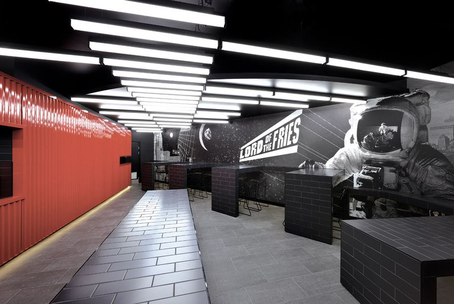
George and Russell’s suite draws on an industrial aesthetic inspired by shipping containers and expressed as a glossy red food servery. Combined with a few other tricks, this exhausted reference becomes the main ingredient and works extremely well in a fast-food context. Like the food, the red, black and white design palette is bold but simple – the signature red counter is combined with pictogram graphics, spacey futuristic wall art (designed by Brendan Elliott from B&Co.), diagonal fluorescent lighting, concrete floors and tiled “subway” surfaces. The effect is a Flash Gordon post-apocalyptic urban industrial aesthetic with a touch of nightclub chic.
The mix works well to provide a robust but flexible design where the base branding ingredients remain the same and what changes from site to site is the way the shipping container reference is expressed, along with minor variations to the furniture design and different interpretations of the wall art. At Northland, for example, the image of the shipping container is most explicit due to its size – it reads as an object within the space that “contains” the kitchen and serving staff. At the smaller Chadstone site, it flattens to become a facade to the serving counter but still retains its recognizable image. On the whole, George and Russell’s scheme is edgy and critical – a space-age futuristic theme positioned within the context of a consumerist retail environment absent of future visions.
Credits
- Project
- Lord of the fries
- Design practice
- Russell & George
Melbourne, Vic, Australia
- Project Team
- Byron George, Ryan Russell, Emily Shannon, Anna Rabaa
- Site Details
-
Location
Melbourne,
Vic,
Australia
- Project Details
-
Status
Built
Category Hospitality, Interiors
Type Restaurants
Source
Project
Published online: 1 Mar 2010
Words:
Christine Phillips
Images:
Dianna Snape,
Tim Griffith
Issue
Artichoke, March 2010