
The north-facing playroom is adjacent to the main living area. Stringybark floorboards provide a warmer surface for the children to play, compared to the exposed and sealed concrete slab in the living space.
Image: Shannon McGrath
The modern fixation with privacy, and inner-city councils’ propensity to institute heritage overlays, have conspired to confine the vast majority of alteration and addition work to the rear of residential allotments. The most obvious result has been a proliferation of light-filled, garden-oriented lounge–kitchen–dining spaces. Indeed, they’re everywhere. They’ve become the bread-and-butter job for the twenty-first-century residential architect/designer/builder, which would be great if that translated to suburbs loaded high with hunks of still-warm organic sourdough slathered in Lescure Beurre des Charentes. Sadly, no.

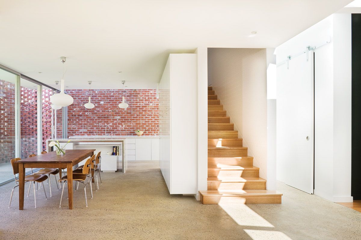
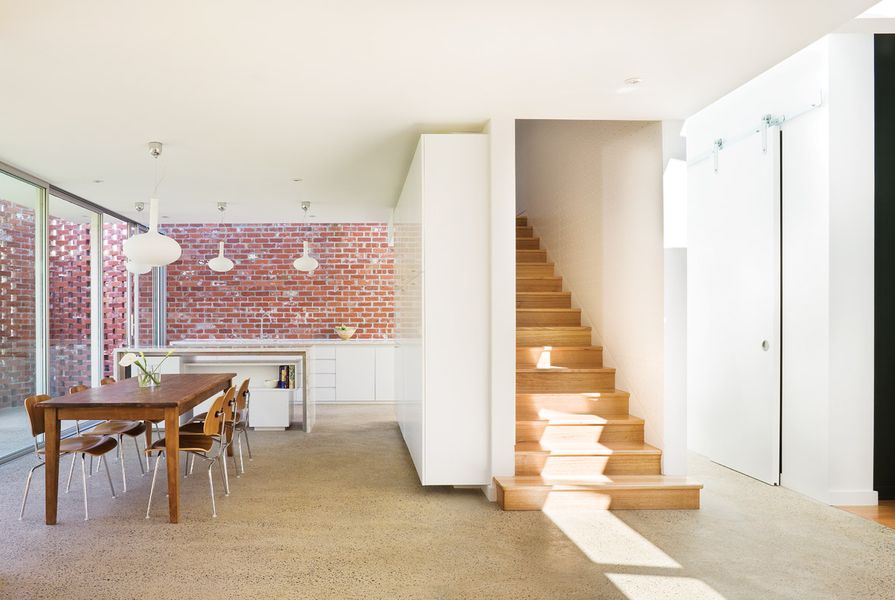
The connection between the new addition and the existing structure is defined, yet a material connection is established through the use of recycled red bricks.
Image: Shannon McGrath
For those of you now lost in bakery-scented reverie, let me drop the metaphor and bring you back on message: lots of renovations just don’t work. Myriad failings bring these refurbished houses undone, but two are particular bugbears for Melbourne architect Leanne Zilka: a poorly defined relationship between the new addition and the pre-existing structure, and failure to truthfully address the limitations presented by cellular floor plan elements retained from the original home. As Leanne contemplated the impending alteration of her family’s Edwardian in suburban Armadale, these challenges were at the forefront of her mind. Happily, in the hands of this architect, they became opportunities for experimentation and invention.
“For alts and adds, I think the key is to design the house so that the new part has something to say to the old,” says Leanne. “With this one, I really wanted to establish a material connection between the existing house and the renovation, and the brickwork provided the perfect medium. Edwardians have these beautiful exposed terracotta bricks but they don’t make them any more, so we had to hunt around for a good match.”

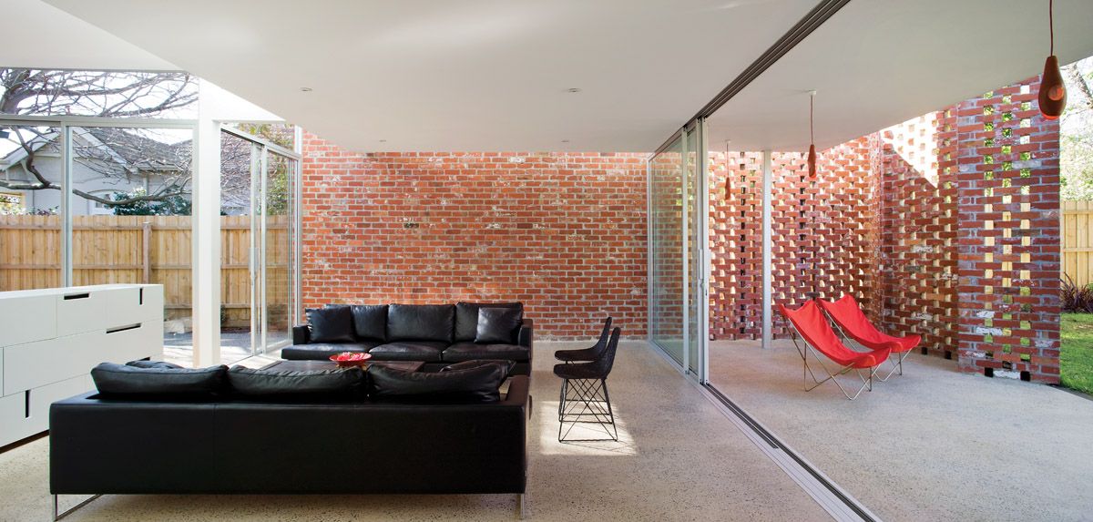
The upper-level projection and the continuation of the brickwork provide a sheltered outdoor space.
Image: Shannon McGrath
After some searching, an inner-city demolition site eventually yielded the required quantity of vintage red bricks, and the original brick walls were extended to accommodate the new addition. However, in a departure from the robust Edwardian bond, they break apart into perforated screens that fold around the rear of the house to form a neat, partially enclosed courtyard. Leanne likens the effect to “opening a curtain,” and the description is apt – the screens, one on each side of the rear elevation, frame a panel of aluminium sliding doors and are at once solid and transparent. Direct eastern sun is translated into gentle patterns of dappled light and shade, providing the interior with a serene sense of connection to the outdoors (a deciduous elm in the adjacent property adds to the effect, giving shade in summer and access to northern light in winter).
Inside the addition, the bricks’ imperfect red surfaces provide a warm, human counterpoint to the flawless white walls and joinery of the kitchen, dining and living zones. Nearby, an enclosed stair to the first-floor sleeping quarters continues the twin themes of perforation and dappled light. The stairway is clad in perforated MDF panels, finished in white 2-pac, that mitigate the glare of western sunlight and throw an ever-shifting matrix of bright dots onto floor and walls.

Seen from the garden, the rear elevation seems as a simple white box crossed horizontally with a strip of windows. It appears to levitate above full-height glazing on the ground floor.
Image: Shannon McGrath
In contrast to the sense of connection to the earth conveyed by the Edwardian brickwork, the rear elevation is characterized by a distinct sense of weightlessness. Viewed from the garden, the upper level appears as a simple white box crossed horizontally by a Ned Kelly strip of windows. With major structural elements hidden from view, floor-to-ceiling glazing on the ground floor and skylights around its periphery, the box seems to levitate above the kitchen–dining–living space. The hole-punched brick screens flank the scene and once again recall curtains, although this time perhaps the curtains of a magician’s closet.
Clearly, Leanne has answered the question of connection between old and new, front and back, in emphatic terms. But what about her other point of consternation – the quaint (read: poky) room at the front? Thankfully, the architect already knew what many have to learn the hard way: a dingy living room with small windows, freshened up with paint, wallpaper and expensive furniture in a combination determined by the designer zeitgeist – and relabelled on the plans as “sitting room” or “formal lounge” – is still a dingy living room with small windows. Without major structural work or a complete programmatic rethink, the odds are in favour of it being left abandoned by the occupants for the bright new open space out back..

The front room has been assigned as a TV room and study. Rich blue walls and plush grey carpet suit the room’s new function.
Image: Shannon McGrath
Leanne’s solution was profoundly simple – she acknowledged the limitations of said front room (gloomy and cellular), assigned a function to it that made the most of its characteristics (study and TV room), and decorated the space accordingly (rich blue walls and grey plush carpet that wouldn’t look out of place in an art-house cinema). This not only makes the most of the existing room, but also allows for a dynamic occupancy of the entire building. The isolation of media consumption to a single room at the front of the house means that the open-plan living area at the rear can be a truly social space, as the family cooks, eats and talks without the distracting babble and flash of a mile-wide, wall-mounted LCD screen and 5.1 surround sound.
The originality of thought, refinement and artfulness displayed in this revitalized old house, in terms of both utility and aesthetics, makes a mockery of catch-all labels like “alt and add” and, yes, journalistic generalizations like “bread and butter”. It’s one of a kind, a solution to a discrete set of problems, and an excellent advertisement for acquiring the services of an architect.
Products and materials
- Roofing
- Patched existing terracotta roof; Lysaght Klip-Lok; Bradford SoundScreen rockwool batts.
- External walls
- Exposed recycled red brick; HardiTex, finished in Dulux AcraTex.
- Internal walls
- Recycled red brick; plasterboard, painted; perforated MDF finished in satin polyurethane.
- Windows
- Sashless; natural anodized aluminium sliding windows and skylights.
- Doors
- Designer Doorware hardware; natural anodized aluminium sliding doors with recessed tracks; Centor A6 top-hung exposed sliding door track.
- Flooring
- Supertuft carpet; stringybark floorboards, matt polyurethane finish; grind and sealed exposed aggregate concrete slab.
- Lighting
- Euroluce internal and external lights; Artemide bathroom lights; Titan downlights.
- Kitchen
- Miele oven and cooktop; Qasair rangehood; Asko dishwasher; KWC kitchen mixer; reconstituted stone benchtops; satin white polyurethane joinery.
- Bathroom
- Caroma toilet suites; Reece tapware; Dorf showerhead; Laminex.
- Climate control
- Daikin airconditioning; hydronically heated slab on ground.
- External elements
- Bluestone paving.
- Other
- Custom-made cabinetry and TV unit.
Credits
- Project
- Material connection
- Architect
- Zilka Studio
Armadale, Melbourne, Vic, Australia
- Project Team
- Leanne Zilka, Jun Nakanishi
- Consultants
-
Builder
Craftsmen Contractors
Engineer Perrett Simpson
Landscaping Zilka Studio
Lighting and interiors Zilka Studio
Quantity surveyor Prowse Quantity Surveyors
- Site Details
-
Location
Armadale,
Melbourne,
Vic,
Australia
Building area 287 m2
- Project Details
-
Status
Built
Design, documentation 12 months
Construction 13 months
Category Residential
Type New houses
Source
Project
Published online: 1 Apr 2010
Words:
Mark Scruby
Images:
Shannon McGrath
Issue
Houses, April 2010