When renovating, there is often a temptation to overdo things – to maximize the size of spaces or add more rooms than necessary. The owners of Nat’s House, a three-bedroom Federation villa in Cammeray, Sydney, were confident about what needed to be done and engaged Studio Prineas to improve the existing rear extension, which accommodated the kitchen, dining and family rooms, laundry and second bathroom. “Our clients were realistic about their budget. They prioritized high quality over extra space and multiple bathrooms,” says principal Eva-Marie Prineas. They also wanted to capture northern light, create a strong indoor–outdoor connection and be respectful to their neighbours.
The east–west orientation and next-door house influenced the positioning and form of the addition. Locating it on the southern side of the property would overshadow the neighbour’s garden, while locating it on the northern side would reduce opportunities for sunlight. “We were concerned with achieving a sympathetic and polite result for the conservation area and adjacent house. Our main challenge became an exercise in how we could bring light into the new addition,” Eva-Marie explains.
A study nook with a view out to the garden has been inserted into the centre of the plan.
Image: Chris Warnes
Studio Prineas designed a split-level addition along the northern side of the property. A perpendicular passageway demonstrates the efficiency of space that is evident throughout the extension. It has cupboards and a small study nook on one side, the laundry and second bathroom on the other, and a glass door at the end, which brings in northern light and provides access to the side of the house.
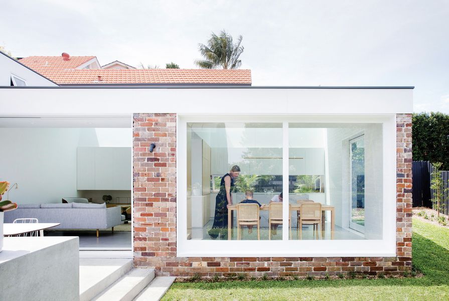
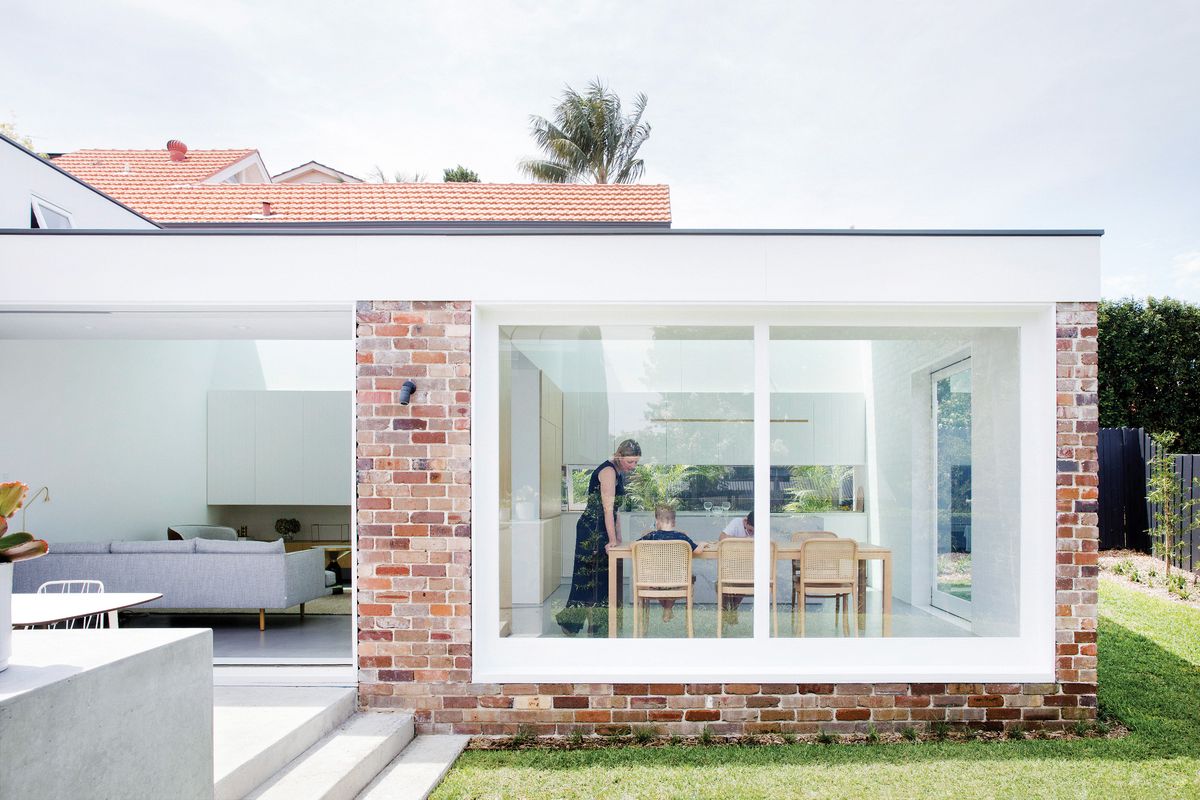
The lounge, kitchen and dining areas are on the lower level of the addition, where they have a physical and visual connection with the garden. By stepping down the site, the recycled red-brick form is anchored to the ground and extra ceiling height is achieved while ensuring that the roof is not visible from the street.
To capture sunlight and minimize overshadowing of the garden, Studio Prineas created a volume with a double-height ceiling and long, narrow skylight to the north, and a roof that folds and slopes to a single-height ceiling to the south. A raked wall on the northern side meets the top of the cupboards, integrating joinery with architecture. The skylight appears and disappears depending on the position from which it is viewed, and the angles and changing ceiling heights provide a sense of loftiness while maintaining the compact scale.
Light becomes the decorative feature of the space as soft, hazy sunlight washes down the raked wall and shifting bands are cast across the floor and wall. The intensity and direction of light also interact with the material palette to accentuate the texture and detail of the grooved panelling and painted brickwork. This tempers the bright, white space as walls, ceilings and cupboards are painted the same colour to appear unified, differentiated by the characteristics of the material. LED lights above the cupboards wash up the rake of the wall at night, in a reversal of the effect during the day, and task lights underneath the kitchen cupboards illuminate the bench.
The space is configured with a subtle shift away from an open-plan configuration so that the living, dining and kitchen areas are defined but connected. This distinction is achieved through an efficient layout and meticulous alignment that make the addition feel contained yet spacious and provide everything the client needs. Each area also has a physical or visual link to the outdoors, expanding the sense of space.
The changing angles and ceiling heights provide a sense of loftiness while maintaining a compact scale.
Image: Chris Warnes
The compact lounge neatly fits a sofa and two armchairs and has a recessed sliding door that opens to the outdoor dining area with a built-in concrete barbecue. Cupboards that appear to be thickened walls partially separate the lounge from the kitchen and dining area, with the alignment of the cupboards demarcating the dining area from the kitchen. Timber joinery conceals the pantry, fridge, freezer, appliances and additional storage, and the simple kitchen island is clad in stone with a soft graphic pattern.
Each space is surrounded by glazing for light and garden views. A large picture window creates a sense of transparency in the dining area, the glass splashback frames views of greenery and a pivoting window – in line with the cupboards – gives a three-dimensional effect to the end wall and allows for cross-ventilation.
Studio Prineas also completed some light cosmetic work in the original house and combined the bathroom and toilet to create a main family bathroom and enlarge the third bedroom.
While the renovation increased the footprint of the house by only nine square metres (from 136 to 145 square metres), it vastly improved both form and function. By bringing in sunlight, using space efficiently and improving the connection to the garden, Studio Prineas demonstrates that good residential architecture is about being better, not bigger. “It’s about getting the design right,” says Eva-Marie. “We kept the footprint small and we didn’t have to compromise.”
Products and materials
- Roofing
- Lysaght Longline in Colorbond 'Woodland Grey'.
- External walls
- Recycled face brick.
- Internal walls
- Face brick in Dulux 'Vivid White'.
- Windows and doors
- Timber frames and doors in Dulux 'Vivid White'.
- Flooring
- Timber flooring, stained; Pandomo concrete finish from Ardex Australia.
- Lighting
- Archier Highline pendant; Douglas and Bec Y Chandelier 03; Flos IC Lights S pendant; custom light fitting at barbecue by the architects.
- Kitchen
- Caesarstone Statuario Maximum benchtops; Eveneer veneer cupboards; Miele integrated Fridge; Liebherr integrated freezer; Fantini Cafe kitchen mixed from Rogerseller; Electrolux barbecue; Smeg appliances.
- Bathroom
- Villeroy and Boch wall-mounted basis; Rogerseller Tonic tapware and mixers; Catalano Sfera wall-hung toilet from Roberseller; Madinoz towel rain in polished chrome.
- External elements
- Sandblasted concrete (terrace); outdoor dining table from Space Furniture; stool from HG Furniture Solutions.
- Other
- Jardan sofa and chairs; Armadillo rug.
Credits
- Project
- Nat's House
- Architect
- Studio Prineas
Sydney, NSW, Australia
- Project Team
- Eva-Marie Prineas, Bridget Webb, Luisa Campos
- Consultants
-
Builder
Focusbuild
Engineer Partridge
Landscape design Serenescapes
Landscaping Grow and Co.
Styling Sarah Ellison
- Site Details
-
Location
Sydney,
NSW,
Australia
Site type Suburban
Site area 396 m2
Building area 145 m2
- Project Details
-
Status
Built
Completion date 2018
Design, documentation 10 months
Construction 8 months
Category Residential
Type Alts and adds, New houses
Source
Project
Published online: 22 Feb 2019
Words:
Rebecca Gross
Images:
Chris Warnes
Issue
Houses, December 2018

