Like much of inner Melbourne, the suburb of Collingwood is undergoing significant transformation, with large swathes of the once-gritty suburb being replaced with medium-scale (and some not-so-medium-scale) residential development. Density is jumping and streets that were traditionally bustling through the day with the comings and goings of the light industry are now busy around the clock. While Collingwood may be known for its AFL team, commission housing and a higher than average number of pubs, its industrial character has made it ripe for new residential development and it is increasingly becoming recognized as the less-gentrified brother to its hipster neighbour Fitzroy.

The upper storeys of the monochromatic form fold and recede to acknowledge and not overshadow the adjacent dwellings.
Image: Dan Hocking
Peel by Milieu is a new residential development straddling the Collingwood and Fitzroy border, designed by DKO Architecture with interiors by Design Office. Occupying a prominent corner position at the intersection of Peel and Wellington Streets, the building sits taller than its close neighbours; however, the mass has been deftly manipulated so that the upper storeys of the monochromatic form fold and recede to acknowledge and not overshadow the adjacent dwellings.
At the ground plane, the thin veil of the white brick cladding is perforated and then peeled back to expose a glass-fronted wine bar named Congress, effectively occupying the front-of-house position. The glazing of this corner is a small civic gesture that improves sightlines through the corner for pedestrians while undoubtedly helping the wine bar gain some exposure. The project team chose a wine bar over yet another cafe, as they wanted to provide a social space for future residents that activated the building at ground level beyond daylight hours.

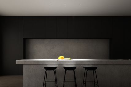
The living space opens out to a generous balcony where concrete panels provide thermal mass.
Image: Dan Hocking
The entrance to the apartments is an under stated, almost invisible glass door, though once inside, the entry sequence is quite dramatic. Bare concrete construction is exposed to one side and the activity of the wine bar is on full display through floor-to-ceiling glass on the other. The entry establishes the cool palette of honest materials that is carried throughout the project, while accentuating the notion that the wine bar really is a second living room for residents. Interestingly, the project eschews the almost obligatory gymnasium, or any other communal spaces, with the rationale that the building’s scale didn’t justify creating one and the area is so well serviced that most residents would become members of many better-serviced boutique gymnasiums in the area.
Further into the building, the lift lobbies are deliberately compact and understated, something that Michael McCormack of Milieu says the property developer insists on for its projects, avoiding long impersonal corridors and imposing a manageable scale of four or five doors per lobby to encourage a sense of community for residents. This is the first of many choices made to foster homeliness within the building, choices that are intrinsic to the building planning, from the meta scale right down to the micro scale of the custom-designed key trays that all residents received upon moving in.

A finely crafted window seat – one of several signature features of the client – provides extra storage space.
Image: Dan Hocking
When visiting one of the eight corner apartments (with thanks to our gracious hosts), both the highly considered planning of the spaces and an exceptional level of detail were immediately evident. At seventy-two square metres the apartment is not large, but for a single-bedroom apartment (or double, if the corner room is used as a bedroom) it is not small, either. The inclusion of an entry vestibule to avoid walking straight into the kitchen and a “corridor” to define the edge of the living area and create an interstitial space to buffer the bedroom and bathroom doors are two examples of how brave planning has segmented the spaces comfortably, rather than attempting to open the plan up at all costs. It is something the residents we spoke with appreciate hugely. While creating an “unnecessary” corridor in an apartment of this size seems counterintuitive, it has turned out, in the eyes of the residents, to be the most inspired bit of planning, along with the incredible amount of built-in storage (which they are yet to fill).

Good access to natural light in all rooms was a priority for the architects.
Image: Dan Hocking
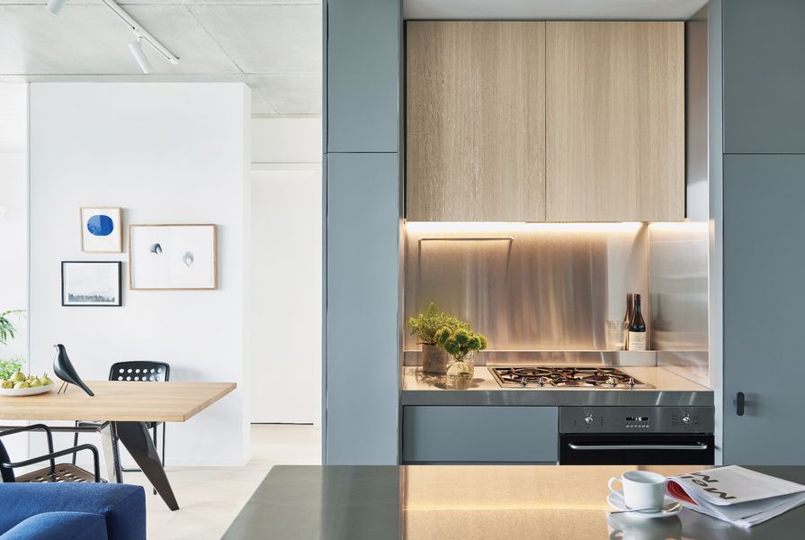
The adherence to a palette of honest finishes is noticeable: the concrete walls experienced in the lobby reappear in the beautifully executed concrete ceilings (it seems all trendy new apartments are obliged to have these now, some better than others), natural stone is used for the generous balconies, cool monochromatic joinery with natural timber and stainless steel carries a consistent bespoke shark-nose detail that elevates each object, and ceilings over the kitchen employ a beautiful, highly detailed series of minimalist coffers to cloak the need for a services zone.
The consistent thoughtfulness throughout the building, always furthering the notion of homeliness over expediency, is what shines through and sets the Peel by Milieu apartments apart. This is a rare example of savvy commercial investment and considerate design principles intersecting to place the experience of the residents equal with, if not above, a healthy bottom line.
Products and materials
- Roofing
- Precast concrete; Kingspan insulation
- External walls
- Robertson Facade Systems Brick Snaps in 'New Diana'
- Internal walls
- CSR Gyprock plasterboard; Dulux paint in 'Natural White' (walls and ceilings) and 'Klute' and 'Tranquil Retreat' (joinery)
- Windows
- Capral aluminium frames powdercoated; Aneeta sashless windows; Viridian EVantage glazing in 'Grey'
- Doors
- Olivari Link door levers from Bellevue Architectural
- Flooring
- Bentzon Carpets Shetland Duo carpet; Britton Timbers Sandwash Oak engineered flooring
- Lighting:
- Sphera Cilindro surface lights, Cono recessed lights and Binario surface track lights
- Kitchen
- Narlam The Oaks veneer; linished stainless steel; Laminex laminate in 'Asphalt'; Smeg oven, cooktop and dishwasher; Raymor Lavas sink mixer from Mico; Duravit Scola basin; Phoenix Mia shower
- Bathroom
- Honed bluestone tiles; Fibonacci terrazzo tiles in 'Dove Grey'
- Other
- Furniture from Living Edge; linen from Linen House Australia; greenery from The Plant Society
Credits
- Project
- Peel by Milieu
- Architect
- Jesse Linardi, Mauro Miglino, Richard Todd, Martin Burzlaff , DKO architecture
- Architect
-
DKO architecture
Melbourne, Vic, Australia
- Consultants
-
Developer
Milieu
Engineer Webber Design
Interior design Damien Mulvihill, Mark Simpson, David Smith, Kat Bond, Phoebe Baker-Gabb
Interior designer DesignInc
Landscape architect LBA Design
- Site Details
-
Site type
Urban
- Project Details
-
Status
Built
Category Residential
Type Apartments, Multi-residential
Source
Project
Published online: 12 Mar 2019
Words:
Brett Seakins
Images:
Dan Hocking
Issue
Houses, December 2018