
Clare Cousins of Clare Cousins Architects.
Image: Peter Bennetts
Discussing the projects featured here, all alterations and additions with similar briefs, Melbourne architect Clare Cousins’s discomfort with self-promotion initially reduces any detailed discussion of her practice down to a single sentence: “Our work begins with trying to identify the nuances of how our clients want to live.” As it turns out, it’s a potent sentence. Exploring these five projects, the implications of this focus on the day-to-day life of their inhabitants becomes increasingly clear.
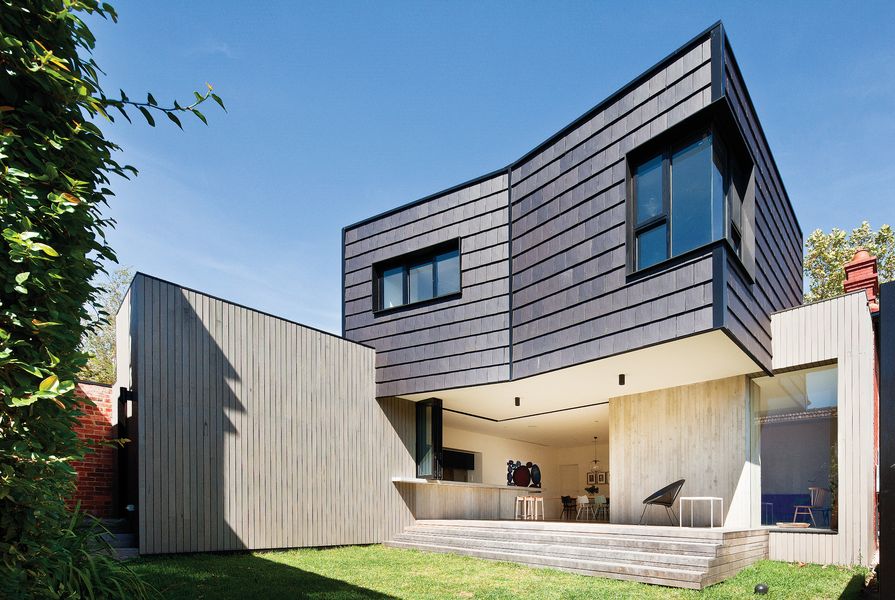
Take the Shingle House, in suburban Armadale. Part of the brief was, inevitably, for a close connection between indoors and out. But in talking through this idea, the client described the casual scenario of making a coffee on one side of the kitchen bench and simply reaching across to pass it outside. This scenario has been realized – sliding doors and bifold panels have been positioned deeper than expected into the ground-floor volume, leaving the kitchen bench partially exposed on the “outside.” This is part of a broader program that includes a cantilevered first-floor extension above a sheltered courtyard space. Off-form concrete has been paired with roof shingles modified to work as vertical cladding, requiring minimal maintenance and providing longevity; and a tightly organized plan, including a powder room and study tucked under and around the stairway, makes the most of a relatively small space.

At the Shingle House, sliding doors and bifold panels are positioned deeper than expected.
Image: Shannon McGrath
This idea of “slipping spaces in,” as Clare refers to it, is central to the design strategy at her own home, the Brick House. The reworking of her family’s single-fronted Edwardian extracts more amenity than you could reasonably expect from the available space. Its curved rear facade drives much of this – on a nine-metre-wide site, its serpentine form delivers seventeen metres of “frontage” to the garden. Instead of the usual approach of positioning a main living space at the rear of the house and having a second one in the old building’s front room (“it would’ve become the ‘formal’ room that never gets used”), the back half of the house incorporates two connected but separate living spaces: one, to the side, provides a space for kids to play without having to tidy up toys when guests visit; and the second, the lounge room, looks out to the rear yard through a curved glass wall. Bucking contemporary convention, this main living space doesn’t provide direct access to the outdoors, but rather feels like a room inserted into the garden. A simple, robust materials palette is again evident, this time with glazed brickwork as a feature.

A glazed brick feature wall complements the simple, robust materials palette.
Image: Shannon McGrath
Bricks also feature in the St Kilda East House. This double-fronted villa technically didn’t undergo an extension, as new architecture replaced a disharmonious palimpsest of ugly additions without increasing the overall size. Parts of the old structure were retained and reimagined, and new sight lines have been opened up, providing connections between spaces where previously there were blank walls and isolated rooms. Interestingly, though, a sense of cellularity from the old house has been retained. “We’re not generally interested in big warehouse spaces out the back of houses,” says Clare. Of greater interest is “spaces revealing themselves” as a house is explored. Two wings push into the backyard, one for living spaces and the other for bedrooms, but rather than closing the two off from each other, oblique viewing lines provide connection.
At the Flinders Lane Apartment, right in the heart of the Melbourne CBD, connection was never going to be a problem. Here, a seventy-five-square-metre single-bedroom apartment has been reworked to fit a second bedroom. Taking inspiration from Japanese architects such as Shigeru Ban and Kazuyo Sejima, and indeed from the urban Japanese way of life, where sleeping quarters are treated with pragmatism rather than romanticism, Clare has applied plywood joinery to divide the space while providing storage in every available location. The apartment’s four-metre-high ceilings meant that a mezzanine loft could be created: the perfect spot for keeping surfboards or, at a pinch, for guests to sleep. Other spaces are given multiple roles, too – for example, the loft ladder provides a series of surfaces for personal effects and knick-knacks, and the main bedroom, raised on a low platform, is reached via ply-clad steps ideal for perching on. This efficiency of space, along with the boundary-blurring effect of matching the plywood joinery to the sanded and limed floorboards and the outlook offered by large windows on three sides, mean that the apartment feels much bigger than it really is.

The choice of materials, along with windows on three sides, allow Flinders Lane Apartment to feel bigger than it really is.
Image: Lisbeth Grosmann
There’s a strong link between the Flinders Lane Apartment and Beach House Mornington. The beach house project, an extension to an old house on the coast south of Melbourne, is a self-contained, one-bedroom treehouse constructed from timber, clad internally in plywood and connected to the main house by a stairway cocooned in translucent sheeting. Like the apartment, the treehouse includes a tiny main bedroom raised on a platform and concealed by sliding panels. Also like the apartment, the treehouse feels much bigger than it really is. With views through gum trees to Port Phillip Bay, and awash with sunlight naturally muted by the raw ply walls, the space is a lesson in understated architecture that preferences the experience of occupation to a pursuit of heroic form.

Beach House Mornington is a lesson in architecture that preferences the experience of occupation.
Image: Shannon McGrath
In many ways this encapsulates Clare Cousins’s architecture. These houses don’t seek to make big external statements; they’re not designed as glamorous objects, with programs fitted in after the fact. On the contrary, they are designed from the inside out, with an emphasis on the finer-grain elements of day-to-day life. Interior architecture is allowed to give these homes character, without relying on wallpaper and soft furnishings, and tough materials such as concrete, brick and plywood are given softer expression through curved shapes or applied textures.
“We like the quietness of our work,” says Clare. “We’re happy when projects work well, when they feel effortless.” For the occupants of these five homes, it seems that the best architecture of all is the architecture that you don’t notice as you go about enjoying your daily life.
Source
People
Published online: 17 Aug 2015
Words:
Mark Scruby
Images:
Lisbeth Grosmann,
Peter Bennetts,
Shannon McGrath
Issue
Houses, December 2014