A commission from a restaurateur starting a new business is tantalizing for any graphic design studio. While creating an identity and design concept that will draw in the hungry (and increasingly food-literate) diners is an enticing challenge, there is also the possibility of sampling every dish on the menu. Because one thing that all the designers interviewed agreed on is that the branding and identity of a new eating place must reflect the philosophy of the food concept and the client.
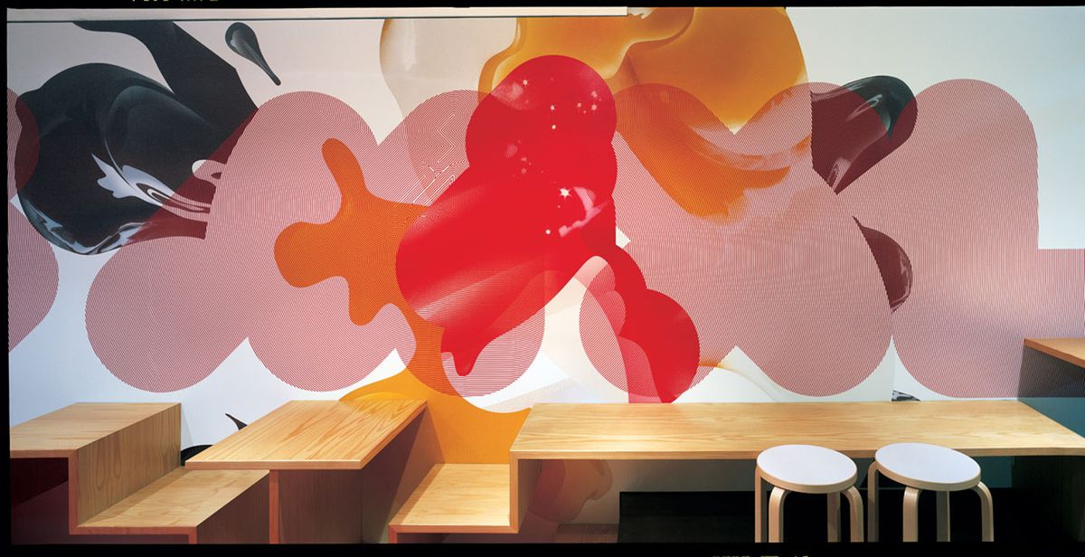
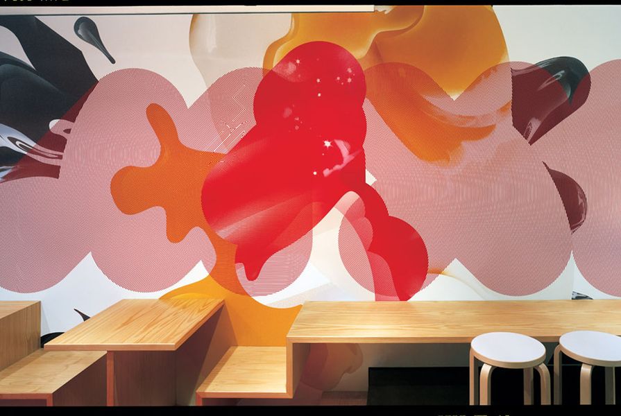
As Fabio Ongarato points out, food is presented to the customer in the context of the surrounding environment. Customers take their cues of what to expect of the food from how they feel when they walk into a space. “Sometimes these expectations are in synch - sometimes they’re almost discordant. We believe in juxtaposition as a means of engagement.” Fabio Ongarato Design has developed identities for a number of restaurants including Salt and Summit in Sydney and Pearl in Melbourne. The studio has also created design concepts for a number of Melbourne eateries including Toasted, Grill’d Healthy and Igloo Zoo. Recently, the practice worked closely with Hassell’s interior designers to develop the design concept for SMXL, a new sandwich bar. “The concept emerged from an over-the-top eighties aesthetic when bigger was definitely better. Zingy colours of chocolate, chilli red and egg-yolk yellow combine with super eighties airbrushed explosions of eggs, noodles and chocolate-coated ice cream.”
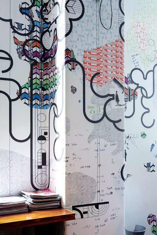
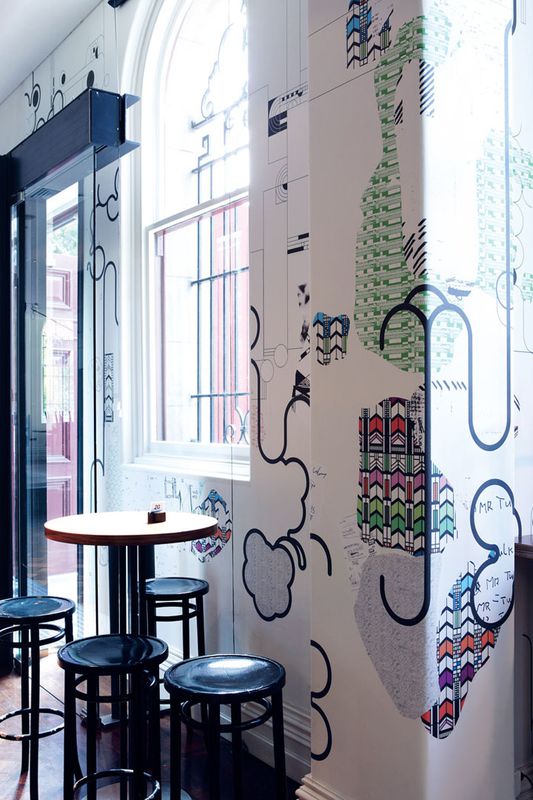
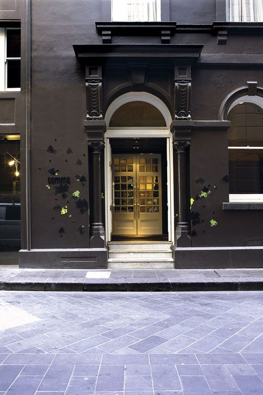
For Fabio Ongarato Design, the name of a restaurant always comes first: “As part of the positioning story, the name anticipates everything else.” Spike Hibberd, the designer who created the identity for Melbourne’s renowned bar Comme and the State Library cafe Mr Tulk, agrees. Mr Tulk is named after the institution’s first librarian, Augustus Tulk, appointed in 1856. Hibberd drew on Tulk’s legacy and the interior designer’s nod to Frank Lloyd Wright’s early American interiors when designing the artwork. A mural on the wall includes writings from Tulk’s diaries and references to his journey from England to Australia. “It helps to define how the name will evoke the essence of the business. Comme, French for “to be”, is more elusive a name than Mr Tulk but is still a starting point for the creative process.” Comme is a contemporary bar in a Victorian building deep in Melbourne’s CBD. “The space needed warmth while having a minimalistic clarity and it had to respond to the Victorian heritage of the building,” explains Hibberd. Unlike Mr Tulk, Comme’s name and identity needed to remain neutral and somewhat subtle as the business is a bar, restaurant and multi-use function space.

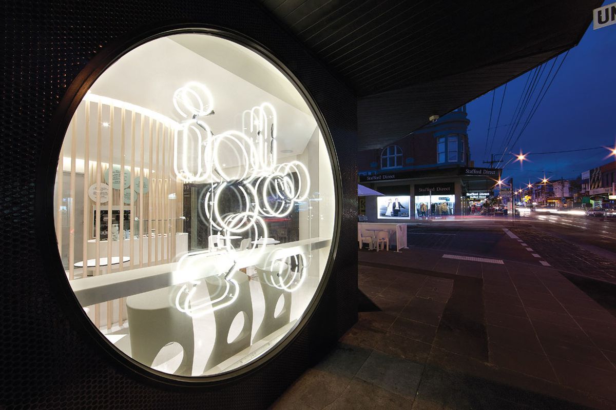
Neon signage for frozen yoghurt store Igloo Zoo by Fabio Ongarato Design.
Image: Dianna Snape
Andrea Benyi and Ariel Aguilera are the enigmatic duo behind Pandarosa, known for their illustrative work seen in projects including Fox Kitchen & Bar in Copenhagen, Farina in Adelaide and Racetrack Cafe in Melbourne. For them, the most important thing to get right is a welcoming atmosphere. “People come to these venues to experience a certain degree of sensual delight (taste, smell, vision) and to take a load off from the everyday … so it’s important to make a mood the patrons feel comfortable in rather than just creating a strong branding image.” As Pandarosa’s graphic work often wraps around walls and across ceilings, messing with ideas of perception, the physical space of a restaurant can determine the overall visual effect.
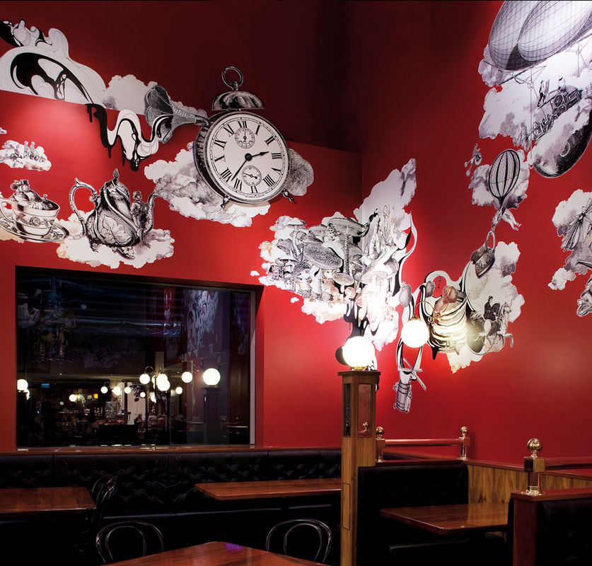
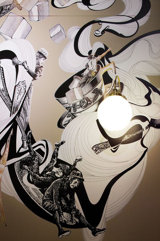
Founded in 1965, the Pancake Parlour is an Australian institution, which has played host to many a children’s birthday party. Qube Konstrukt was commissioned to bring this family-friendly restaurant into the twenty-first century and did so with extensive wall graphics that “tell the story of a great, frantic, surreal air race, the goal of which is to deliver, in time, all the ingredients for the world’s biggest pancake picnic.” The design references the restaurant’s well-known brand of Alice in Wonderland-style whimsy and uses a collage of Victorian etchings woven together with more contemporary elements.
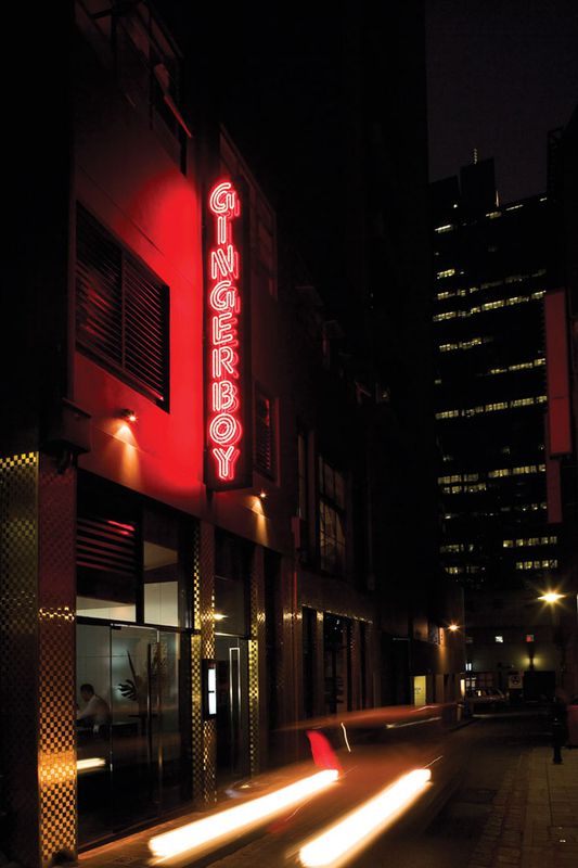
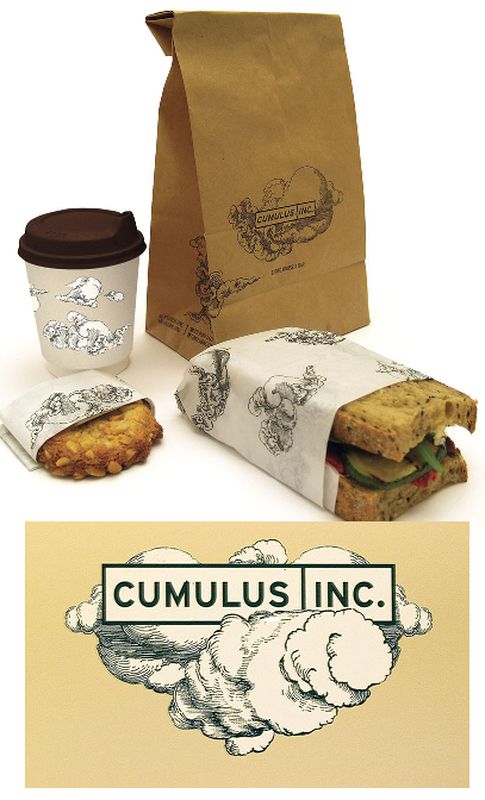
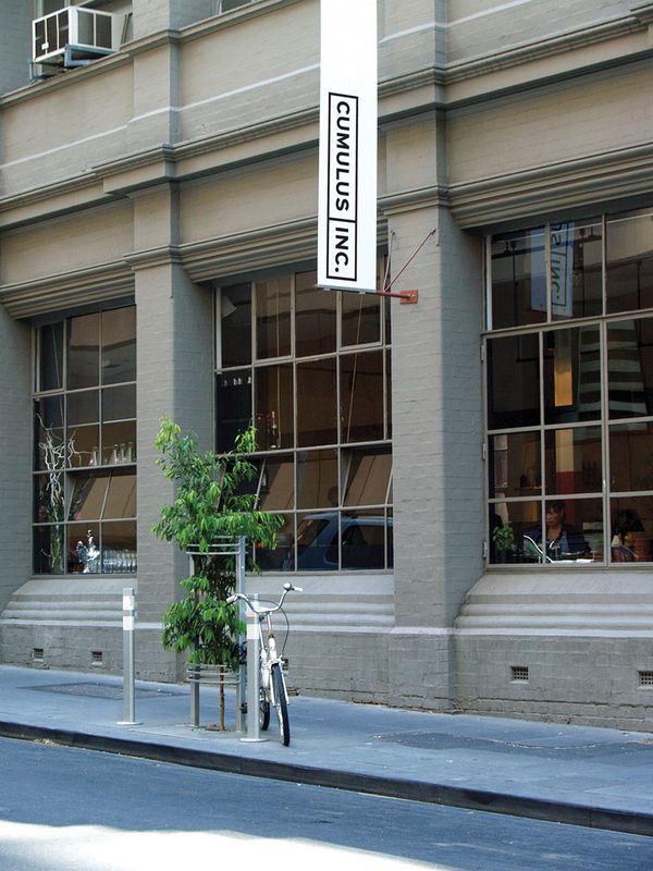
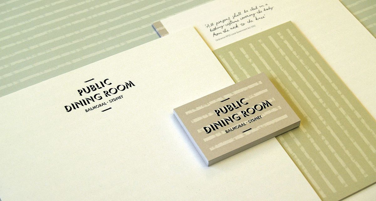
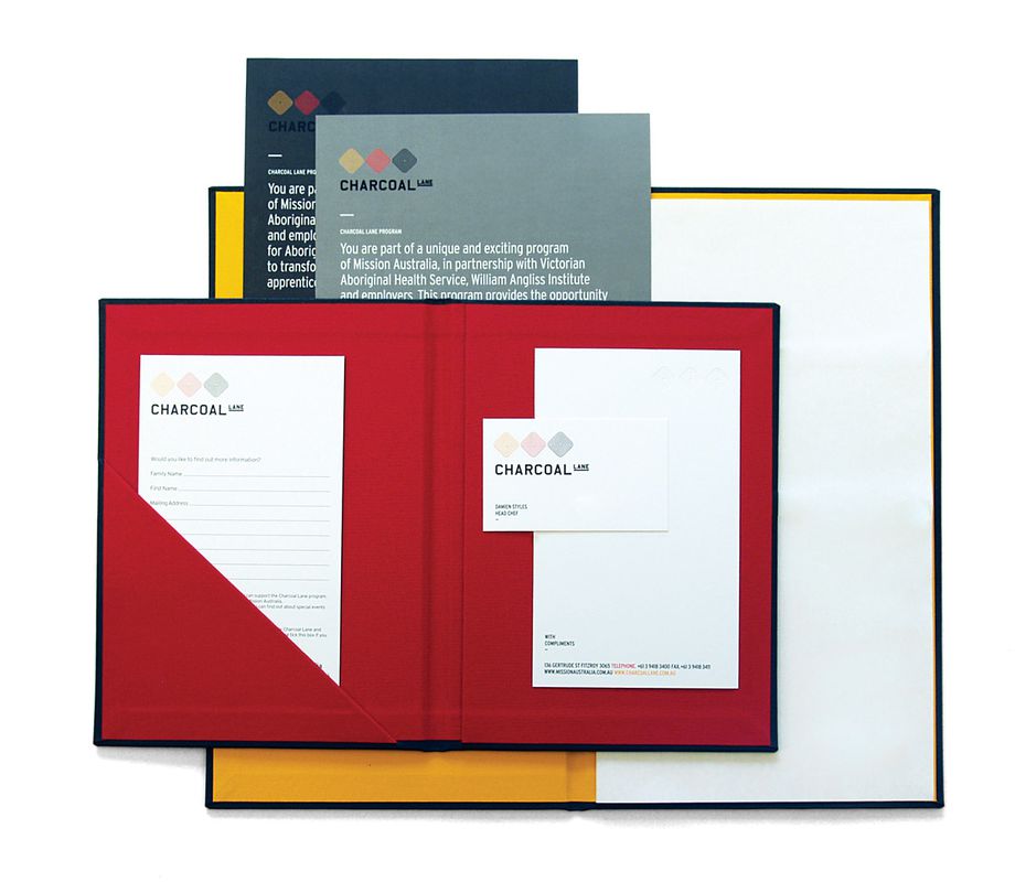
Studio Round took inspiration from the fixtures of the inner-city location of Cumulus Inc., allowing the industrial aesthetic to influence the typography and colour palette but keeping it “light, airy and dreamlike to reflect the name and capture a sense of the space.” Studio Round finds the name rarely, if ever, comes first, even though it has quite a significant impact on the final identity direction. It took a while to convince the client that The Public Dining Room name was the way to go. “The client wanted something that was Melbourne in its edgy coolness while not alienating the established older Sydney set who had always frequented the establishment,” explained Nudds. For Studio Round, the primary influence is the style of food and type of service that patrons will experience. Inspiration for the Gingerboy menu came from hawker cuisine and led the studio to develop an identity based on the neon signage that dominates city streetscapes in Asia. But close to home, Charcoal Lane (see page 118) was the trickiest commission for Studio Round. An iconic site for the Indigenous community, the studio had to take into account layers of social and cultural history to develop an understated identity that would not dominate the space and would allow the Indigenous art in the restaurant to come to the fore.
In the end the food and atmosphere are as important to the designer as to the customer. Because as Pandarosa points out, “People will always rate a venue depending on how they felt during their visit, not how slick the venue’s identity was.”
Source
Discussion
Published online: 1 Mar 2010
Words:
Melanie Joosten
Images:
Dianna Snape,
Paul Knight,
Shannon McGrath
Issue
Artichoke, March 2010