When this house was first published in Vogue Living in October 1987, the article was entitled “Shock Treatment.” It was an apt description of a provocatively polychromatic piece of postmodernism in a leafy inner-Sydney street.
It was designed by Peter Stronach, then a partner at Allen Jack and Cottier and midway through a highly influential career. The colour scheme, so much a part of its early identity, was a collaboration with the equally influential interior designer George Freedman.
The house was commissioned by Sydney advertising executive John Nankervis. Betsy Brennan, writing for Vogue Living at the time, wonderfully describes the “colourful” John as “(he) of the red Ferrari, the crocodile shoes and … the yellow speedos.”
It was the ’80s after all, and John Nankervis was one of the country’s most successful admen. He imagined the house as a bachelor pad while he was in between marriages. He subsequently remarried and shared the house with Amanda Nankervis before selling to fellow adman, commentator and broadcaster Phillip Adams after just a few years.

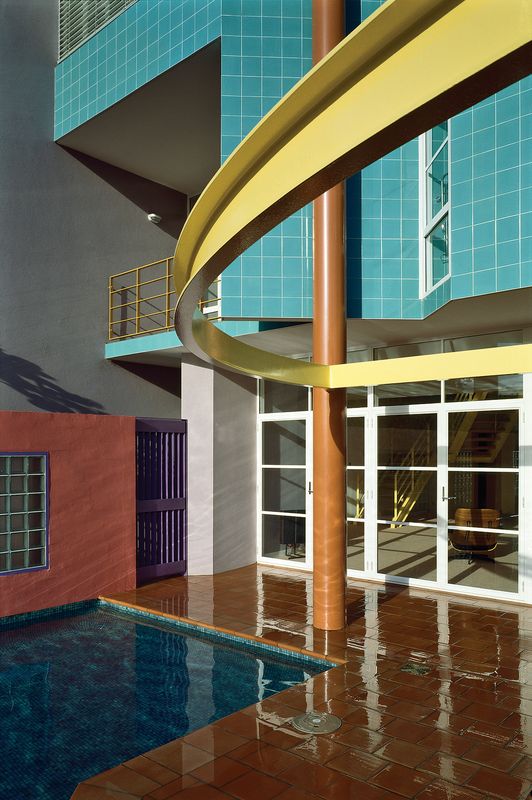
Access to the main bedroom and ensuite on the first level is via the striking yellow steel stair. Artwork: Hanna Kay.
Image: Katherine Lu
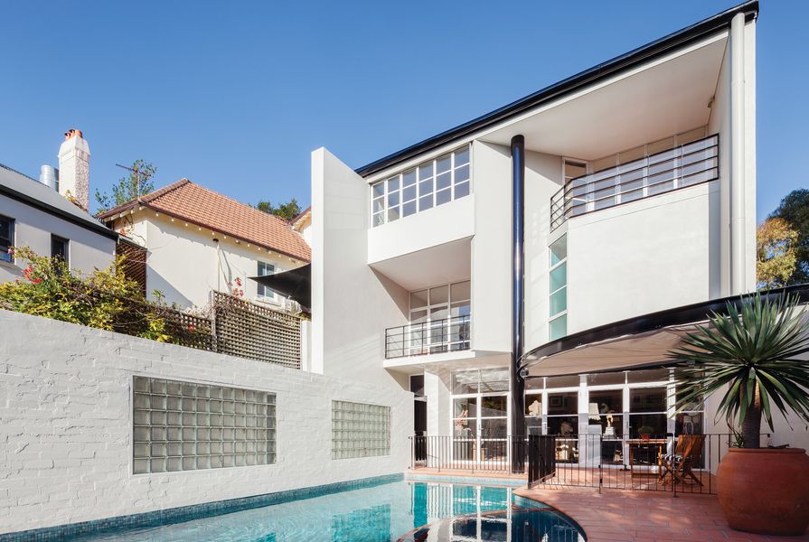
The striking difference between Phillip’s version of the house, as it is now, and the original is the transition from polychromatic to monochromatic. The terracotta, pinks and purples, the turquoise tiles and orange and yellow steel of the exterior have been painted over, first in a deep red and then in white with black details. Now, in real estate marketing material it is called “The White House.”
Reflecting on the house’s original hues Phillip says, “It was incredibly assertive. The Nankervises were entirely compatible with it. I needed to detune it. The colours swallowed me up.” The original owners entertained here. It’s easy to imagine the socializing and parties that were par for the course in the advertising world in Sydney in the late ’80s. For Phillip and his partner Patrice Newell it has been a quiet retreat, a place for work and writing and a city bolthole to balance their life in the country. Different lives and different personalities have been accommodated by the architecture. In particular, the design’s focus on privacy has afforded both occupants a commensurate advantage – both wanted to be away from prying eyes, for different reasons.
The house is set deep within a plot that runs the full depth of the block, rising a couple of levels from a quiet street on one side to a busier one with an old shop fronting it on the other. The new architecture is accessed from the quieter side and backs onto the commercial space and tucks in underneath it.

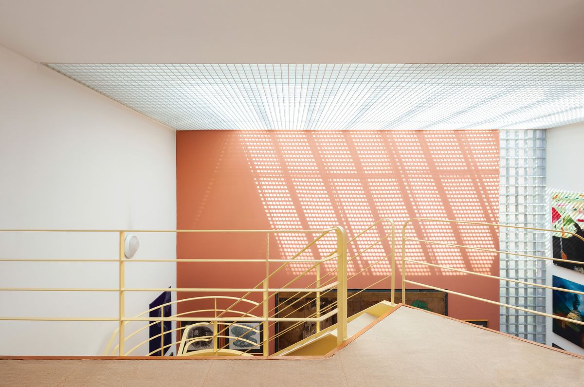
An open space on the top level was used for entertaining by the original owner, but has since been used as a library.
Image: Katherine Lu
The star of Peter’s scheme is the section. Over a double garage he designed a vast pool deck. Entry is via a path up the side. The space of the pool deck flows in and under two floors of bedrooms and living spaces before soaring up into a three-level void, flooded with natural light, that backs onto the shared wall of the commercial building. It’s a dramatic space punctuated with a yellow steel stair winding up to access the main bedroom and bathroom on the first level, and to an open space on the top level that John used for entertaining and Phillip turned into a library. At the ground level, the space continues to burrow under the commercial building above it to accommodate a kitchen, bathroom and another bedroom with an ensuite.
The surprising thing about entering Phillip’s version of this house is the amount of art filling the walls and floor. He is an inveterate collector of fine art and antiquities and the place is rich with both.
“Whacko! All that wall space,” he recounts from early visits to inspect the house. It was obviously a drawcard. “Blank walls are an abomination. I cover them up, as you can see.” Inside, the George Freedman colours are largely intact, but where in the first incarnation of the interior they were the main player, here they are glimpsed as a background to the vast collection of framed works, installed bookcases and clustered plinths of statuary and objects. Oriental rugs are layered over beige wool flooring.

The ensuite to the main bedroom is generously proportioned and features its original bright hues.
Image: Katherine Lu
Peter’s spatial cleverness, George’s colour mastery and Phillip’s personal art collection – antiquities laid over modernism – all combine here to arresting effect. It’s a fantastic and idiosyncratic interior.
At the base of the three-level volume, with art climbing up the high walls, Phillip has positioned black leather sofas and armchairs and a large television where previously the Nankervises had a dining table. By the terrace and pool deck, in what was originally the lounge room, Phillip has commandingly positioned his desk opposite the entry. Behind it looms an Egyptian sarcophagus attended by a pair of statues of Horus, and other classical antiquities that lend the appropriate gravitas to a space that has held conversations with Australia’s great and powerful, including several prime ministers.
Recently the house was put up for sale again and John was surprised to have several old colleagues and friends contact him about it. Many, he said, expressed an interest in the property and reinstating the original colours, which are now not so shocking but have some nostalgic and perhaps heritage value. Peter says he has no issue with Phillip’s recolouring. “Houses change over time – with different owners,” he says.

Original plans of the house from March 1985. Drawings courtesy of Woollahra Municipal Council.
An interesting perspective comes from Peter’s longtime partner, interior designer Tim Allison. Tim suggests that Peter designed this house after visiting America and the houses of Richard Meier in particular. One can see those influences here: the planar juxtapositions, the punctuating fenestration and the ship-like balustrading, made even clearer when the house is white, like Meier’s are. In a way, the colours obscured the architecture by dismantling it into its component parts.
As he prepares to depart his home of several decades and return to a pre-modern interior in the country, Phillip muses on the effect of modern architecture as a machine for living in. “I’d never lived in a modern house, ever,” he says. “All of my houses had been relatively or absolutely ancient. But I found I quite liked it actually. Rather than living in gloom, which is my natural habitat, I suddenly found myself in a glass house. It’s so bright! It didn’t appeal to me at first, but I became converted to sunlight.
“Do you change the machine or does the machine change you?” he asks. Clearly it’s a bit of both.
Credits
- Project
- Jersey House
- Architect
- Peter Stronach
- Consultants
-
Builder
Paul Ratcliff Constructions
Hydraulic engineer Thomson Harris and Partners
Structural engineer Taylor Thomson Whitting (TTW)
- Site Details
-
Location
Sydney,
NSW,
Australia
Site type Suburban
- Project Details
-
Status
Built
Category Residential
Type New houses
Source
Project
Published online: 30 Aug 2017
Words:
David Clark
Images:
John Gollings,
Katherine Lu
Issue
Houses, April 2017