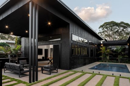

Bikes on display at Made to Measure: Handmade Bike Show.
Image: Tobias Titz
Made to Measure: Handmade Bike Show
Bikes have been around since the early 1800s and, with the exception of a few aberrations (I’m looking at you, recumbents), the basic design hasn’t changed since. It is within these functional constraints that designers turn the humble pushie into a work of art. Treadlie magazine commissioned eighteen bikes from a range of builders, from established pros to backyard enthusiasts. The bikes demonstrated variety in design, style and function: retro-inspired ladies’ bikes, sleek single-speeds and burly mountain bikes.
The two-wheeled display was situated directly inside the entrance to Design:Made:Trade at the Royal Exhibition Building, as part of the 2011 State of Design. It attracted attention from bearded men muttering about lugs, welds and geometry, and from young fixie riders appreciating the detail in the hand-painted frames.
The bike I was most tempted to ride off on was the Aemilia, built by Mrs Fairweather’s Bicycle Emporium. Perfect for tweedy afternoons cruising along European cycleways, Aemilia comes dressed in dainty laser-cut veneer “spats” with matching timber handles and leather handlebar streamers. Another stand-out was the aptly named Big Mama, the two-wheeled equivalent of a John Deere tractor (and not just because it was bright green). Built by David Bowan from Bobo Bicycles, it can carry up to three kids plus a load of groceries, using an extra-long frame. Cargo bikes are an important step in encouraging people to use bikes as their primary form of transport – extra carrying capacity turns them into a practical alternative to a car. The hipster kids were impressed with the Bumble Bee, built by Dan Hale from Shifter Bikes. Melbourne designer Mick Peel rescued the bike and lovingly polished, painted and chrome-plated it back to gleaming perfection.
– Emma Clark

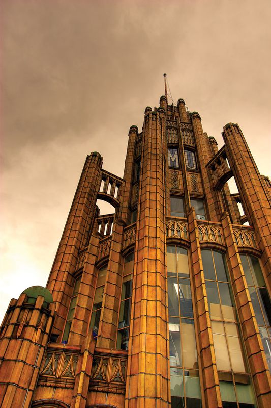
Fluid Taxonomies, a light installation by Philippa Abbott and Simone Bliss at Do Design Space.
Image: Tobias Titz
Do Design Space
High up in Melbourne’s GPO lies an unused space of sprawling ceilings and halls, a tunnel of rooms and corners, divided by glass. For a week in July, this site was home to the State of Design’s Do Design Space, “part installation, part classroom, part studio, part laboratory,” a central hub to the festival’s program, with a diverse range of events and activities running morning to night. And such an array necessitated a painfully edited review.
The Do Design Space began its week with Design for an Active City, a competition run with VicUrban. The brief invited designers to engage pedestrians along the bleak expanse of Collins Street Bridge through design. While some responses were sincere, forward-thinking solutions, the winner was a predictable choice for VicUrban, meeting the practical criteria of a windbreak.

The Do Design Space on level two of the Melbourne GPO.
Image: Tobias Titz
Midweek saw RMIT’s Design Research Institute initiate a disquieting, but valuable discussion with “Mobilise Design Thinking to Solve Today’s Big Challenges,” exploring the myriad of obstacles in our city’s future, and our urban attitudes.
Do Design Space was also home to week-long installations, such as the Design Reading Room, presented by Coöp and Perimeter Books. The glowing nook of makeshift shelves displayed publications chosen by designers as being important to their practice. The printed material had a considered balance – for graphic designer Mark Gowing, the influence of a book like US Trade Centre Graphics in Europe was apparent, yet the art of Ai Weiwei was not.
Thursday night was hosted by The Design Files blog professional Lucy Feagins, who brought her online format live for the first time. Known for her loyalty to local creatives, Feagins curated a distinctly crafty panel, with illustrator Beci Orpin, interior stylist Clair Wayman and Harvest Workroom’s Lara Davies. Rather dryly interviewed on their typical day, the top ten “Lessons Learned” and unanimous dislike for proportionate administration to success was refreshing to hear.
An anchor within the Do Design Space’s activity was Micro Kitchen, a pop-up initiative by Broadsheet serving up a daily soup borne of a complementary collaboration between a designer and chef. And the week ended with the space beautifully utilized for Eat With Me, a Melbourne-based social network encouraging members to connect with strangers through sharing meals. Attendees were open despite being a little nervous, it being near impossible to keep up pretence with a mouthful. Part founder Bethany Jones says it began with reading the projected high rate of single living by 2030. “It can be miserable cooking and eating alone,” she said, “We wanted to provide for that issue now.”
With time to reflect, it is obvious Do Design Space thoroughly succeeded as the heart of the State of Design Festival; its diverse events representing the potential far-reaching influence of design in our lives, and into the future. The week provided a wealth of professional opinion and exciting possibilities, cleverly curated to maximize its accessibility and relevance to enthusiasts and designers of all disciplines.
– Bonnie Abbott
Title Sequence presented by Speakeasy Cinema

Late night platform at the Australian Centre for Contemporary Art (ACCA).
Image: Tobias Titz
Warmed by tacos and gyozas, Melbourne’s cinephiles and typography junkies filed into the Australian Centre for Contemporary Art (ACCA) for what turned out to be an eye-opening presentation of the power of the title sequence.
Warren Taylor from The Narrows contemporary art space introduced with the godfather of titles, Saul Bass, best known for his collaborations with Alfred Hitchcock. Taylor presented Bass’s creative breadth, from the bold graphics of Psycho to the neon-fantasia of Martin Scorsese’s 1995 film Casino.
Standout presentations included Andrew Aston’s example of the silly, yet brilliant Napoleon Dynamite using tomato sauce, mustard, peanut butter and library cards. A special mention goes to Suzy Tuxen on her typographic perspective with Wes Anderson’s borderline obsessive use of the Futura type.
Few know just how much a sequence of credits can help an audience gain insight and inform them on the greater meaning of a film, as motion graphics artist Dom Bartolo passionately demonstrated. He began with a charming example in 1962’s To Kill A Mockingbird, which sets the film’s perspective from a child narrator’s point of view. Bartolo finished the evening with the violent, epileptic and drug-induced psychosis that is Enter The Void.
While spilling out into the cold night, one thought back to Stuart Geddes’s example of Bullitt, with its title sequence by Pablo Ferro. Using seamless type-transitions as if to move through the type, he created doorways into the plot’s motivations. In essence, it was a flawless blend of design and cinematography that left a memorable impression, prompting us to take note when the first chords chime and credits roll.
– Mason Browne
Reel Architecture
Standing proud and still within the active city, a building’s permanence is the foundation of its art form. Young collective Reel Architecture has initiated a competition where this immobility is explored through the moving image, in three minutes or less, in response to the festival’s Design That Moves theme.
Launched as part of State of Design, Reel Architecture hosted an afternoon of short films that celebrate architecture, sensitively chosen and carefully curated. Potential submitters were guided through each short film, featuring a passionate perspective on the buildings around us. As an inspiring introduction to the competition, the films studied architecture in the background and foreground of our lives. The stability of buildings, physical and abstract, and the human business that transpires in their shadows. Sometimes empty, dangerous and broody, other times characterful, they are monolithic, lonely giants, their unusual expanse the creation of a visionary civilization. Through the camera, we watched a building become a symbol of something that transcends time, stoic against the effects of ageing, so much more imposing than merely a roof and rooms.
Unité Mobile (Roads Are Also Places) 2005 was a highlight, watching the scale of Le Corbusier’s Unité d’Habitation shift as a remote-controlled semi-trailer toy pulled a miniature model of the building through its own halls. It delighted residents and turned an angular cement wall into a colossal sculptural form, mysterious and majestic against the bigger-still canopy of sky.
– Bonnie Abbott
Melbourne Open House
Architectural voyeurs rejoice – the city of Melbourne has thrown open her doors and you’re all invited for a glimpse of the rare, the rarefied, the shiny and new, and the long forgotten, stretching out across the four corners of the Hoddle Grid.
You may want to block out the whole weekend. There are seventy-five architectural treasures to discover. And don’t worry – you won’t be alone. The throngs will be joining you and the queues may be a little trying. But it’ll be worth it – you never know what you’ll find.

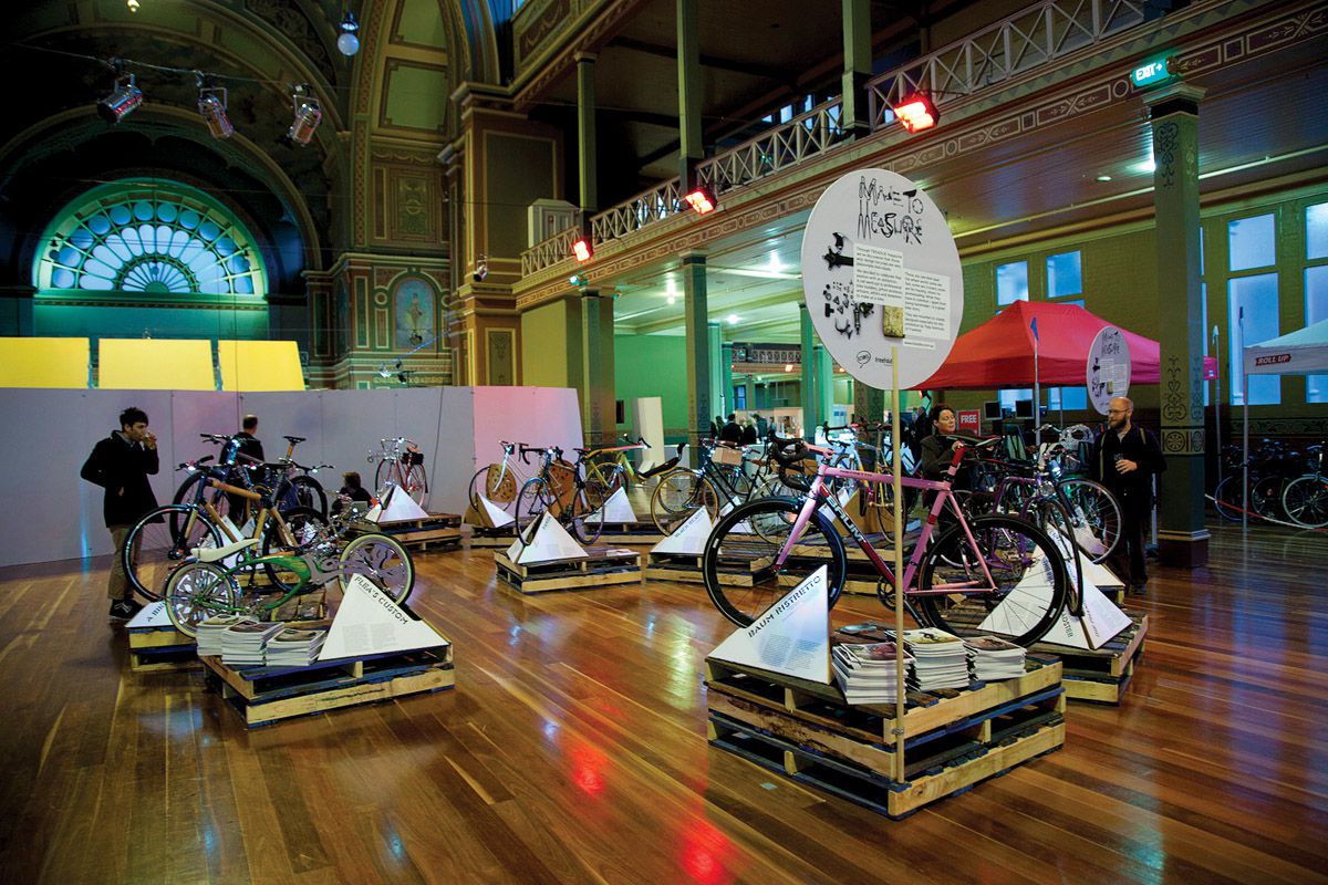
Manchester Unity was one of the buildings on display as part of Melbourne Open House.
Image: Lachlan Doig
Banks, those villains of the modern age, are adept at disingenuous management speak and the blander end of corporate architecture. It’s a surprise then that the ANZ Bank is in possession of the glorious Gothic Revival building on the corner of Queen and Collins streets. In 1881, the bank’s then general manager, Sir George Verdon – an erstwhile patron of the arts and architecture – commissioned Melbourne architect William Wardell to design a new Australian headquarters for the English, Scottish and Australian Chartered Bank.
One-hundred-and-thirty years on, the bank and the adjacent cathedral room have enjoyed a painstaking restoration. The result is a dramatic and richly decorated space, with stately pillars and a coffered glass ceiling. It’s a popular one – the throngs of archifans will form snaking lines down Collins Street.
Huddled by a barren strip of Docklands roadway, the intriguing Mission to Seafarers is far enough off the beaten track that you won’t have to queue at all. Inside its Arts and Crafts-style exterior, there is a welcoming chapel, dark and timber-clad, its walls pierced by intricate leadlight portholes – some old, some new – depicting ocean-going scenes in tribute to those lost at sea.
There’s a serene pocket garden at the rear and the Norla Dome, originally a gymnasium for seafarers and now host to the Maritime Art Prize and Exhibition. The mission was designed by Toorak architect Walter Butler and built between 1916 and 1919.
Step forward a decade and back into the CBD proper, to a true icon of the Melbourne skyline. Gazing benevolently over the busy intersection of Swanston and Collins streets, the Manchester Unity Building was once the city’s tallest building. Designed by architect Marcus Barlow, with construction completed in 1932, it is now home to dental practice Smile Solutions, whose director Dr Kia Pajouhesh has been responsible for much of the building’s carefully executed restoration.
The building culminates in that dazzling turret, all buttresses and windows, that is currently home to a team of hard-working dentists and specialists, busily restoring teeth and seemingly oblivious to both the captivating views and interwar architecture that surround them.
Where to next, you might ask? There’s plenty more to see on the map. Pick an area, an era, a style, a type … If only one could spend more time getting to know one’s own city.
– Peter Davies
Urban Realities: Landscape Urbanism Three-Day Design Challenge

Urban Realities, Site 01: Urban Augment, Team 2, The MAD Collective.
Image: Jonathan Butler
What do you get when you combine one hundred participants from around the globe, swirl them around to form teams, plant them on the windswept, vacant esplanade of Melbourne’s Docklands and deny them seventy-two hours of sleep? It’s not chaos, as you might expect, but instead the Urban Realities: Landscape Urbanism Three-Day Design Challenge.
Docklands’ reputation as the city’s sterile, blank archetype of faceless corporatalia has resisted repeated attempts at rehabilitation. Part of its dilemma, counter-intuitively, is its proximity to the much-loved CBD – a space devoid of laneways and smaller-scale interventions becomes lifeless. The Urban Realities experimenters hypothesized that Docklands’ monolithic scale could be counteracted by elements that the precinct had rejected: small, whimsical, fleeting, contextual projects that encourage interaction, rather than isolation.

Urban Realities, Site 09: Urban Augment, Team 5, Dirtybuoy.
Image: Jonathan Butler
Each group of ten was asked to draw on the skills of their multidisciplined members to design and build a temporary structure with a budget of only two-and-a-half thousand dollars. Interventions included transformations of topography, traffic flow and vegetation, and the manipulation of light, wind and water. Enthusiasm was evident as teams briefly downed tools to show their creations to bemused office workers. Some competitors spoke of the joy of interacting with local inhabitants, while others emphasized the value of returning to the site whenever inspiration at the drawing board started to wane. The real-time discussion occurring via social media (blogging, tweeting, etc.) added to the frenetic activity and interactivity of the event, and ultimately the democratization of the site.
– Virginia Mannering
Troika
Throughout the festival, The Wheeler Centre hosted Skype talks with international creatives. The second in the series was UK studio Troika. Despite the complexity of its projects, Troika is not concerned about failing. “You have to fail fast, rather than worrying about failing at all,” explained Sebastien Noel. “The earlier you fail, the sooner you can improve.” Joined by Conny Fryer, two-thirds of Troika responded with sincerity and warmth to questions from panellists Fleur Watson, Gyungju Chyon, Paul Fuog, Pheobe Whitman, Simon LeAmon and, later, from the floor.
Troika is renowned for creating objects and installations in the intersection between architecture, art and technical invention. Together with scientists and engineers, these collaborations turn into sensitive, immersive, digital experiences that evoke emotional responses.
Questions from the audience and panel consistently circled technology, the technical and corporate sleekness of their pieces supposedly throwing into question their work as art. Yet Fryer played it down, explaining that technology is merely a tool – one that lends itself to creating experiences, and it is experience that is key.
With the call ended, the post-panel discussion quickly became divided. Some panellists felt their progressive approach needed to be culturally valued, but how, when it is at once art, design, corporate, public and experimental? Others countered that Troika’s value transcends galleries and tradeshows. The night ended with: Does it really matter? Perhaps not. Troika doesn’t seek out new technology and construct around it. It makes intuitive connections; discipline is immaterial when a simple idea lives in a digital body so unexpectedly organic, mirroring the ever-shifting identities of beauty, nature and machine.
– Bonnie Abbott
Top 5 × 5
“It’s my favourite colour – and it’s been my favourite for a long time,” says designer Beci Orpin of a bold yellow swatch on screen. “What I like most about yellow is its sense of warmth and playfulness combined with a touch of nostalgia.”

TOP 5 X 5 speaker Ian Wong talks up orange at the Zenith showroom.
Image: Jamie Calero
And that was the premise of the recent Top 5 × 5 event – what is your favourite colour and why? The Design Institute of Australia invited five prominent Melbourne designers – illustrator Beci Orpin, graphic designer Michaela Webb of Studio Round, industrial designer Ian Wong, architect Debbie Ryan of McBride Charles Ryan, and architect Pascale Gomes-McNabb – to select a colour and discuss its context in their work and the wider world.
Though the selected colours tripped across the rainbow – from Orpin’s yellow, to Ryan’s red via Wong’s orange to Webb’s Yves Klein blue and Gomes-McNabb’s black – what was perhaps more interesting was the connections each of the speakers made about the role of colour in the world and in design.
There were references to popular culture – recent blue-hued fashion collections from Prada and Rag & Bone; or the red and yellow branding of fast-food restaurants; or the noirish garb of Darth Vader. And appearances in nature – the cochineal beetle and the ruddy dye it produces; the orange shades of lava and fire, and ripening fruit; and the jaundiced skin of sickness.
The production of colour also threaded through the conversation. In the case of Webb’s chosen Yves Klein blue, the production almost is the colour – that is, the process employed by Klein is the only way to accurately produce the depth and vibrancy that characterizes the real shade. Anything else is an approximation. Orpin and Wong also touched on production – how industrialization and advances in dye and pigment technology moved us from traditional ochre shades to the use of brighter oranges and yellows.
The symbolism each speaker identified for his or her chosen colour, whether life or death, or happiness or anger, gave pause for thought. No colour, it seems, is just a simple mix of C and Y and M and K. Every hue is infused with layers of meaning, inferences and interpretation.
– Peter Davies

Keynote speaker Carolyn Steel on food and design.
Image: Tobias Titz
Keynote: Carolyn Steel
Carolyn Steel’s keynote presentation on how food shapes cities created compelling links between food supply, consumption, population growth and the diminishing relationship between people and food. Against a fascinating historic overview came the gloomy revelation that feeding growing populations has created vast soil degradation, deforestation, pollution, hunger and obesity.
Steel’s discussion about the correlation between expanding populations and increased meat consumption still resonates – we give such little attention to the supply cycle of a piece of cow’s thigh. As busy people we follow the same patterns with purchases made speedily and thoughtlessly. Beef from the supermarket is conveniently wrapped and ready to take home. Its story is deliberately banal – just functional packaging, plastic wrap and a plain label conveying weight and price. Where did that piece of muscle come from and did it belong to a well-cared-for cow? Who is the farmer, the agent, or the multinational that had an interest in the cow? Who takes the cow from the farm to the slaughterhouse, and how far do they travel? How far do the refrigeration trucks travel and how many other people are involved? Replace cow with chickens, potatoes or oranges and the story is similar – supermarkets and multinationals have taken the human out of the food system.
Lifting us out of food gloom, Steel administered a salve by offering ways that positive change might be influenced. Food is a powerful design tool and agent for urban renewal. It is multidisciplinary and as a connective tool can shape cities, transport systems, regional landscapes, politics, social spaces and ideologies. Steel issued a passionate call for “sitopia” (sitos is Ancient Greek for food): a food-centric world consciousness. A sitopic city has strong links to its productive hinterlands, lattice-like food networks with active markets, local shops, a strong sense of food identity, open dialogue between consumers and producers and greater government protection from food monopolies. Bit by bit each person can make lifestyle adjustments to eventually, collectively, create a tipping point toward change.
– Susan Reid
Source
Discussion
Published online: 1 Dec 2011
Words:
Peter Davies,
Susan Reid,
Bonnie Abbott,
Virginia Mannering,
Mason Browne,
Emma Clark
Images:
Jamie Calero,
Jonathan Butler,
Lachlan Doig,
Tobias Titz
Issue
Artichoke, December 2011