“Less is more” is a common phrase in architecture and design, meaning less decoration has more impact. Mies van der Rohe popularized the expression to describe his modernist architectural approach, which distilled a building’s elements to extreme simplicity so that each served multiple visual and functional purposes.

A predominantly white interior acts as a backdrop to a yellow highlight, a signifier of the brand.
Image: Jan Vranovsky
Less is undoubtedly more at Susuru, but here the phrase can be interpreted in another way too – that it requires more effort to make something that looks like less. All details must be meticulous, exacting and considered, as there is no place to hide imperfections or afterthoughts in a minimalist space.
Ben Berwick of Newcastle and Sydney-based architecture practice Prevalent designed Susuru, which opened in late 2017. The ramen and gyoza restaurant is located in a century-old brick warehouse on King Street, an emerging dining precinct, but the design breaks from the popular local aesthetic that references Newcastle’s heritage. Instead it looks to one of the world’s most forward-thinking cities, Tokyo.
Restaurateur Taiyo Namba asked for a fun, vibrant space that would attract a young clientele and could be franchised in the future. Building a strong brand image was important. “If the concept is going to be exported from Newcastle to Australia’s major cities it needed to be striking,” says Berwick. Chef Chris Schofield also wanted a space that looked like a Tokyo Metro station. Without being too literal about the reference, Berwick took ideas and elements for inspiration: clean spaces, yellow tiles, lighting panels, rectilinear geometries and the one-point perspective that is inherent to train tunnels and platforms. And like the “less is more” ethos, every element serves a visual and functional purpose.
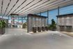
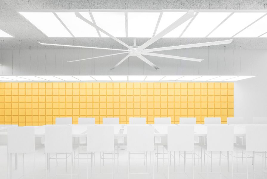
The white facade stands out on the streetscape and two large windows provide views into the crisp-white and golden-yellow interior. Long LED panels extend over the tables and are suspended from the high ceilings at varying heights, helping the space to feel less cavernous. White epoxy flooring shows marks and scuffs, as in a station, and acoustic felt blocks set in a metal framework on the wall reference the square tiles of the Tokyo Metro.

Susuru is situated in a prominent 1906 building in Newcastle and enlivens the streetscape.
Image: Jan Vranovsky
The felt blocks are bright yellow, a common colour in Japanese stations and a “pleasant colour to eat against,” Berwick says. Yellow conveys the fresh and bold Susuru brand image and the wall provides a desirable backdrop for “Instagrammable” moments for a distinctive social media presence. The menu board and toilet doors also inject colour, with illustrations that draw on pop art and comic books, bringing a graphic element to the space, much like advertising in a train carriage or station.
Contrasting with the sharp lines and smooth surfaces, the front door and windows are made with Alusion, a stabilized aluminium foam with opacity and a swirling bubble effect. It brings a textured overlay that Berwick describes as “high-tech grime” – a cleaned-up version of a gritty street feel – and afternoon sun creates plays of light and shadow.

Graphic elements are cycled seasonally, much like advertisements in Tokyo’s Metro system.
Image: Jan Vranovsky
One long communal table stretches down the centre of Susuru, with channels to hold condiments. Not wanting to prevent patrons from eating alone, the recesses also provide separation between diners and the wider tables allow people to sit further apart. Smaller and lower tables around the perimeter of the restaurant have upholstered bench seating and five stools overlook the kitchen as they would in a traditional Japanese ramen restaurant. Local metalworkers and powdercoaters fabricated the tables and chairs, which have concealed power cables and power points for the tablet ordering system that will be installed in the future.
The precision of the design of Susuru stems from Berwick’s experience working with contemporary Japanese architects. “It requires a lot of consideration and coordination to make something look minimal. The Japanese architects test every option and iteration so that a design couldn’t be another way,” he says.
Indeed, the interior elements of Susuru have been reduced and distilled to create a minimalist, almost futuristic space – particularly so for Newcastle and appropriately so for the franchise opportunities it may bring.
Products and materials
- Walls and ceilings
- Alusion aluminium screens from Cymat Technologies. Colorbo acoustic tiles.
- Windows and doors
- Double glazing track, bifold windows with aluminium screen insert and frameless glass pivot door from F & C Glass and Aluminium.
- Flooring
- Epoxy resin from Butler’s Epoxy Flooring.
- Joinery
- Corian table and benchtops from Hunter Benchtops.
- Lighting
- Ceiling fan from Big Ass Fans.
- Furniture
- Tables and chairs custom-made by Imagiron.
Credits
- Project
- Susuru
- Design practice
- Prevalent
Newcastle, NSW, Australia
- Consultants
-
Builder
Peter Haas
Electrician Timothy Glasson
Graphic design Headjam
- Site Details
-
Location
Newcastle,
NSW,
Australia
- Project Details
-
Status
Built
Design, documentation 4 months
Construction 3 months
Category Hospitality, Interiors
Type Restaurants
Source
Project
Published online: 21 Jan 2019
Words:
Rebecca Gross
Images:
Jan Vranovsky
Issue
Artichoke, September 2018