The suburbs that make up Sydney’s inner west have experienced something of a resurgence in popularity over the last few years. Despite rising property prices, the area has become a magnet for home buyers – its semi-urban landscape is characterized by freshly restored houses, converted warehouses and a crop of bustling cafes and shops.
The owners of this house, a couple who had relocated to Sydney from a quiet coastal town, were keen to return to an urban environment. A brief search led them to a dilapidated terrace house on a tight site in Annandale, a stone’s throw from the city centre. “We liked the suburb’s sense of community as well as its proximity to the city,” the client explains. The building’s previous incarnations as a hotel, factory and pub had resulted in a haphazard arrangement of volumes and a rather gloomy interior. “Our friends thought we were crazy,” adds the client, “but we were immediately struck by its potential.”
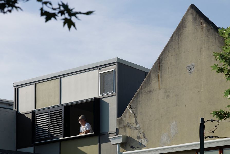
The clients happened across the work of architect Shaun Carter of Carterwilliamson in a local newspaper. “We liked his story and we hit it off immediately,” explains the client. They worked together for eighteen months, developing their vision for the property. Their main goal was to bring light into the site and to make sense of the existing structures. “We also wanted to give the facade a proper identity,” says Shaun. “As the remaining half of the old pub, it provided no real relationship to the street. We wanted it to look like a traditional terrace house.”
Restrictions imposed by the council meant that little could be done to remedy poor planning at the entry level. After months of negotiations, Shaun found a way to maximize the floor area by relocating the stair to make space for a new master bedroom and study. The remaining space at the back of the site was retained as a small garden and lightwell rising the height of the terrace, bringing in additional daylight to the rear. The team also discovered a thick sandstone wall running along the eastern boundary. In addition to the tactile appeal of its rugged texture, the stone acts as something of a natural airconditioner, cooling the space on warm summer days.

There are hints of the building’s previous incarnations as a hotel, factory and pub.
Image: Brett Boardman
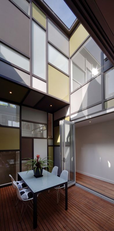
As if planned, the moodiness of the ground floor is a neat counterpoint to the upper levels. As you ascend the stairs, the full drama of the house becomes apparent as the glazed internal walls and courtyard come into view. “The house was deliberately organized around the central stair and pairing courtyard, bringing in light and cross-ventilation,” explains Shaun. “This also meant that we could achieve a constant visual connection between the rooms.” This connection was achieved by creating glazed “punctures” in the courtyard-facing walls. The remainder of the cladding – fibrecement panels set into timber stud framing – was painted various colours. “We adopted the Federation-style idea of using tessellated tiling for the facade, utilizing the batten system to create an interesting pattern. The clients were keen to experiment with colour, and this gave rise to the Mondrian-like result. We used colours that you wouldn’t necessarily put together. It was a bold decision but we feel that the tonal mix works really well,” he adds.
An additional spatial strategy was to ensure that the house was never more than one room deep between outdoor spaces. “It is the possibility of beyond that makes a room feel less constrained, more vital,” says Shaun. “We have used this approach throughout the house so that the rooms could all enjoy strong connections to the outdoors.” The open-plan kitchen has an unobstructed relationship with both the courtyard and city view beyond, while the dining area enjoys a similar connection to the front-facing balcony. “The balcony does more than just add value to the dining room,” he explains. “It also has the added benefit of addressing the street below.”

The open-plan kitchen is adjacent to the central courtyard.
Image: Brett Boardman
As a final flourish, the uppermost level opens up to become a sizeable roof terrace, with views over the city. “With little room for planting, we decided to turn the deck into an urban garden,” says Shaun. The team discovered a vertical system that was easily attached to the three existing structural walls. “Aside from being a great spot to relax after a day at work, the deck’s perfect for growing all kinds of herbs and vegetables,” says the client. “It’s also a great place for our cats to hang out.”
Surveying from this level, the house appears as the clever result of what can be achieved on a tight site with limited resources. What was essentially a complicated spatial arrangement has been resolved into a livable and dynamic home environment.
Products and materials
- Roofing
- Colorbond Klip-Lok.
- External walls
- Existing brick, painted; fibre cement sheet with battened joints, painted.
- Internal walls
- Plasterboard, painted.
- Windows
- Broadview aluminium, natural anodized fixed and bifold; Windoor custom timber frames.
- Doors
- Broadview aluminium, natural anodized bifold.
- Flooring
- Spotted gum timber floors; carpet.
- Lighting
- Lumascape in-floor uplights; pendants.
- Kitchen
- AEG oven; Highlander cooktop; Ilve rangehood; Bosch dishwasher; Franke ‘Planar’ sink; ss benchtop; Bisazza tiles; Abey Gessi pull-out tap.
- Bathroom
- Artedomus Vixel mosaics; Virtu Circuit accessories; Caroma ‘Cube’ basin; Concertto tapware.
- Climate control
- Natural ventilation.
- External elements
- Eco Outdoor pavers; Elmich vertical garden system.
Credits
- Project
- Three-part harmony
- Architect
- Carter Williamson Architects
Sydney, NSW, Australia
- Project Team
- Shaun Carter, Lisa Merkesteyn, Helen Yeadon
- Consultants
-
Builder
Hampstead Homes
Engineer Low & Hooke
Interiors and lighting Carter Williamson Architects
Joinery CraftyKabinets
Landscaping Carter Williamson Architects
- Site Details
-
Location
Sydney,
NSW,
Australia
Building area 180 m2
- Project Details
-
Status
Built
Design, documentation 12 months
Construction 6 months
Category Interiors, Residential
Type New houses
Source
Project
Published online: 1 Apr 2010
Words:
Elana Castle
Images:
Brett Boardman
Issue
Houses, April 2010