The team behind Vacation Cafe – owners and brothers Kael and Matt Sahely, design practice Therefore and branding agency The Company You Keep – knew they were up against a saturated cafe market when they began the project. Rather than getting overly strategic about market positioning, they approached this venture as an experimental playground. It was an opportunity to have some fun and follow their own paths of curiosity. Intentional or not, this gave them a point of difference that is palpable from the moment you spot Vacation Cafe in the streetscape.
Therefore was keen to see the relaxed, playful energy of the owners translated in the space. Having previously collaborated with the owners on a number of projects, they had a natural intuition for who the brothers are and what excites them. The owners felt confident in giving their designers as much freedom as possible, allowing Therefore to pursue their own interests at the same time.

The floor plan needed to be very efficient to make use of the small tenancy.
Image: Sean Fennessy
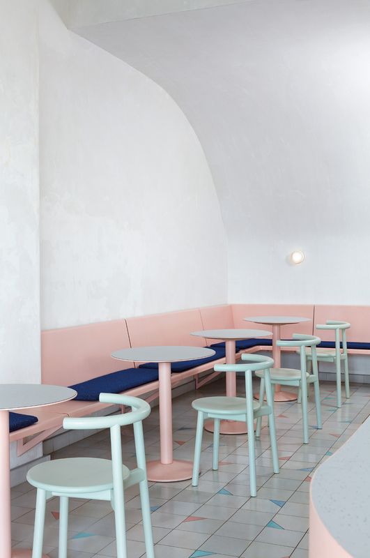
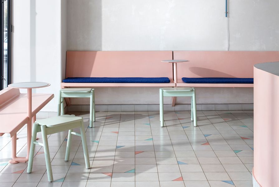
It’s perhaps the colour palette that is the most striking when you first enter Vacation. The space is predominantly light grey, pastel peach and mint green – a far cry from anything in the immediate context. The sweetness of the colour scheme is offset by a rich royal blue that sharpens the palette. If you grew up in the eighties, these colours conjure up childhood nostalgia, and if you didn’t, they hark to a chilled out Florida beachside. Either way, both take you far away from the corporate Melbourne CBD.
Underfoot, the custom tile pattern rumbles with energy. Multicoloured triangular tiles are sporadically inserted, somewhat similar to the joyful disorder of thrown confetti. Circles and rounded edges repeat themselves throughout the space, creating dynamism. It’s a geometry that was born out of the pragmatic needs of spatial planning. The main servery has rounded edges to facilitate traffic flows around it. Attracted to this simple geometry, Therefore repeated the rounded corner motif throughout. It forms the profile of the fixed benches, the curve of the dropped bulkhead, the openings to the kitchen and the steel framing for the glazing. Drawing from the same family of geometry, circles can also be identified repeatedly throughout the space, including the circular backed Mattiazzi Solo chairs, the fixed round side tables and the semicircular Laal pendant that hangs above the counter.

The white set plaster wraps up the back wall and into a large barrel vault, which conceals a neighbouring staircase that protruded into the tenancy.
Image: Sean Fennessy
While the space has a youthful energy about it, it’s by no means naive. Perhaps it’s the eight-metre-high ceiling and austere grey polished plaster backdrop that gives this light-filled space a sense of authority. Vacation has a gallery-like quality, as if it’s part cafe, part art installation. The organization of colours and geometry within this volume exhibit a sense of ordered, deliberate composure. Although perceived as colourful, the range of hues are quite restrained and are unwavering in their consistency. For example, the mint of the Luke Mills stools perfectly matches the Mattiazzi chairs. The peachy pink in the floor tiles and the powdercoated steel work are also identical. Similarly, the geometries are reduced to either straight lines and circles or partial circles only. Through the distilled use of colour and simple geometry, the space has abstractness about it. It is at once playful and ordered.
Vacation Cafe is the result of the fluid and synchronized understanding between designer and owner. The outcome is a fun and cheeky energy unfolding in a gallery-like context. It’s like a play-ground for grown-ups – it’s no wonder it’s called Vacation Cafe.
Products and materials
- Walls and ceilings
- White set hard plaster with beeswax finish over existing masonry. Ceilings painted in Dulux ‘Whisper White.’
- Windows and doors
- Custom fabricated steel windows and doors in matte black.
- Flooring
- Encaustic Cement Tile in ‘Stone Light,’ ‘French Blue,’ ‘Miami Green’ and ‘Soft Pink’ from Bespoke Tiles and Stone.
- Joinery
- Banquettes upholstered in Raf Simons Pilot fabric from Kvadrat Maharam. Custom steel joinery powdercoated in Dulux ‘Wedgewood.’ Vinyl bar and tabletops in Taralay Premium Compact surface in ‘Nauru’ from Gerflor.
- Lighting
- Muller van Severen Hanging lamp in blue from Matter. Rich Brilliant Willing Crisp wall sconce in white from Living Edge. Laal Conehome Single Arch pendant. Binario track lighting and Mattia downlights from Sphera.
- Furniture
- Custom steel furniture powdercoated in custom pink. Mattiazzi Solo chair from District. Ranger stool in custom colour from Life Space Journey. Custom-made powdercoated steel table with vinyl top.
Credits
- Project
- Vacation Cafe
- Design practice
- Therefore
Melbourne, Vic, Australia
- Project Team
- Alex Lake, Anouska Milstein, Raphael Graham
- Consultants
-
Access consultant
Before Compliance
Branding consultant The Company You Keep
Builder CBD Contracting
Building surveyor Steve Watson & Partners
ESD Nick Bishop ESD
Engineer Meyer Consulting
- Site Details
-
Location
Melbourne,
Vic,
Australia
Site type Urban
- Project Details
-
Status
Built
Design, documentation 4 months
Construction 2 months
Category Hospitality, Interiors
Type Cafes
Source
Project
Published online: 16 Nov 2018
Words:
Ella Leoncio
Images:
Sean Fennessy
Issue
Artichoke, March 2018