The new Westfield in Pitt Street, Sydney, is a huge and complex project that has taken the better part of a decade to come together – and it’s not finished yet [as of June 2011]. Three separate retail arcades at the southern end of the pedestrianized part of Pitt Street Mall – Imperial Arcade, Skygarden and Centrepoint Tower – were acquired over a number of years by Westfield. It wasn’t until they had all three that their vision for a seven-level retail centre began to take shape. With each of the three sites featuring different floor levels, the centre site, the Imperial Arcade, had to be completely demolished and excavated, with a new insertion linking the existing two buildings. This fact alone means that the resulting building is highly complex, with floor and ceiling levels constantly rising and dipping.
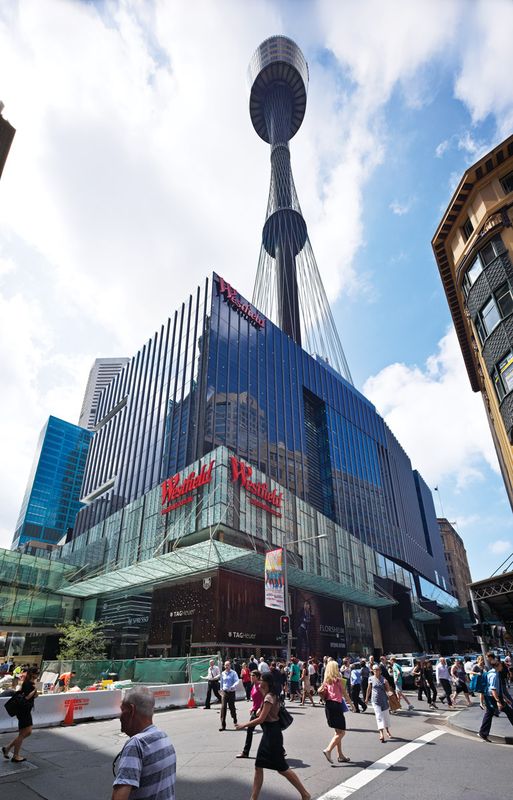
The planning for how to link the buildings was already fairly advanced by the time Westfield held an architectural competition and appointed John Wardle Architects to design a thirty-storey commercial tower above the centre site. A huge egg-shaped tower will cut a fantastic new skyline for this central part of the city. “We looked very carefully at the profiling of the building,” explains Wardle. “One thing that’s very distinctive about Sydney is a very tight relationship between their towers. The egg-shaped profile of the tower will pull the tower away from its rectilinear neighbours.”

Entry from 100 Market Street showing patterned glass facade and woven rope concrete installation by Dani Marti.
Image: Peter Bennetts
John Wardle Architects was also responsible for the external facade of the retail centre, for which they were inspired by the idea of stitching – not only in a fashion sense, but also metaphorically in terms of the building stitching this precinct together. The awning is a fine stainless steel thread that weaves through the awning, through an eyelet, back up the facade and back down. The pattern on the facade’s glass is a rush called Lomandra multiflora, which is an indigenous grass in the Sydney area used by the local Aboriginal people for weaving baskets. According to Wardle, “There’s an interesting link with this history and the contemporary nature of shopping, collecting and packaging.”
With the structure of the retail centre, Westfield had already done a lot of planning, based on highly detailed research into retail strategies. A major goal was to deliver the most lettable area possible, while the positioning of each store and its branding was also key to the design strategy, including the circulation of customers through the space. Part of that was about placing the stores in key spots so that well known and loved brands are in the customer’s sight lines so they are drawn through the space.

Underground, concrete floors and other devices provide the illusion of a streetscape.
Image: Peter Bennetts
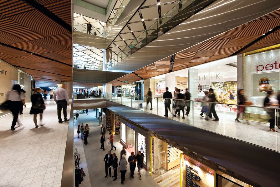
For the interiors of the retail centre, Westfield appointed Japanese design studio Wonderwall, famous for their its eye-catching retail interiors around the world. With extensive experience and expertise in designing retail stores, Wonderwall, nevertheless, had a challenge before them, as it is the studio’s first shopping centre. This meant the approach had to incorporate a more long-lasting space that would not age. Wonderwall founder and principal designer Masamichi Katayama explained (through a translator), “I tried not to create something decorative and surprising – instead I tried to do delicate, nicely done design that can be loved by a lot of audiences.”

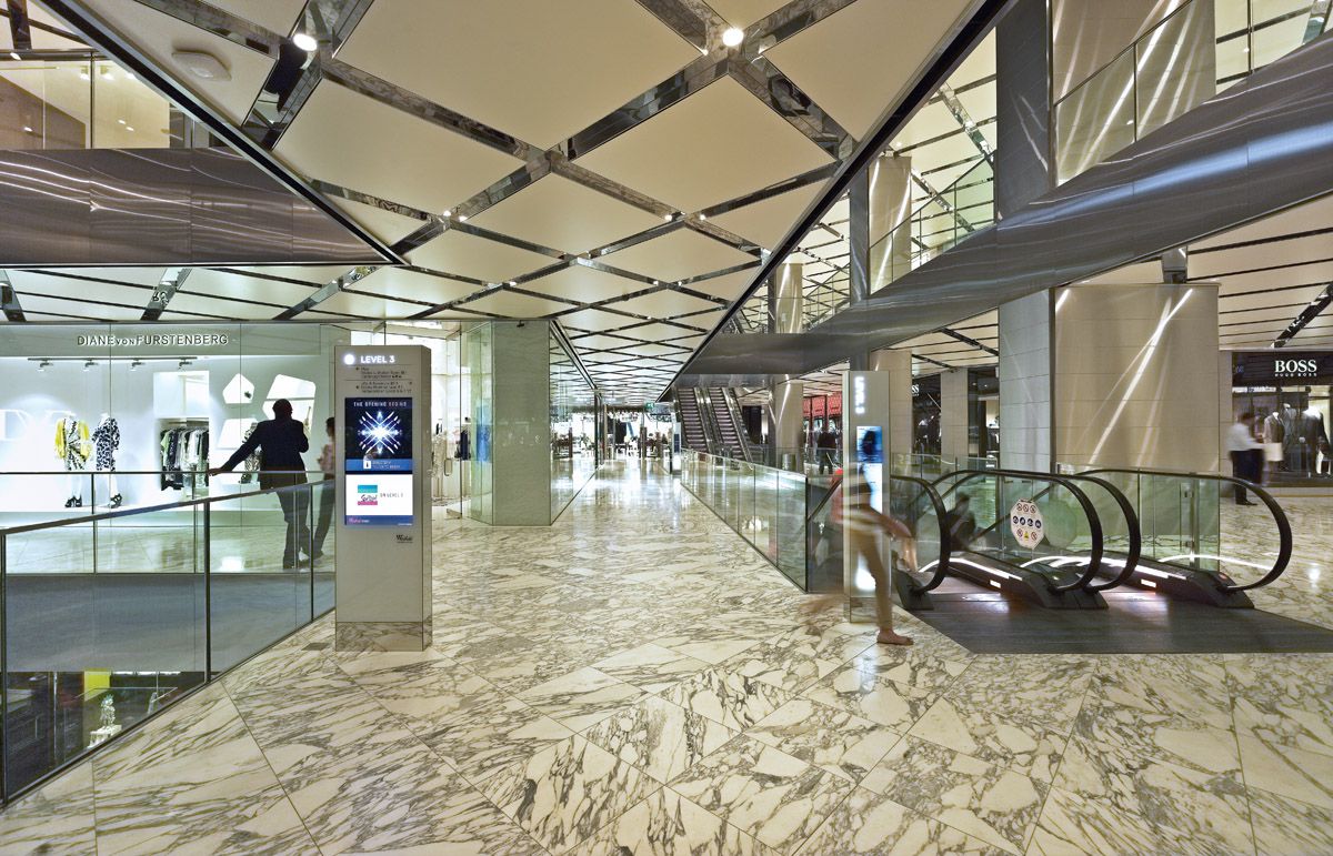
On levels three and four, marble is used to create a sense of luxury.
Image: Peter Bennetts
Westfield’s brief to Wonderwall for the design of the four levels of the shopping centre was basic: casual, street wear and luxury. The underground level – street wear – is treated as an outside streetscape with low-level lighting, concrete and tiled floor with brick walls. “It’s very unusual to see concrete floor in a shopping mall,” says Katayama. “In my mind this is outside.” On the second level – casual – the ceiling is the feature, with timber placed in a pattern of interconnecting diagonal lines and hidden lighting elements. And on levels three and four – luxury – white marble floors and ceiling have been interspersed with stainless steel and white plaster. The quality of materials is high, thanks to Westfield. “The retailers here are of a high calibre,” explains Frank Alvarez, principal designer at Westfield. “It was our job to lift the bar when it comes to the quality of the materiality throughout the building, inside and out.”

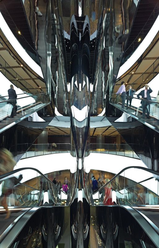
Voids have been cut through the architecture to help create a sense of openness and orientation.
Image: Tony Hill
Low ceiling heights within the existing structures presented a design challenge, but Wonderwall tackled the problem by creating voids to allow shoppers to see where they’ve come from and where they’re going. The use of a reflective stainless steel, especially at the escalators, makes the spaces feel more open and light. Wayfinding also helped with this. Melbourne multidisciplinary designers Büro North designed the environmental graphics in a muted white palette with illuminated text. “Using established principles for pedestrian movement, proximity of transport nodes and extensive site audits, we developed an anticipated pedestrian load model for the development of appropriate signage,” explains Finn Butler from Büro North.
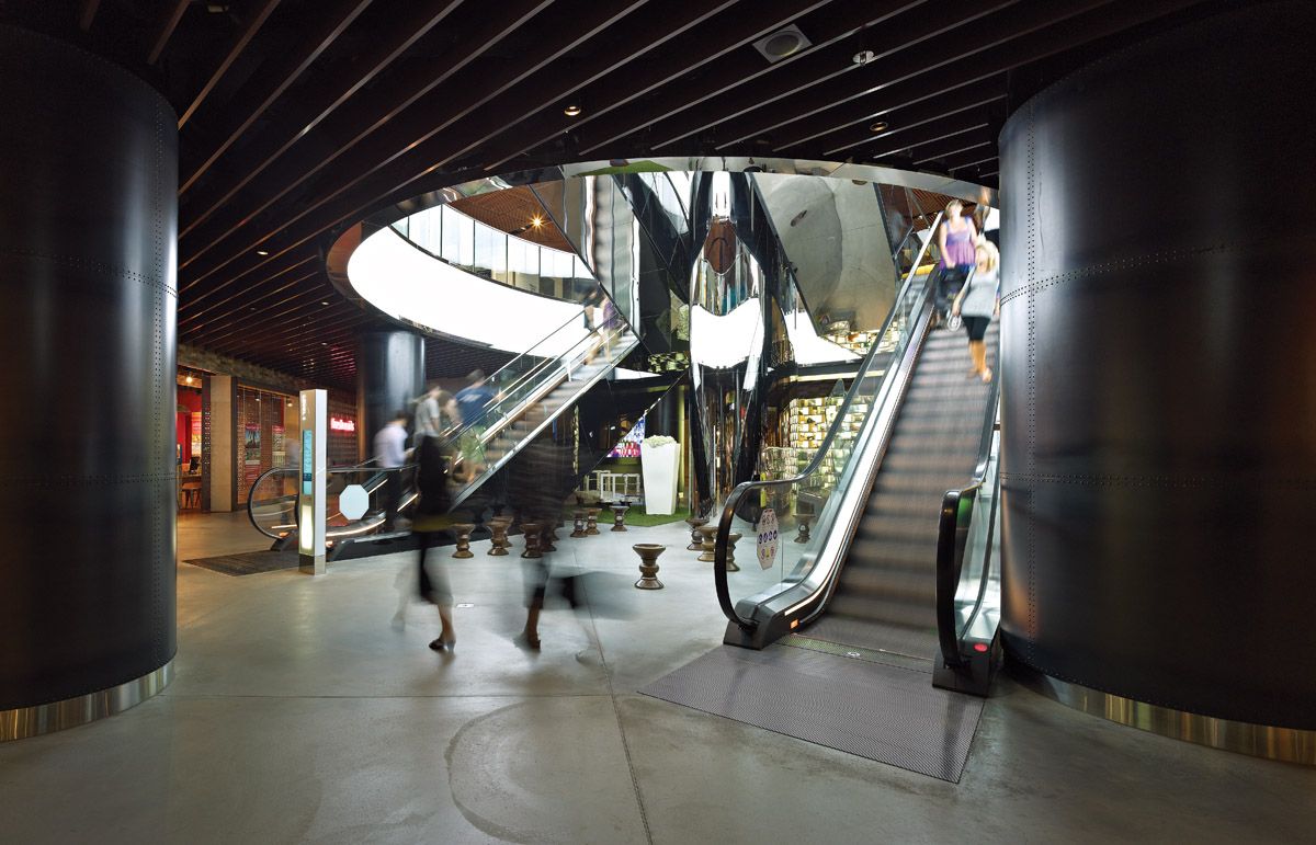
As well as the wayfinding system, Büro North also produced interpretive heritage graphics, including embedded stainless steel heritage quotes in the paving at major entrances and an illuminated heritage timeline. History was also embedded in the project thanks to Sydney Tower. Since it is such an important landmark, Wonderwall was keen to celebrate the fact that this shopping centre exists at its base. By encasing the base of the tower in a large cylinder of black steel, shoppers have a visual connection to the tower above.
The project is still not complete – areas to be finished include the dining precinct on levels five and six and the level seven restaurant and bar precinct later in 2011. And the egg-shaped tower, 85 Castlereagh Street, is due for completion in 2012.
This is a building borne of constraints – to fit within the existing architecture, to adhere to strict city planning laws and to deliver a working retail environment in one of the top shopping streets in the world. But often complexity is what makes a project fascinating. As Wardle comments, “It’s often harder to design something in a paddock. This project was much more interesting for being so complex.”
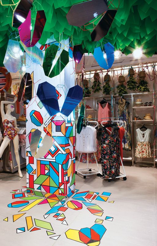
Sportsgirl installation

Sportsgirl installation.
Image: Terence Chin
Sportsgirl is well known for its eye-catching and innovative interiors and Gloss Creative, the Melbourne-based design studio, has been the creative force behind a number of its store installations over the years. The team was approached to create the entrance installation for the company’s “Superflagship” store in Pitt Street.
Aptly named “Jeepers Creepers,” the concept is based around the national campaign’s theme of “Summer,” and features a variety of bugs and overgrown garden plants. “We were inspired by the sounds and feel of a summer garden,” explains Amanda Henderson, Gloss Creative’s principal. The team worked in collaboration with London-based design consultancy HMKM working within the same concept, colour palette (bright hues overlaid on neutral white backgrounds) and high-impact materials. “We created a range of geometric, suspended bugs that were formed using handmade, illuminated wire bug frames and finished with holographic, glowing and coloured mirrored wings. We also printed the same patterns and vibrant colours on the floor and columns. To achieve the feeling of being in a garden, we also filled the ceiling with fluorescent green plastic leaves to create a glowing canopy.” It’s a fun, effective and original prelude to the rest of the store.
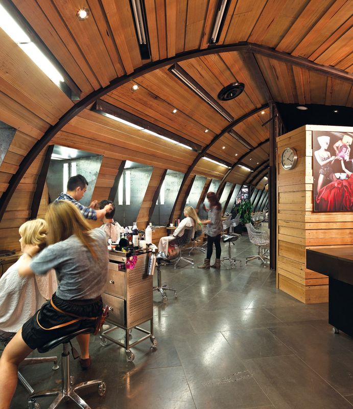
DJ’s Hair Artistry

DJ’s Hair Artistry.
Image: Peter Bennetts
A hair salon located in a shopping centre presents a certain conundrum. Faced with the challenge of creating a distinctive user experience in a small, predefined space in the midst of a busy mall, designer Gordon Xue (The Xue Project), was also given the added task of mimicking but enhancing the salon’s existing studio in Chinatown. “As brand recognition was an important requisite for the client, I repeated the theme of reused materials and arched ceilings but further extended the curve into a tunnel-like shape, creating the feel of an old train carriage.”
Xue’s spatial device also reinforces the process of moving from one zone to the next as hair is washed, cut, coloured and styled. The ceiling is interspersed with a combination of halogen and LED lighting, forming the correct daylight effect for hair colouring. “I also wanted to create an urban environment and in addition to the recycled timber, employed materials like raw structural steel and stone flooring to complete the aesthetic,” adds Xue. The most significant of these elements is the vertical run of metal tension bars at the salon’s entrance. They have the effect of drawing in passers-by but also create a feeling of enclosure and intimacy for customers.
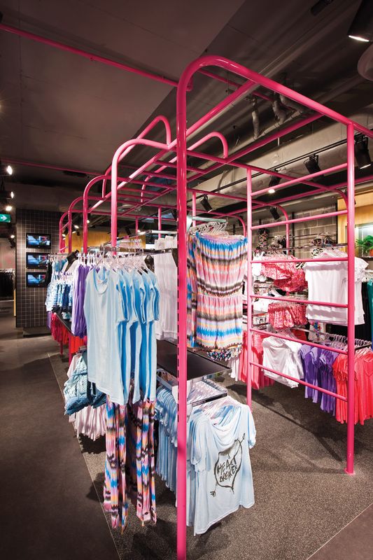
Supré

Supré at Westfield Sydney.
Image: Jason Busch
Synonymous with its bright pink magenta branding, Supré’s new fitout in the basement of Westfield’s Pitt Street centre somehow takes the fun, flirty and girlie theme of the brand to a new level. With a significant increase in internet sales, Supré wanted to strategically create a more inviting interior that would act as a drawcard for customers. They turned to Sydney designer Andrew Waller to conceptualize an environment that would feel like a “hangout” for the “Supré girl.”
“We developed the idea of an ‘urban landscape’ that would consist of a number of built forms and zones representing the various kinds of Supré customer,” explains Waller. A plywood play house, skate ramp and hot pink climbing frame are a few of the standout pieces, which also cleverly double as clothing display pieces. The textural palette, including materials like plywood, rubber gym matting, black metal piping/railings, and exposed concrete reinforce the urban theme. The exterior of the shopfront, the Westfield “attention-seeking zone,” extends the sculptural dialogue of the interior. Fuschia, backlit stepping tiles – hopscotch style, with integrated imagery – serenade a circular mannequin platform.
The feel is definitely 1980s, but this is not accidental. The new store coincides with celebrations of the chain’s establishment in 1984.
Credits
- Project
- Westfield Sydney
- Design architect
- Westfield Design and Construction
100 William Street, Sydney, NSW, Australia
- Consultants
-
Builder
Westfield Design and Construction
Design architect Wardle
ESD Cundall Australia
Industrial design Robert Watson
Interior architect Wonderwall
Lighting Norman Disney Young, S4B Studio
Project manager Westfield Design and Construction
Signage and wayfinding Büro North
Structure and facade engineering Hyder Consulting
- Site Details
-
Location
188 Pitt Street,
Sydney,
NSW,
Australia
Site type Urban
- Project Details
-
Status
Built
Design, documentation 22 months
Construction 28 months
Website http://www.westfield.com.au/
Category Commercial, Interiors
Type Retail
- Client
-
Client name
Westfield Sydney
Website Westfield
Source
Project
Published online: 14 Sep 2011
Words:
Elana Castle,
Penny Craswell
Images:
Jason Busch,
Peter Bennetts,
Terence Chin,
Tony Hill
Issue
Artichoke, June 2011