Over the past ten years of reviewing houses, I have observed changes in the emphases of client briefs and the architectural response. Open-plan living has been adapted to contemporary life, easing out some of the difficulties inherent in this form, re-engaging with the qualities of a room and continually renegotiating a relationship with home technology. Spaces such as kitchens have increasingly become served rather than servant spaces and there is a renewed level of engagement with the immediate external environment, particularly in homes designed for families with young children. Winscombe Extension by Preston Lane Architects reflects a number of these shifts. When I spoke with director Daniel Lane about the project, he noted that today’s clients are also asking for less space, but wanting it to do more.
Winscombe Extension, tucked into the hill of Tasmania’s Lower Sandy Bay, is home to a couple and their three young children. The family bought the Californian brick bungalow over three years ago and spent the first year and a half renovating much of the existing building and landscaping the backyard. When Preston Lane Architects came on board, this preparatory work had effectively left a north-facing, three-dimensional slice of space at the back of the house, between the rear brick wall and the newly planted garden. The clients had also established a very distinct aesthetic, which was characterized by white-on-white, with black accents, against the texture of natural materials such as clear-finished timber.
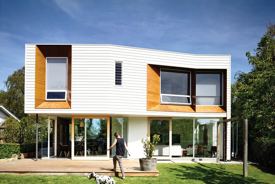
Taking cues from the “weight” of the existing brick house, the architects developed a two-storey extension that adds a solid, weatherboard form to the upper level and a visually lighter lower floor, defined by fixed and sliding full-height glazing, which places the occupant within the garden. The upper floor, which captures slices of view to the Derwent River and framed views back to Mount Wellington, gives the home a main bedroom with an ensuite, a nursery and a study, while the garden level has a new kitchen with a scullery and a living room. A small laundry is spliced into the extension at the same level as the existing house.

The cupboards in the kitchen are made from repurposed flooring timber. Artwork (L-R): Katarina Vesterberg; Sophie Burbury; Emily Ferretti.
Image: Derek Swalwell
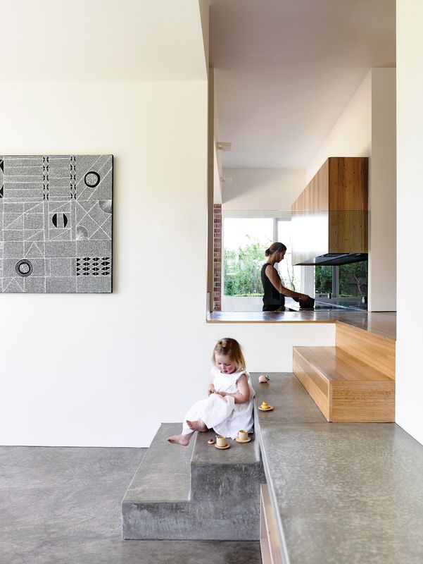
The stairs are the key spatial device that connects and divides each component of the program. A generous landing at the existing floor level is open to the kitchen, separated by a glass balustrade. The kitchen bench matches the landing height in a clever piece of detail manipulation. This configuration allows occupants of the kitchen to look through to the existing house, particularly the playroom, in addition to seeing into the new living space. Equally, anyone on the landing can view all spaces, old and new. The stair itself offers a solid divider between the kitchen and living room, so that each space offers a sense of enclosure, or the qualities of a room. A scullery removes the tangle of appliances from the kitchen, allowing it to be more aesthetically clean and effectively served.
Deep, angled reveals surrounding the glazing on the upper level are crucial to the aesthetic balance of the rear elevation and the orientation of the occupant. Daniel felt that this type of detail was required to amplify the intended weight of the upper floor and balance the undercut of the garden level. While the upper floor is clad in white-painted weatherboards, the bold reveals are skinned with lightly stained Western red cedar. This move offers a distinctive graphic for the northern facade while framing the view from within the upper floor and offering the occupant some privacy. A kick in the line of this facade is the final strategic move on this elevation, creating the impression that each of the two spaces on the garden level claims its own piece of garden.

A landing at the existing floor level matches the height of the kitchen bench, allowing views through to the living area. Artwork: Sophie Burbury.
Image: Derek Swalwell
While the palette is neutral within the new spaces, certain materials are used as features. The cupboards in the kitchen and bathroom are constructed from repurposed flooring timber, taken from the rear lean-to, with nail holes filled and aligned in a rhythm along the fronts. Bricks from the rear wall of the existing house have become a textured wall and backdrop in the kitchen, with a smattering of paint left across their faces.
The clients want their children to grow up spending plenty of time outdoors and the extension opens the house to this possibility. From the moment you enter the body of the home, you look through to a thin slice of the lush green backyard, with the full view opening up at the landing that sits between old and new. One of the clients notes that while she had concerns that the new living spaces might be too small, in occupying the finished building she has been pleasantly surprised by the way the garden becomes part of the lower floor, expanding the sense of space. It seems that these changes in house design could offer increased richness for the home environment. This extension retains the advantages of open-plan living in the way spaces are visually connected through structured viewing points or via the garden, and yet the level of enclosure allows each room to have individual qualities and vistas.
Products and materials
- Roofing
- Lysaght Klip-Lok 406 roof cladding
- External walls
- James Hardie Scyon Linea cladding; Western red cedar from Tilling Timber; salvaged bricks
- Internal walls
- Boral plasterboard; salvaged bricks Windows: Tasmanian oak frames in painted finish; Capral 425 Narrowline glazing system in anodized aluminium finish
- Doors
- Custom Tasmanian oak doors on Capral 1030 tracks in lime wash finish; MDF-lined doors on Centor tracks in painted finish
- Flooring
- Burnished concrete; Tasmanian oak in satin finish
- Lighting
- Emac & Lawton Lighting pendant; Fagerhult Gaudi Linear fluorescent; Artemide Square Wall light; Ligman Gino wall light
- Kitchen
- Miele oven; AEG dishwasher; Franke sink
- Bathroom
- Paco Jaanson basin; Clearwater Formoso bath
Credits
- Project
- Winscombe Extension
- Architect
- Preston Lane Architects
Hobart, Tas, Australia
- Project Team
- Daniel Lane, Nathanael Preston, Justin Hanlon, Garth Ancher
- Consultants
-
Builder
Mark Young
Engineer Burbury Consulting
Interior design Preston Lane Architects, Sophie Burbury
- Site Details
-
Site type
Suburban
Site area 832 m2
Building area 260 m2
- Project Details
-
Status
Built
Completion date 2013
Design, documentation 6 months
Construction 6 months
Category Residential
Type Alts and adds
Source
Project
Published online: 11 Jun 2015
Words:
Judith Abell
Images:
Derek Swalwell
Issue
Houses, April 2015