
The original arched facade belies a new interior.
Image: Earl Carter
The City House by O’Connor and Houle is a rare creature: a house used as a part-time residence in a location that many would dream of settling in full-time. Virtually nothing of the old house – located in the shell of a relatively narrow, fully attached Arts and Crafts dwelling – remains other than the facade and one idiosyncratically suspended, and now disused, chimney. From the front door back this is a totally new build, and the resultant internal spaces reflect the blankness of the canvas, and bear no resemblance to the historic planning of the original dwelling.
Annick Houle presented the dwelling to me in a matter-of-fact way, choosing not to focus on conceptual “baggage,” as some might. As a result I experienced the house very clearly as a place of things and presences, and not as a place of ideas or concepts. It is not that the ideas aren’t there – there is a clear conceptual diagram, evident in the spatial clarity of the architecture. It is more the case that the house is experienced as a series of concrete material experiences, which taken together frame a particular lifestyle.
The ground floor of the dwelling is largely open plan, with a single services pod positioned just inside the front door. This pod separates the front bay window study area (a relic of the Arts and Crafts facade) from the kitchen and living areas. It contains a toilet and compact laundry, as well as a pantry and other cupboards of various shapes and sizes.

A new open kitchen uses space cleverly with range tucked under the stair.
Image: Earl Carter
The kitchen is open, with the cooktop tucked neatly beneath the stair to the upper level. A generous central bench accommodates seating and kitchen work, and is topped in white marble. From the kitchen the space flows smoothly around a long table, which is flanked by a shallow side light well with enormous sliding glass doors. It is then on to the living room proper, which faces a small rear yard. The rear wall of the living room, facing due north in an excellent aspect, is framed by another enormous door, this one a pivot – this and a pass door completely open up the living room to the yard.
The sense of space on the ground floor is expansive without being excessive. There is enough room for the space’s different functions, and it is all pretty comfortable, but because of its narrowness there is some congenial jostling of shoulders. Having the light well adjacent to the dining table makes an enormous difference to the sense of containment, and the room does not have the “gun barrel” feeling common to narrow attached terraces.
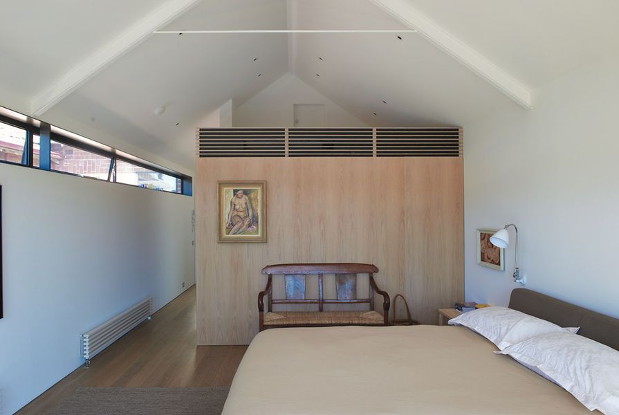
Vertical space assists with this sense of generosity. A void cuts through the heart of the dwelling, with a lofty two-storey space above the kitchen work area. This generous spatial “chunk” out of the upper level came at the expense of a third bedroom; the resultant two-bedroom plan represents a kind of “underdevelopment” of the site, in itself a luxury. The space separates the main and second bedrooms on the upper level, and a bridge links the two through the void. This void at the upper level is punctuated by a wine cellar, visible through a glass floor beneath the dining table. When the lights are on in the cellar a three-level visual void is traced through the house.

The living space. Artwork: Dale Hickey, Peter Cole, Paul Partos.
Image: Earl Carter
The main bedroom is luxurious without being remotely ostentatious; this might also be a fitting description of the house overall. The second bedroom is of more modest dimensions, and fronts the old upper-level balcony facing the street. Two marble-lined bathing areas are provided on this floor.
A separate studio room that can be used as a work or sleeping space, and which has its own bathroom, has been constructed in the rear yard over a garage. Access is from the street to the immediate north of the lot.
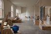
You could not visit this house without noting the owner’s significant art collection. Paintings, prints and sculptures are everywhere in this interior. The art and the architecture have something going on here, and I can’t help feeling that the experience of the place would be distinctly different – and perhaps a little bloodless – without the texture and presence of so many good pieces. The two elements of art and architecture exist symbiotically, and in perfect harmony.
Architecture can sometimes be accused of being arrogant and overbearing, but City House is certainly not an example of this. The balance achieved here is pleasing to the once-off visitor, and I imagine it is equally or more pleasing for the occupants. The combination of the owners’ collecting skills and the architects’ relatively restrained design approach has resulted in a dwelling founded on that most rare of commodities: exceptional good taste.
Products and materials
- Roofing and external walls
- VM Zinc Anthra-Zinc.
- Internal walls
- Plasterboard.
- Windows and doors
- Custom timber and steel windows and doors.
- Flooring
- Market Timbers tallowwood flooring.
- Kitchen
- Qasair rangehood; Miele dishwasher; Multyflex Wolf fridges.
- Bathroom
- Vola tapware; Carrara marble.
Credits
- Project
- City House
- Architect
- O'Connor and Houle Architecture
Melbourne, Vic, Australia
- Project Team
- Annick Houle, Stephen O'Connor, Mitchell Kedell, Henry Tinsley
- Consultants
-
Builder
Smart and Cain Constructions
Engineer Mark Hodkinson
Landscaping Simon Croome Garden Management
Lighting Erco
- Site Details
-
Location
Melbourne,
Vic,
Australia
Site type Suburban
Site area 288 m2
Building area 200 m2
- Project Details
-
Status
Built
Design, documentation 9 months
Construction 12 months
Category Residential
Type Alts and adds, New houses
Source
Project
Published online: 6 May 2013
Words:
Marcus Baumgart
Images:
Earl Carter
Issue
Houses, February 2013