At the risk of sounding clichéd, opposites do attract. Not always in love, but often in design, and in the case of this Sydney house, much of its appeal comes from its unexpected contrasts in form and scale. They begin with its relationship to place: a contemporary building on a conservative suburban street where buildings are mostly from the inter-war years. It’s slightly out of context, though it takes all its cues – bar aesthetics – from the site.
“The form and everything that flows from it is a response to the awkward geometry of the block,” says architect Andrew Burges. “It’s a flat-ended wedge, with four neighbouring properties and a laneway adjoining, and there was a fairly ordinary Federation house in the centre of the site. Our strategy with the new house was to invert the site and compress the building to the back, where the geometry is tighter, to turn what traditionally is the front garden into an informal backyard. This is where the northern sun is
The laneway allowed Andrew to push parking to the back of the site and the building envelope right to the rear, leaving him the question: How should this building address the street?

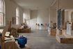
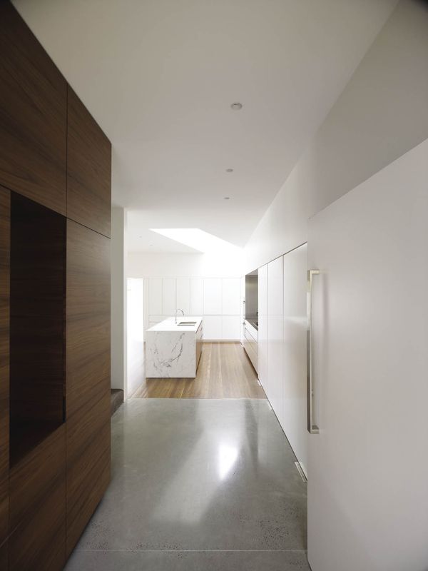
The ground-floor family room and kitchen.
Image: Brett Boardman
“We started thinking about the suburban fence line as a critical datum in the experience of the house,” say Andrew. “Below the fence line, it doesn’t have much outlook, except for the garden, but it’s more private. Above the fence line it opens up to broader views but it’s more exposed, so there are privacy issues, which affected the language of this part of the structure. So we considered the floor plates for the two levels as quite separate and distinct, with different criteria shaping them.”
From outside the shift is signalled not only in form, but also in material language. The ground floor is Bowral Blue face brick with cedar-framed glazing – a reference to the prior house. The first floor is positioned slightly off-axis from the level below, creating angled overhangs above the living spaces. In contrast to the ground floor’s transparency, the first floor is fully screened with sliding cedar louvres.

A small space adjacent to the family room.
Image: Brett Boardman
Inside, the ground floor frames domestic life on a deep plan as opposed to the prevailing Australian linear model. “We were interested in the social functions of a house with unusual groupings of rooms, so we developed a deep rectangular plan of bays, separated by strong bands of walls, but open enough to allow access and viewing between the spaces.”
The idea for the bays has a cultural note. “One of the clients is Indian and we looked at Le Corbusier’s work in India – that repetitive bay format and thickness of walls. That idea certainly influenced our structure, though we’ve organized it differently.” The first bay is a dining room and informal living area with a window opening fully to the garden. This is a beautiful room for reading, catching the winter sun as it does.

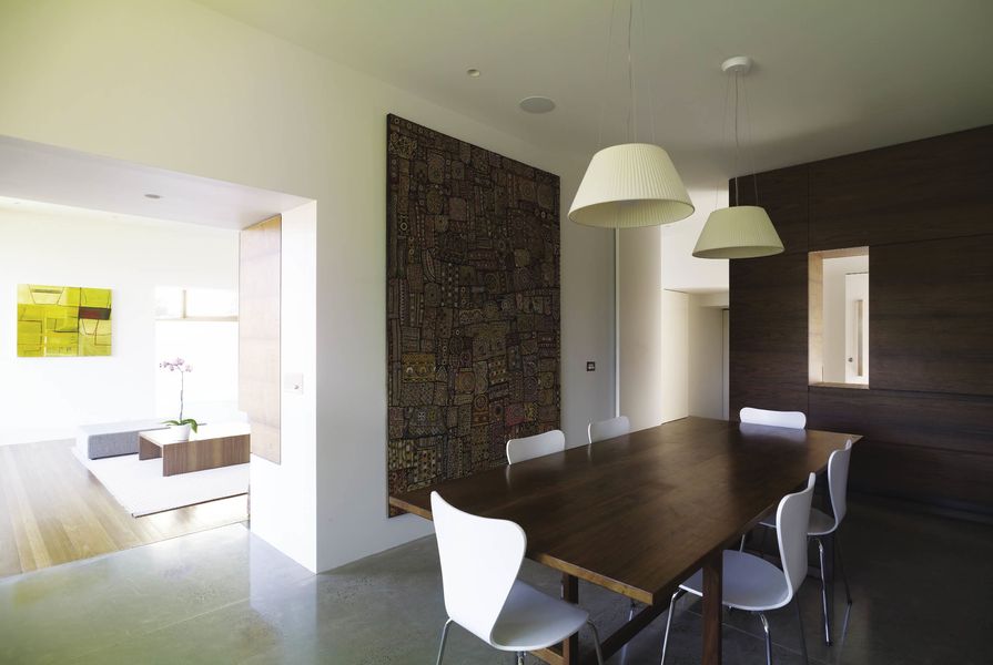
The formal living and dining area.
Image: Brett Boardman
The second bay is a busier space, with kitchen and butler’s pantry to the south and family room to the north. Here a glass wall slides completely away, directly connecting this room to the garden. The third and smallest bay is a kids’ play area overlooking a narrow lap pool.
Floors on this level are either recycled ironbark or polished concrete with a wet-look sealant. Walls partitioning the bays are thickened with joinery in American walnut. The kitchen is stainless steel and stone, with a high-mirrored splashback reflecting the garden. The palette is simple but detailed with hutches and display niches for books and collected objects to personalize the rooms.
While the ground-floor plan is tightly structured and focused towards the garden, upstairs is a looser fit. Individual rooms shift alignment and shape to catch the light or views. A generous tapered landing off the stairs opens to the main bedroom occupying the east wing. Its ensuite is partitioned into bays (vanity/toilet/shower) – the architects’ reference to the nearby coastal bays of Bronte, Clovelly and Coogee. The west wing is divided into children’s bedrooms, a bathroom and study.
As different as the two levels are in plan, they intersect at one dramatic point in the house: a high, faceted void above the kitchen. “Resolving the geometry between the two levels gave us an opportunity to solve the light issue at the back of the ground-floor deep plan with this playful element,” explains Andrew, who delights in making thresholds of spatial interest. The entry to the house, for instance, is a five-ways intersection with passage to the garage, guest bathroom, laundry, living areas and staircase. Utility rooms such as the guest bathroom, butler’s pantry and small south courtyard – tucked into the leftover segments of the ground-floor envelope – illustrate his approach to planning and scale. “Pushing these little rooms into the fill areas at the back left the main rooms with solid rectilinear space. Some elements are quite compressed, such as the bathrooms, and others are much larger than you’d anticipate for rooms of this scale – like the sliding glass windows and doors of the living areas. How we arrived at them is more intuitive than theoretical, but I really like those opposites.”
Products and materials
- Roofing
- Lysaght Klip-Lok, ultra marine finish, ‘Surfmist’
- External walls
- Bowral bricks, ‘Bowral Blue’; rendered masonry, painted ‘Soapstone’; Western red cedar shiplapped profile.
- Internal walls
- Masonry walls with Proyalbi 10 mm white set render, painted Dulux ‘Natural White’; 2-pack polyurethane joinery, painted Dulux ‘Natural White’; American walnut joinery.
- Windows and doors
- Western red cedar, Woodmans CladCoat finish.
- Flooring
- Polished concrete, partial grind finish with 10 mm blackstone aggregate; recycled ironbark floorboards, tung oil finish.
- Lighting
- Kreon wall lights.
- Kitchen
- Miele oven, induction cooktop, integrated dishwasher; Combi oven; Liebherr integrated fridge; Franke undermount sink; Rogerseller Cafe sink mixer.
- Bathroom
- Kaldewei Centro Duo bath; Stormtech grated drains; Rogerseller Zero basin; Tonic motion mixers; Villeroy & Boch Omnia compact wall-hung toilet; white matt wall tile; Aretusa Light grit-blasted stone finish; Isernia sandblasted stone finish.
- Heating/cooling
- VRV airconditioning units; Western red cedar external battens for sun control.
- External elements
- Pietra Catalan stone paver.
Credits
- Project
- Waverley house
- Architect
- Andrew Burges Architects
Surry Hills, Sydney, NSW, Australia
- Project Team
- Andrew Burges, Jeremy Bull
- Consultants
-
Builder
Everest Construction Pty Ltd
Engineer Northrop Consulting Engineers
Joinery Glen Ryan & Associates
- Site Details
-
Location
Sydney,
NSW,
Australia
Site type Suburban
Building area 286 m2
- Project Details
-
Status
Built
Design, documentation 14 months
Construction 18 months
Category Residential
Type New houses
Source
Project
Published online: 1 Oct 2010
Words:
Peter Salhani
Images:
Brett Boardman
Issue
Houses, October 2010